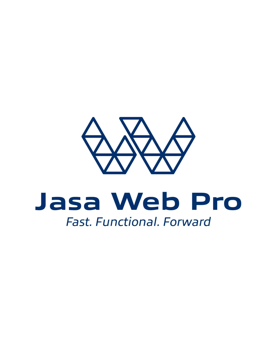
Jasa Web Pro logo logo review
4.1/5
Logo score Combination mark category

Jasa Web Pro logo

creative330194 Essential logo review

This logo presents a modern, professional image with a distinctive geometric mark and strong readability, but should be tested for clarity at small scale and in less optimal uses.

This logo lockup shows strong execution, supported by visual balance and text readability; improving distinctiveness is the clearest next step.

Combination Mark Geometric, Modern, Minimal Technology/web Services
5/5
Legibility
3.6/5
Originality
4/5
Balance
4/5
Scale
4/5
Style consistency
Your next steps

What to fix first

Focus on the changes that matter. Keep what makes the logo work.

1

Standalone mark

Test symbol clarity at small sizes and on dark backgrounds.

High priority Worth testing Low effort

Mark is built from fine triangle outlines that may lose clarity or appear faint at small sizes, especially if reversed or reduced.

See the category review

Detailed review

Logo performance breakdown

5/5

Brief & logo match

Sleek geometric 'W' and tech-forward layout clearly express a professional web service provider focused on speed and functionality, matching the brief of 'Jasa Website Profesional'.

5/5

Legibility

Wordmark 5/5 · Layout 5/5

  • Clear, bold sans-serif text is highly readable.
  • Geometric symbol presents an unambiguous shape.
5/5

Misinterpretations

  • No negative or confusing secondary readings detected.
4/5

Balance alignment

Symbol 4/5 · Wordmark 4/5 · Layout 4/5

  • Overall balanced composition, horizontally and vertically.
  • Spacing between the geometric mark and wordmark is moderately generous; could be visually tightened for stronger vertical integration.

    Optional refinement logomark+wordmark arrangement
Uploaded logoAlignment guide overlay

Inspect spacing with the guide. Optical balance may differ from geometric centering.

4/5

Scalability

Symbol 3/5 · Wordmark 5/5 · Layout 4/5

  • Mark is built from fine triangle outlines that may lose clarity or appear faint at small sizes, especially if reversed or reduced.

    Worth testing Standalone mark

    Try: Test symbol clarity at small sizes and on dark backgrounds.

4/5

Style consistency

Available in Advanced logo reviews
3.6/5

Originality

Symbol 4/5 · Wordmark 3/5

Available in Advanced logo reviews
Try your own review

Wondering how your logo performs?

Get a clear logo score, key risks, and priority fix ideas before your client or audience sees it.

Review my logo