KEVODESK logo review
3.8/5
Logo score Wordmark category

KEVODESK

creative174813 Essential logo review

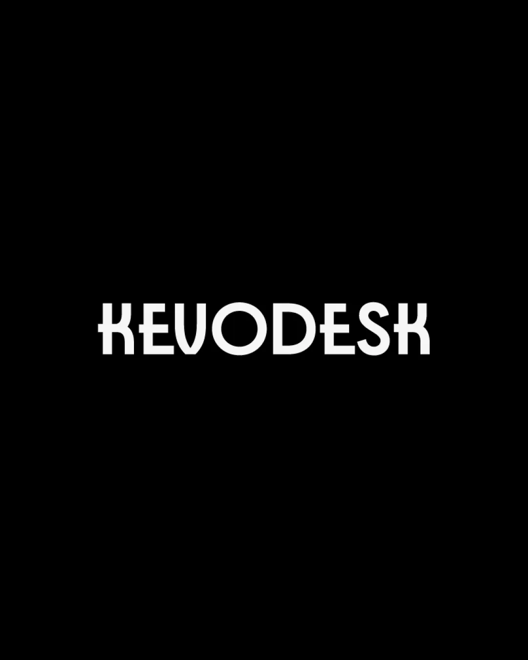
A distinctive wordmark with excellent clarity and originality, though it would benefit from improved horizontal balance by refining the proportion or spacing of the outer 'K's.

This wordmark shows solid execution, supported by distinctive construction and text readability; improving visual balance is the clearest next step.

Wordmark Geometric, Stylized Sans-serif Office Supplies
4/5
Legibility
4/5
Originality
3/5
Balance
4/5
Scale
Your next steps

What to fix first

Focus on the changes that matter. Keep what makes the logo work.

1

whole wordmark

Adjust spacing or letter widths to balance side weight with central letters.

High priority Visible issue Low effort

The highly stylized 'K' characters at both ends create heavier visual weight compared to the more open 'O' and 'D' in the center. This produces a slight imbalance, making the sides feel denser and distracting from the cohesion.

See the category review


Detailed review

Logo performance breakdown

4/5

Brief & logo match

The strong, contemporary type and structural elements of the wordmark fit workspace accessories, but the current side-heavy weight slightly detracts from optimal brand harmony.

5/5

Misinterpretations

  • No sign of harmful misinterpretations or confusion.
4/5

Legibility

  • Unambiguous brand name; stylized yet clear letterforms.
  • The 'K's use mirrored and geometric forms that, while creative, may be briefly confusing at a glance or at small sizes.

    Worth testing 'K' characters (start and end)
4/5

Originality

  • Distinct custom type approach with memorable mirrored 'K's.
4/5

Scalability

Available in Advanced logo reviews
3/5

Balance alignment

Available in Advanced logo reviews
Try your own review

Wondering how your logo performs?

Get a clear logo score, key risks, and priority fix ideas before your client or audience sees it.

Review my logo