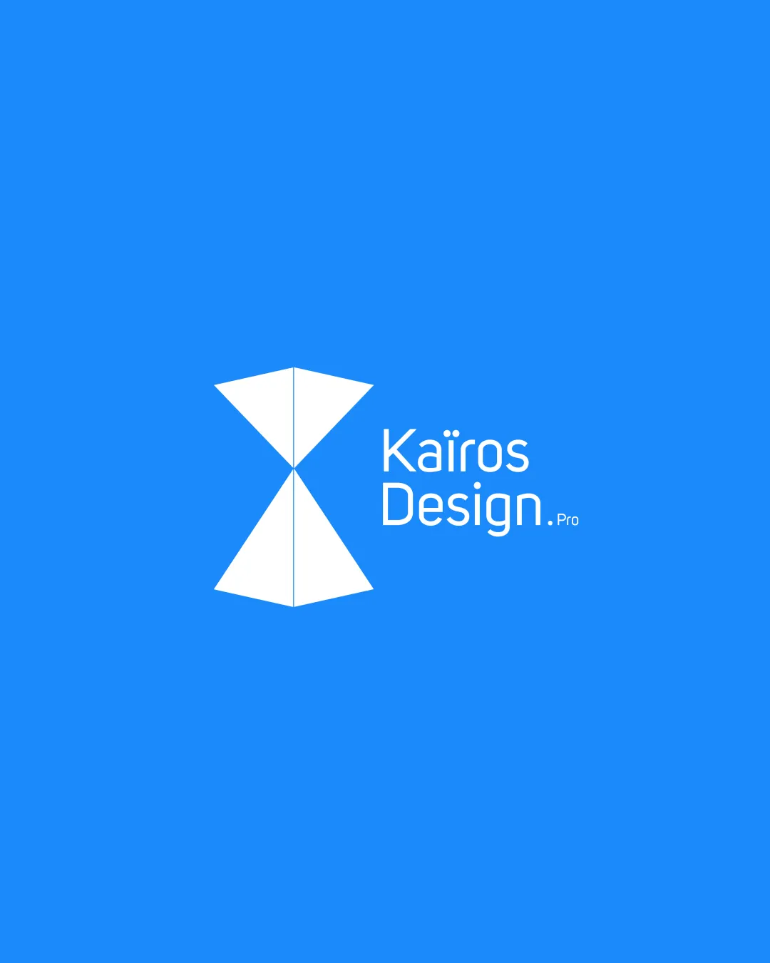
Kaïros Design. Pro logo review
4.3/5
Logo score
Logo review of

Kaïros Design. Pro

A strong, distinctive, and contemporary logo suitable for a design-focused brand

Combination Mark Minimalist Geometric Creative/design Services
4.5/5
Legibility
4/5
Originality
4.5/5
Misread
4.5/5
Balance
4/5
Scale
Action plan

What to fix first

The most important fixes to handle before polishing the full presentation.

1

Slightly increase the '.Pro' text size or adjust weight

Medium priority

Current '.Pro' may not be readable at small sizes

Impact: Improves Small-scale Legibility For All Branding Uses · Effort: Low

2

Test mark at micro sizes for line thickness retention

Medium priority

Fine center line may disappear when scaled down

Impact: Ensures Mark Clarity Across All Scale Applications · Effort: Low

Detailed review

Logo performance breakdown

4.5/5

Legibility

Checkmark icon Clean, highly readable modern sans-serif font
Checkmark icon Good contrast between text and background

Warning icon Small '.Pro' text may lose clarity at small sizes

4/5

Originality

Checkmark icon Original use of geometric hourglass to convey message
Checkmark icon Distinctive minimalist approach

Warning icon Hourglass shape is not entirely unique; could risk subtle resemblance to existing marks

4/5

Color harmony

Checkmark icon Bright blue conveys creativity and modernity
Checkmark icon Blue-white contrast is visually appealing

Warning icon Palette is safe but not distinctive

Blue
#2196F3

White
#FFFFFF

Your palette is close. Refine the color roles and combinations before updating the logo.

Build brand colors
4.5/5

Balance alignment

Checkmark icon Well-aligned relationship between symbol and wordmark
Checkmark icon Good overall composition and white space

Warning icon Slight visual tension with off-center text block under the mark

logo 200x250 pixels scalability test alignment grid overlay
4/5

Scalability

Checkmark icon Simple geometric mark is highly scalable
Checkmark icon Minimal detail supports use at small sizes

Warning icon Very fine detail in the center line of the mark could disappear at extremely small sizes

logo 200x250 pixels scalability test

200x250 px

logo 100x125 pixels scalability test

100×125 px

logo 50x62 pixels scalability test

50×62 px

4.5/5

Misinterpretations

Checkmark icon No negative or confusing alternate readings detected

4.5/5

Logo structure & brief match

Checkmark icon Mark and text complement each other visually and conceptually

Checkmark icon Industry Fit: Appropriate contemporary style for a design agency
Checkmark icon Tone Alignment: Minimal yet professional and creative

Try your own review

Wondering how your logo performs?

Get a clear logo score, key risks, and priority fix ideas before your client or audience sees it.

Review my logo