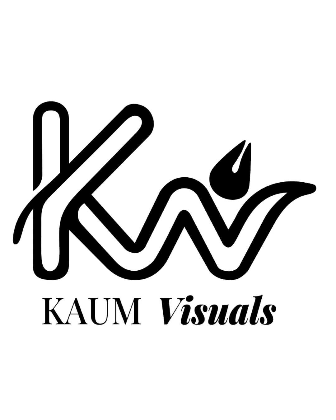
KAUM Visuals logo review
3.9 / 5
Logo score
Logo review of

Kaum Visuals

Review the detailed scores below to see what is working and what should be refined first.

Combination Mark Modern, Line-based, Semi-script Media
4/5
Legibility
4/5
Originality
5/5
Misread
3/5
Balance
3/5
Scale
Detailed review

Logo performance breakdown

4/5

Legibility

Checkmark icon Both 'KAUM' and 'Visuals' are readable with a good choice of contrasting fonts.
Checkmark icon 'KW' monogram is mostly identifiable.

Warning icon The overlapping and stylized 'KW' can cause some reading hesitation, especially at smaller sizes.
Warning icon 'Visuals' in a stylized serif contrasts sharply with 'KAUM', creating a disjointed feel.

4/5

Originality

Checkmark icon Integrating the droplet/flame into the 'W' is a clever detail relevant to a creative industry.
Checkmark icon Monogram design has a distinctive, modern feel.

Warning icon Monogrammed initials with a droplet/flame motif are relatively common in creative fields, lessening uniqueness.

5/5

Color harmony

Checkmark icon Monochrome palette ensures strong contrast and visual clarity.
Checkmark icon Limited color use provides professionalism and adaptability.

Black
#000000

White
#FFFFFF

3/5

Balance alignment

Checkmark icon The monogram and text are vertically stacked for hierarchy.
Checkmark icon Logo feels horizontally centered.

Warning icon The spacing between 'KW' monogram and the droplet/flame is inconsistent, causing a slight heavy tilt visually to the right.
Warning icon 'Visuals' is stronger in weight and italic, which throws off the alignment with the more reserved 'KAUM'.

logo 200x250 pixels scalability test alignment grid overlay
3/5

Scalability

Checkmark icon Bold, simple lines suggest reasonable scalability for larger formats such as signs and banners.
Checkmark icon Black-and-white palette enhances contrast for many applications.

Warning icon Thin, open ends of the monogram may lose clarity at small scales or embroidery.
Warning icon Detailed droplet/flame element might be lost in tiny icons like favicons or stamps.

logo 200x250 pixels scalability test

200x250 px

logo 100x125 pixels scalability test

100×125 px

logo 50x62 pixels scalability test

50×62 px

5/5

Misinterpretations

Checkmark icon No overtly negative or inappropriate shapes detected in the mark.

3 / 5

Symbol & text fit

Checkmark icon Both elements are proportionately sized.
Checkmark icon Clear separation between logomark and wordmark helps in versatility.

Warning icon The typefaces for 'KAUM' (serif) and 'Visuals' (italicized bold serif) conflict stylistically with the fluid, modern logomark.
Warning icon Font style transition between 'KAUM' and 'Visuals' is abrupt, reducing harmony.

Try your own review

Wondering how your logo performs?

Get a clear logo score, key risks, and priority fix ideas before your client or audience sees it.

Review my logo