Wondering how your logo performs? 🧐
Get professional logo reviews in seconds and catch design issues in time.
Try it Now!Logo review of KAUTSAR
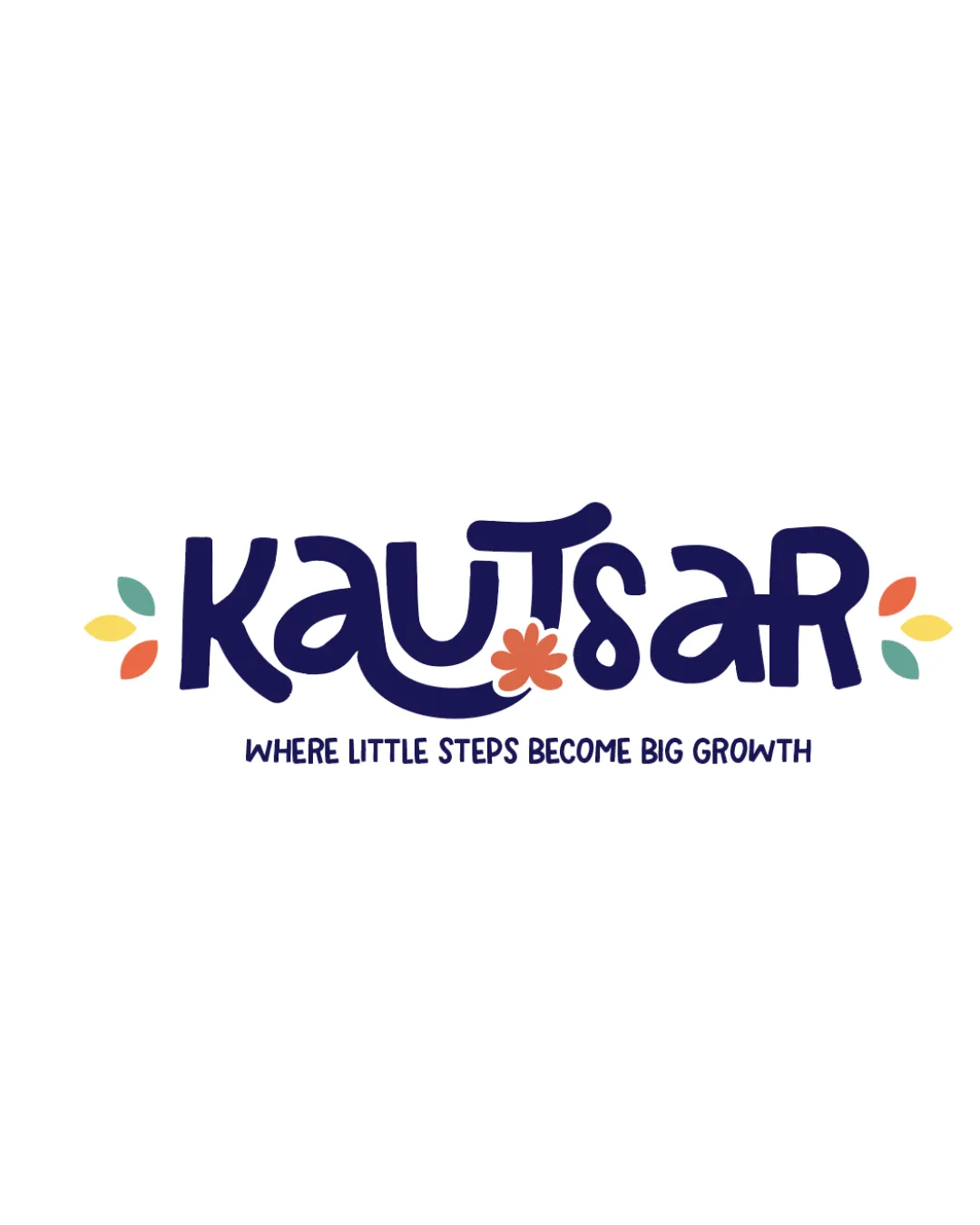
 Logo analysis by AI
Logo type:
Style:
Detected symbol:
Detected text:
Business industry:
Review requested by Haznajims
**If AI can recognize or misinterpret it, so can people.
Structured logo review
Legibility
Primary text is mostly clear and distinct, even with the playful font style.
Supporting tagline is readable at moderate sizes.
The ornate 'S' with the flower shape could be a hurdle at very small sizes.
Visually complex letterforms may slightly hinder instant recognition from a distance.
Scalability versatility
Logo’s bold letters help maintain clarity in many print applications.
Good performance on web, banners, and educational materials.
Delicate floral details and tagline may become illegible at favicon or pencil-eraser sizes.
Complex multiple colored elements could cause issues in single-color reproduction or embroidery for uniforms.

200x250 px

100×125 px

50×62 px
Balance alignment
Logo feels horizontally balanced with mirrored leaf accents on each side.
Text is well centered, with supporting tagline aligned beneath.
The unique flourish on the 'T' and the distinctive 'S' might slightly disrupt the flow compared to other characters, causing minor visual imbalance.


Originality
Custom playful letterforms and integration of the flower motif into the text feel fresh and distinctive.
Colorful leaves and central flower add a unique child-friendly character.
While playful, the use of foliage and flower motifs is somewhat common in educational/children’s brands; slightly reduces uniqueness.
Aesthetic look
Friendly, inviting, and age-appropriate aesthetic for an educational brand.
Color palette is harmonious and matches a growth or learning theme.
Logo borders on being slightly busy with multiple colors and decorative accents.
Ornamental style may age rapidly or not translate well to serious/advanced educational sectors.
Dual meaning and misinterpretations
No inappropriate or confusing symbols appear within logotype or decorative marks.
Floral motif is benign and universally friendly.
Color harmony
Bright, nature-inspired colors work well together and feel optimistic.
Balanced distribution of accent colors prevents overwhelming the design.
Navy
#212356
Orange
#F28255
Yellow
#FFE36E
Teal
#84C3B0
Red
#F46B5D

