 View review
Logo score
Logo review ofKisaic Culture | Curiosity | Connection
Ready for advanced client presentation with small accessibility and flat-use improvements needed for full professional maturity.
Legibility
Originality
Misread
Balance
Scale
Action plan
What to fix first
The most important fixes to handle before polishing the full presentation.
1
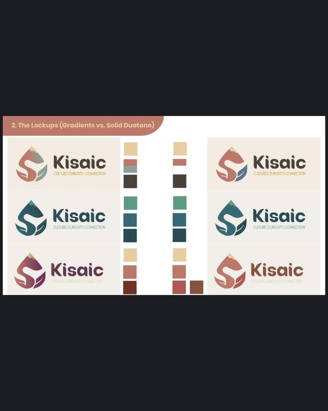
Test all palette/lockup variants for adequate contrast and legibility, particularly tagline visibility on light backgrounds.
High priorityTagline and symbol detail can fade or blur in some lighter or low-contrast setups.
Impact: Ensures Accessibility And Usability Across Print, Digital, And Small Sizes. · Effort: Medium
2
Optimize a single-color/flat version of mark for imprint and micro use cases (social/media avatars, stamps).
Medium priorityCurrent gradients may lose clarity in restricted media; a true flat option ensures consistency.
Impact: Improves Practical Deployment And Ensures Mark Resilience Across All Formats. · Effort: Medium
Detailed review
Logo performance breakdown
Legibility
 Primary name 'Kisaic' is always clear and clean. Subline generally readable in most versions.
 Smallest or lightest applications cause tagline to fade or lose contrast.
Originality
Letter-symbol fusion (KAS, bud, mountain) is conceptually unique. Avoids obvious tourist or cliché icons.
Central flower/teardrop motif is a little common in abstract marks.
Color harmony
Palette feels earthy, cultured, modern, and fits the brand story. Color system provisions for both gradients and solids.
Some color combos lack strong contrast between elements, risking muddiness in certain backgrounds.
BurntSienna
#A76657
Beige
#CAB895
Fjord
#23696C
Patina
#5C7F74
DarkBrown
#645147
Your palette is close. Explore sharper color combinations with Colorfly.design before updating the logo.
Explore palettesBalance alignment
Mark and wordmark align well, good optical spacing. Logo feels visually grounded across all lockups.

Scalability
Mark is relatively simple and distinct, works in flat or gradient. Few overlapping elements to collapse.
Fine color transitions and some details may reduce legibility at very small sizes. Some gradient color schemes risk muddy appearance if converted to black and white.
200x250 px
100×125 px
50×62 px
Misinterpretations
No inappropriate or embarrassing visual resemblance detected. Abstract forms still read as intended.
Logo structure & brief match
Mark and type are harmonized, both organic yet structured.
Sizes and weights balanced across all shown lockups.
Symbolism And Concept: Mark addresses travel, culture, and curiosity through flower, mountain, and letter fusion.
Palette/cultural Association: Earthy and soft palette supports curiosity, culture, and connection; accent tones reference nature without being clichéd.
Try your own review
Review my logo
Wondering how your logo performs?
Get a clear logo score, key risks, and priority fix ideas before your client or audience sees it.
Keep exploring