KKL logo review
2.8/5
Logo score
Logo review of

Kkl

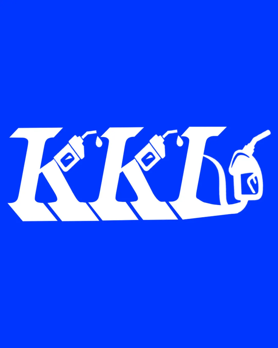
Clear industry signal is achieved, but the logo needs visual refinement, improved balance, and simplification for professional use.

Combination Bold Industrial Monogram With Illustrative Elements Automotive/industrial Supply
4/5
Legibility
3/5
Originality
5/5
Misread
2.5/5
Balance
2.5/5
Scale
Your next steps

What to fix first

Focus on the changes that matter. Keep what makes the logo work.

1

entire wordmark and illustrative elements

Refine the illustrative elements for more balanced integration with the letterforms.

Visible issue High priority Medium effort
Area to inspectApproximate location

The added fuel cans and nozzle above each letter create visual clutter and cause uneven weight, making the composition top-heavy and less cohesive.

How to check

Visually review adjusted placement and integration of illustrations for improved balance.

See the category review
2

fuel cans, drops, and nozzle details

Simplify or bolden the small illustrative details to maintain clarity at small scale.

Visible issue High priority Medium effort
Area to inspectApproximate location

Small details in the cans, drops, and nozzle could become illegible or lost at reduced sizes.

How to check

Test the logo at smaller sizes to confirm detail retention.

See the category review
Detailed review

Logo performance breakdown

3/5

Brief & logo match

Based on an inferred industry
Compared with

No provided brief; inferred goal is to signal lubrication or automotive industry via initials and related tools.

Theme matches the likely industry, but the execution needs refinement for distinctiveness and practical use.

  • Industry Signal

    The use of fuel cans and a nozzle strongly points to lubrication, fueling or automotive supplies.

  • Typography And Integration

    The serif letterforms are bold and commanding, but the illustrative integration feels forced, reducing cohesion.

4/5

Legibility

  • All letters are distinct and readable.
3/5

Originality

  • Integrates product-relevant illustrations with the wordmark.
  • While the combination of initials and tools signals the industry clearly, the use of generic fuel cans and nozzle is a common trope, limiting distinction from similar brands.

    Optional refinement entire concept

    Try: Incorporate a more unique illustrative treatment or subtle twist to further differentiate the brand identity.

    Check: Compare silhouette and visual approach against category norms for greater originality.

2.5/5

Balance alignment

  • The added fuel cans and nozzle above each letter create visual clutter and cause uneven weight, making the composition top-heavy and less cohesive.

    Visible issue entire wordmark and illustrative elements

    Try: Refine the illustrative elements for more balanced integration with the letterforms.

    Check: Visually review adjusted placement and integration of illustrations for improved balance.
    Area to inspectApproximate location
Uploaded logoAlignment guide overlay

Inspect spacing with the guide. Optical balance may differ from geometric centering.

2.5/5

Scalability

  • Small details in the cans, drops, and nozzle could become illegible or lost at reduced sizes.

    Visible issue fuel cans, drops, and nozzle details

    Try: Simplify or bolden the small illustrative details to maintain clarity at small scale.

    Check: Test the logo at smaller sizes to confirm detail retention.

    Area to inspectApproximate location
Uploaded logo at 200 pixels wide
200 × 250 px
Uploaded logo at 100 pixels wide
100 × 125 px
Uploaded logo at 50 pixels wide
50 × 63 px

Compare the detail at different sizes. Labels show the full image dimensions.

5/5

Misinterpretations

  • No obvious negative or unintended interpretations.

Black & white

Does the shape still work without color?

These tests are available only for logos uploaded in vector (SVG) format.

Background contrast

Find the surfaces where your logo stays clear.

These tests are available only for logos uploaded in vector (SVG) format.

Blur & silhouette

A 3px blur softens fine details so you can check whether the overall shape stays recognizable. If key gaps close or elements merge, the logo may rely too heavily on detail.

These tests are available only for logos uploaded in vector (SVG) format.

Try your own review

Wondering how your logo performs?

Get a clear logo score, key risks, and priority fix ideas before your client or audience sees it.

Review my logo