 View review
Logo score
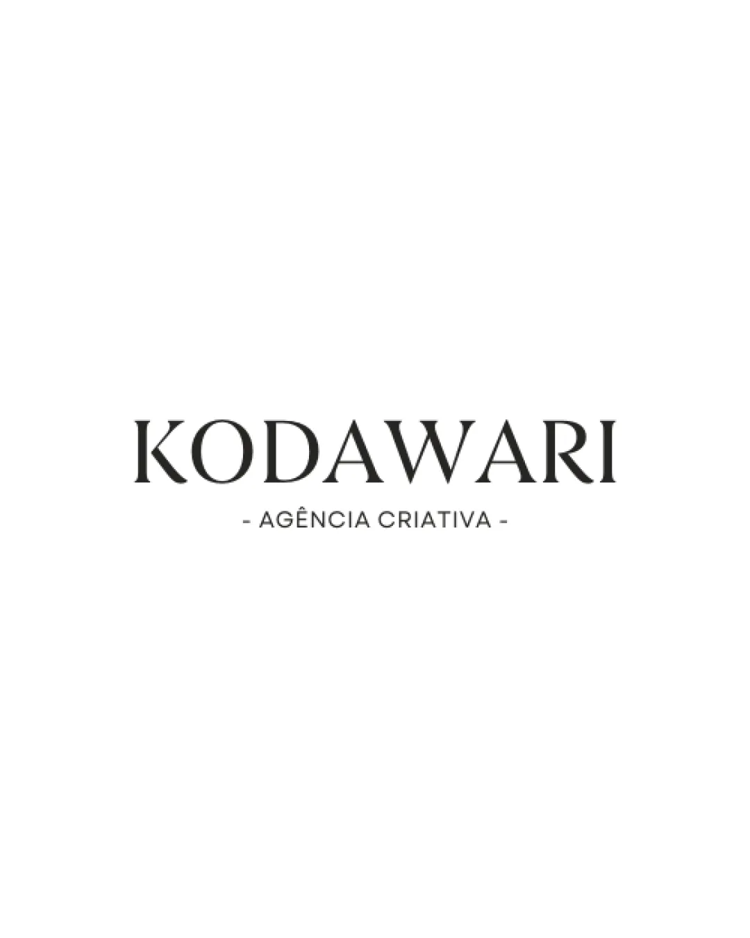
Logo review ofKodawari, Agência Criativa
Review the detailed scores below to see what is working and what should be refined first.
Legibility
Originality
Misread
Balance
Scale
Detailed review
Logo performance breakdown
Legibility
![]() Text is highly legible with excellent spacing
Text is highly legible with excellent spacing![]() Contrasting colors enhance readability
Contrasting colors enhance readability![]() Font size is appropriate and clear
Font size is appropriate and clear
Originality
![]() Elegant execution for a wordmark
Elegant execution for a wordmark![]() Serif font choice adds a refined touch
Serif font choice adds a refined touch
![]() Relies on standard serif type without unique letterforms or distinguishing visual marks
Relies on standard serif type without unique letterforms or distinguishing visual marks![]() Very little to set it apart from other agency wordmarks
Very little to set it apart from other agency wordmarks
Color harmony
![]() Monochrome palette is classic and cohesive
Monochrome palette is classic and cohesive![]() No jarring contrasts; colors support professional tone
No jarring contrasts; colors support professional tone
Dark Gray
#222222
White
#FFFFFF
Balance alignment
![]() Strong central alignment between main name and tagline
Strong central alignment between main name and tagline![]() Symmetrical layout provides a professional and stable appearance
Symmetrical layout provides a professional and stable appearance

Scalability
![]() Simple wordmark is highly scalable
Simple wordmark is highly scalable![]() Works well across diverse mediums, including print and digital
Works well across diverse mediums, including print and digital![]() Minimalist style translates clearly for business cards, stationery, and web use
Minimalist style translates clearly for business cards, stationery, and web use
![]() Thin details in tagline may lose clarity at very small sizes, such as on favicons or embroidery
Thin details in tagline may lose clarity at very small sizes, such as on favicons or embroidery
200x250 px
100×125 px
50×62 px
Misinterpretations
![]() No inappropriate or awkward shapes
No inappropriate or awkward shapes![]() No risk of misinterpretation in the composition
No risk of misinterpretation in the composition
Try your own review
Review my logo
Wondering how your logo performs?
Get a clear logo score, key risks, and priority fix ideas before your client or audience sees it.
Keep exploring


