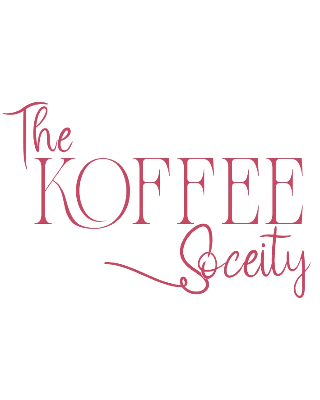
The KOFFEE Society logo review
3.3 / 5
Logo score
Logo review of

The Koffee Society

Usable for a boutique/elegant coffee brand, but not highly distinctive or fully client-ready.

Wordmark Elegant Serif And Script Coffee/food & Beverage
4/5
Legibility
3/5
Originality
5/5
Misread
4/5
Balance
3/5
Scale
Action plan

What to fix first

The most important fixes to handle before polishing the full presentation.

1

Refine the script 'Society' word by reducing the flourish and improving stroke clarity for better scalability.

High priority

'Society' becomes less readable and creates imbalance, diminishing professionalism.

Impact: Greater Clarity At Smaller Sizes And More Balanced Composition · Effort: Medium

2

Explore addition of a subtle, simple icon or motif to increase distinctiveness and brand recall.

Medium priority

Pure wordmark is elegant but lacks visual ownability compared to industry competitors.

Impact: Could Significantly Enhance Originality And Memorability · Effort: Medium

Detailed review

Logo performance breakdown

4/5

Legibility

Checkmark icon Main word 'KOFFEE' is highly readable and stands out.
Checkmark icon Contrast between serif and script fonts aids differentiation.

Warning icon Script font used for 'Society' is slightly less legible, especially with the extended flourish.

3/5

Originality

Checkmark icon Mix of elegant serif and script; somewhat distinctive character shapes.

Warning icon Overall concept is common among cafe/coffee brands.
Warning icon No unique symbol to further set it apart.

4/5

Color harmony

Checkmark icon Consistent pink tone, matches elegant aesthetic.

Warning icon Single tone limits contrast and application versatility.

Blush Pink
#CC5566

Your palette is close. Refine the color roles and combinations before updating the logo.

Build brand colors
4/5

Balance alignment

Checkmark icon Good typographic hierarchy; 'KOFFEE' draws focus.
Checkmark icon Script balances the serif text.

Warning icon 'Society' flourish causes minor imbalance on right side.

logo 200x250 pixels scalability test alignment grid overlay
3/5

Scalability

Checkmark icon No complex graphic, just typography.

Warning icon Thin strokes and flourishing script may lose clarity at smaller sizes.

logo 200x250 pixels scalability test

200x250 px

logo 100x125 pixels scalability test

100×125 px

logo 50x62 pixels scalability test

50×62 px

5/5

Misinterpretations

Checkmark icon No inappropriate or confusing accidental shapes.

Beta

No AI design signals found

Likely designed by a human

Letterforms and flourishes are coherent and deliberate with no generative irregularities.

  • Consistent type selection and spacing throughout
  • No malformed or nonsensical letters or swashes

Visual assessment; not definitive proof of authorship.

Brief match

Checkmark icon Detected Industry: Elegant/coffee-house vibe is captured well for the coffee/food & beverage sector.

Try your own review

Wondering how your logo performs?

Get a clear logo score, key risks, and priority fix ideas before your client or audience sees it.

Review my logo