Simplify or remove gradients and sparkle details for better scalability and clarity, especially at small sizes.
Current logo will lose definition and look cluttered when scaled down for small formats (social icons, embroidery, etc).
high
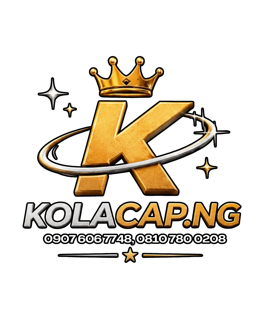
Not client-ready for all formats; requires detail and layout simplification for flexible, professional application.
Focus on the changes that matter. Keep what makes the logo work.
Current logo will lose definition and look cluttered when scaled down for small formats (social icons, embroidery, etc).
high
Overcrowded layouts reduce attention on the brand name/logo, which should be the primary identifier.
medium
Large gold 'K' and crown visually emphasize premium headwear and brand authority, but the overall style may come off as flashy depending on the target segment.
Estimated colors. Use the original design file for exact values.
Create a full color palette using these colors
Create new palette
Inspect spacing with the guide. Optical balance may differ from geometric centering.
Get a clear logo score, key risks, and priority fix ideas before your client or audience sees it.
More credits needed
Add credits to continue without losing your work.
Then $7/month. Cancel anytime.
Essential logo review with AI
Estimated progress