Wondering how your logo performs? 🧐
Get professional logo reviews in seconds and catch design issues in time.
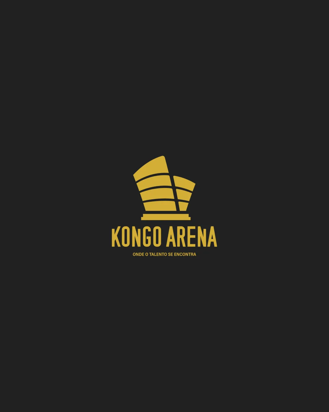
Try it Now!Logo review of KONGO ARENA, ONDE O TALENTO SE ENCONTRA
 Logo analysis by AI
Logo type:
Style:
Detected symbol:
Detected text:
Business industry:
Review requested by Abraaobelitosmc
**If AI can recognize or misinterpret it, so can people.
Structured logo review
Legibility
![]() Main text 'KONGO ARENA' is highly readable with excellent contrast against dark background.
Main text 'KONGO ARENA' is highly readable with excellent contrast against dark background.![]() Typeface is bold, sans-serif, and straightforward.
Typeface is bold, sans-serif, and straightforward.
![]() Tagline 'ONDE O TALENTO SE ENCONTRA' is significantly smaller and may become illegible at smaller sizes or from a distance.
Tagline 'ONDE O TALENTO SE ENCONTRA' is significantly smaller and may become illegible at smaller sizes or from a distance.
Scalability versatility
![]() Bold mark and large text ensure good scaling for signage, posters, and digital displays.
Bold mark and large text ensure good scaling for signage, posters, and digital displays.![]() Simple color palette works for monochrome versions.
Simple color palette works for monochrome versions.
![]() Small tagline will be lost on small applications such as business cards or favicons.
Small tagline will be lost on small applications such as business cards or favicons.![]() Symbol’s thin interior divisions may be hard to reproduce on embroidery or very small media.
Symbol’s thin interior divisions may be hard to reproduce on embroidery or very small media.
200x250 px
100×125 px
50×62 px
Balance alignment
![]() Symbol is well-centered above the wordmark, providing a strong visual anchor.
Symbol is well-centered above the wordmark, providing a strong visual anchor.![]() Text is aligned for clear hierarchy.
Text is aligned for clear hierarchy.
![]() Slight imbalance in the weight of the building mark versus the boldness of the main text—symbol could be slightly heavier to match.
Slight imbalance in the weight of the building mark versus the boldness of the main text—symbol could be slightly heavier to match.

Originality
![]() Abstract architectural shape is industry-appropriate and not a direct copy of generic arena icons.
Abstract architectural shape is industry-appropriate and not a direct copy of generic arena icons.
![]() Use of an arena/building shape is common in event/entertainment branding and lacks a unique visual twist.
Use of an arena/building shape is common in event/entertainment branding and lacks a unique visual twist.
Logomark wordmark fit
![]() Geometric style of the mark pairs well with the blocky, sans-serif text.
Geometric style of the mark pairs well with the blocky, sans-serif text.![]() Both elements feel contemporary.
Both elements feel contemporary.
![]() Slight mismatch where the symbol’s curves contrast sharply with the angular letterforms—could be softened for even greater cohesion.
Slight mismatch where the symbol’s curves contrast sharply with the angular letterforms—could be softened for even greater cohesion.
Aesthetic look
![]() Clean, modern, and minimal aesthetic with strong visual appeal.
Clean, modern, and minimal aesthetic with strong visual appeal.![]() Color contrast is impactful.
Color contrast is impactful.
![]() Lacks a distinctive flair or memorable element to set it apart from similar arena/event logos.
Lacks a distinctive flair or memorable element to set it apart from similar arena/event logos.
Dual meaning and misinterpretations
![]() No inappropriate or ambiguous dual meanings detected.
No inappropriate or ambiguous dual meanings detected.
Color harmony
![]() Excellent two-color contrast; harmonious and consistent branding.
Excellent two-color contrast; harmonious and consistent branding.![]() Palette is appropriate and professional.
Palette is appropriate and professional.
Goldenrod
#F1C232
Eerie Black
#232323