 View review
Logo score
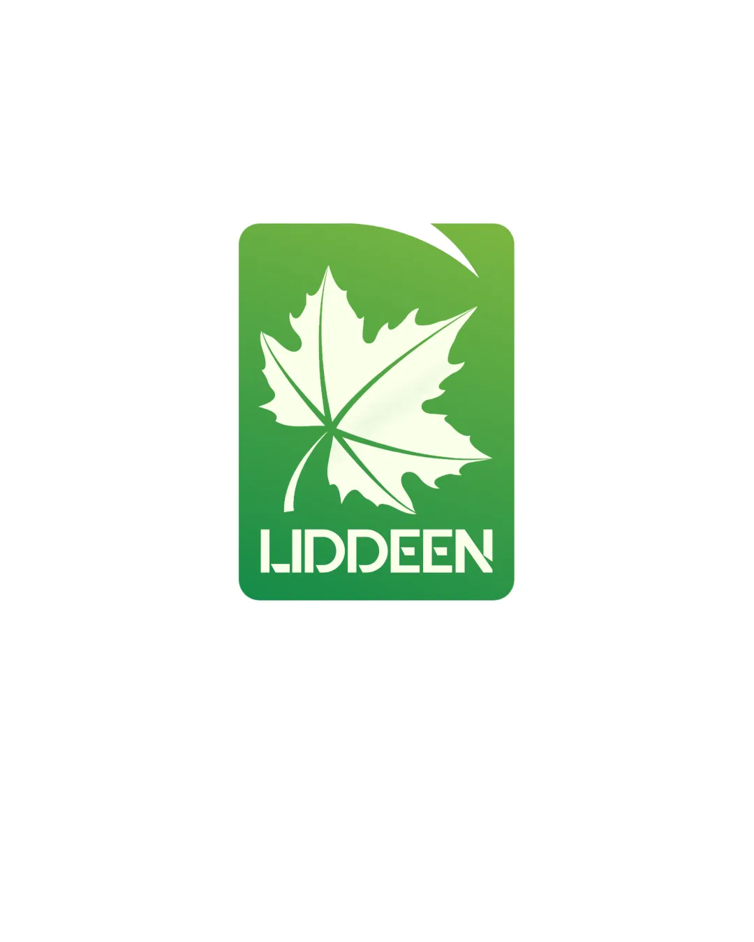
Logo review ofLiddeen
Originality is somewhat generic but safe for the industry; strong usability and no critical risks present.
Legibility
Originality
Misread
Balance
Scale
Action plan
What to fix first
The most important fixes to handle before polishing the full presentation.
1
Refine the wordmark for slightly improved instant readability, especially the double 'D' area.
Medium priorityCurrent font is stylish but could confuse at a glance, reducing practical legibility.
Impact: Medium · Effort: Medium
2
Test leaf detail at small sizes; consider simplifying outlines if detail is lost.
Low priorityEnsures versatility across all usage scales.
Impact: Low · Effort: Low
Detailed review
Logo performance breakdown
Legibility
 Text is bold, clear, and geometric
 Stylized font may reduce instant readability, especially with the double 'D'
Originality
Leaf usage is appropriate for organic/natural brands
Leaf-in-rectangle motif is somewhat generic
Color harmony
Green gradient is fresh and suits organic market
Apple
#6AC043
White
#FFFFFF
Pigment green
#399C3A
Balance alignment
Good vertical and horizontal balance between symbol and text Symmetrical composition

Scalability
Simple shapes and solid colors aid scalability
Thin lines in the leaf may lose detail at small sizes
200x250 px
100×125 px
50×62 px
Misinterpretations
No inappropriate or unintended visual readings detected
Logo structure & brief match
Wordmark is well integrated under the mark
Organic Food / Premium Branding: Leaf symbol and green palette directly reinforce organic/natural positioning; minimalist style gives a premium, clean impression.
Try your own review
Review my logo
Wondering how your logo performs?
Get a clear logo score, key risks, and priority fix ideas before your client or audience sees it.
Keep exploring