Concept & direction
Shattered glass effects on the bold initials and plus sign reinforce the auto glass repair/replacement theme directly and recognizably.
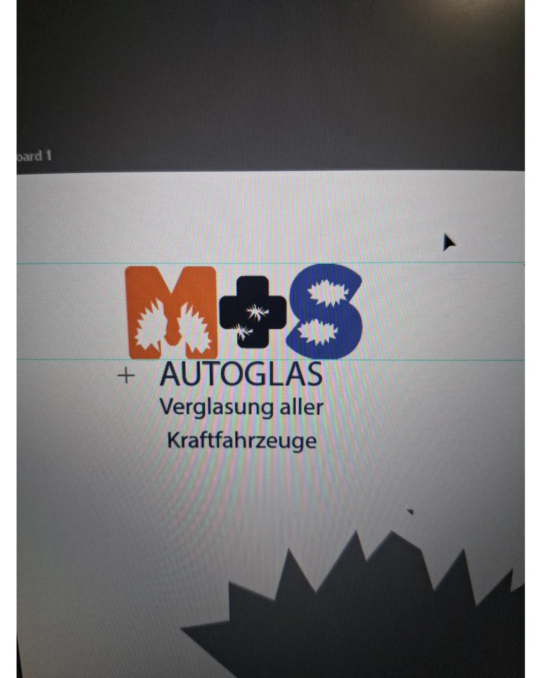
A functional, category-appropriate logo with a clear concept, but uneven balance and a divided style between symbol and wordmark call for further unification and polish.
This logo lockup has a workable foundation; improving visual balance is the clearest next step.
Focus on the changes that matter. Keep what makes the logo work.
Shattered glass effects on the bold initials and plus sign reinforce the auto glass repair/replacement theme directly and recognizably.
initials row
The size and weight of 'M', '+', and 'S' vary significantly, causing a visual imbalance and disjointed alignment in the top row.
See the category reviewThe shattered glass motif directly identifies the auto glass repair field, but execution needs adjustment to present a unified, professional impression.
Wordmark 5/5 · Layout 4/5
Symbol 4/5 · Wordmark 4/5
Estimated colors. Use the original design file for exact values.
Create a full color palette using these colors
Create new paletteSymbol 3/5 · Wordmark 4/5 · Layout 3/5
Symbol 3/5 · Wordmark 2/5
Symbol 2/5 · Wordmark 3/5 · Layout 3/5
The size and weight of 'M', '+', and 'S' vary significantly, causing a visual imbalance and disjointed alignment in the top row.
Try: Refine the size and stroke weight of each character to achieve a more balanced, cohesive appearance.

Inspect spacing with the guide. Optical balance may differ from geometric centering.
The playful, impactful shattered-glass motif of the initials does not translate into the plain, modern sans-serif type used for AUTOGLAS and supporting text, creating a stylistic disconnect.
Get a clear logo score, key risks, and priority fix ideas before your client or audience sees it.
More credits needed
Add credits to continue without losing your work.
Then $7/month. Cancel anytime.
Essential logo review with AI
Estimated progress