 View review
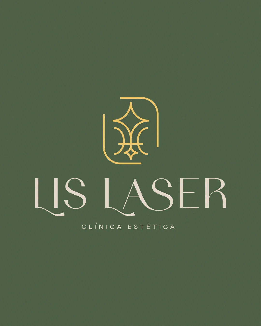
Logo score
Logo review ofLis Laser Clínica Estética
Review the detailed scores below to see what is working and what should be refined first.
Legibility
Originality
Misread
Balance
Scale
Detailed review
Logo performance breakdown
Legibility
 High contrast between text and background Unique typeface adds character and brand personality Main clinic name is clearly readable
 Decorative swashes and thin strokes may reduce clarity at small sizes Accent on 'É' in 'ESTÉTICA' could become illegible when scaled down
Originality
Geometric symbol is custom and feels unique to the brand Custom typography with elegant flourishes adds distinctiveness
Floral/starburst motifs are somewhat common in wellness and beauty industries
Color harmony
Soft, harmonious palette with excellent contrast Two-tone approach is non-distracting and elegant
Grayish Olive
#46583C
Gold
#EDCB7F
White
#FFFFFF
Balance alignment
Symmetrical symbol is visually balanced Wordmark is evenly spaced
Visual hierarchy may be disturbed by the gap between symbol and text The decorative swash under 'LIS LASER' is not mirrored, slightly disrupting harmony

Scalability
Symbol is minimal and will retain clarity at smaller sizes Logo works well on print and digital media
Thin lines and intricate details in symbol and wordmark may not perform well on very small items like favicons or embroidery Text styling may require simplification for applications like small promotional products
200x250 px
100×125 px
50×62 px
Misinterpretations
No inappropriate or misleading visual references detected
Symbol & text fit
Both elements share a refined, elegant aesthetic
Line weight of the symbol complements the wordmark's thin, delicate letterforms
Symbol could integrate slightly better with the wordmark by reducing vertical spacing or aligning horizontal accents
Try your own review
Review my logo
Wondering how your logo performs?
Get a clear logo score, key risks, and priority fix ideas before your client or audience sees it.
Keep exploring