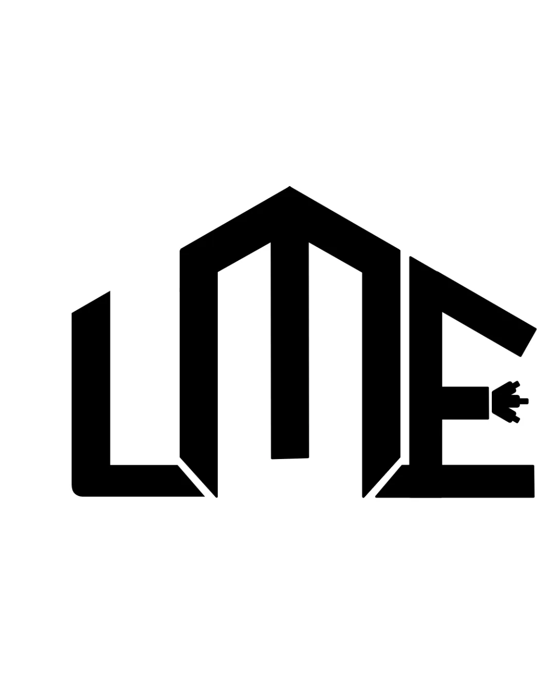
letter 'LME'
Consider subtly refining letter differentiation—especially in the 'L'—to improve instant readability while maintaining the geometric style.
Logo preview unavailable. The written feedback is still available on this card.
The angular styling of the 'L' and 'M' may cause brief hesitation in reading the initials, especially with the joined geometric roof line.
How to check
See the category review Show the logo at a small size and ask viewers to read the initials aloud quickly.