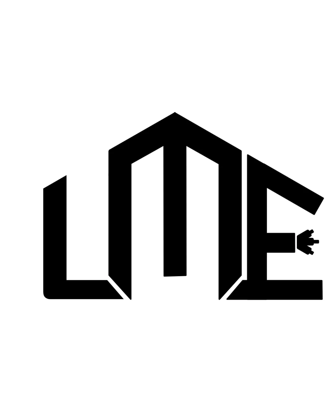
LME logo review
3/5
Logo score
Logo review of

Lme

A bold, conceptually strong lettermark that needs minor adjustments for clarity and small-size usability.

Lettermark Geometric, Modern, Bold Electrical Or Technology
3/5
Legibility
4/5
Originality
5/5
Misread
3/5
Balance
3/5
Scale
Your next steps

What to fix first

Focus on the changes that matter. Keep what makes the logo work.

1

letterform 'L'

Slightly differentiate the 'L' shape or its spacing from the 'M' to enhance clarity.

Visible issue High priority Low effort
Area to inspectApproximate location

The 'L' could be misread due to its unconventional angle and the similarity in style to the adjacent 'M'.

How to check

Ask several people unfamiliar with the brand to quickly read the monogram.

See the category review
2

plug detail at end of 'E'

Test logo at small sizes to verify plug legibility or consider a simplified plug form.

Worth testing Medium priority Low effort
Area to inspectApproximate location

The plug shape contains small details which may be lost or appear cluttered at smaller sizes.

How to check

Print or scale down the logo to common icon sizes to verify plug remains recognizable.

See the category review
Detailed review

Logo performance breakdown

4/5

Brief & logo match

Based on an inferred industry
Compared with

electrical or energy-related business, inferred from the plug symbol and angular mark style.

Effectively communicates an electrical/energy focus with a memorable graphic identity.

  • Electrical/energy Reference

    The plug icon strongly links the design to electrical or energy services, ensuring instant relevance for that industry.

  • Distinct Brand Identity

    Architectural angularity and plug detail create a logo that will stand out among generic wordmarks in this space.

3/5

Legibility

  • Word is mostly readable once noticed
  • Distinctive angles create a memorable mark
  • The 'L' could be misread due to its unconventional angle and the similarity in style to the adjacent 'M'.

    Visible issue letterform 'L'

    Try: Slightly differentiate the 'L' shape or its spacing from the 'M' to enhance clarity.

    Check: Ask several people unfamiliar with the brand to quickly read the monogram.
    Area to inspectApproximate location
4/5

Originality

  • Plug integration is distinctive for segment
  • Unique angular construction stands out
3/5

Balance alignment

  • Unified style across letters
  • Bold silhouette is visually arresting
  • The horizontal baseline appears uneven due to the angled line on the 'L' and the offset plug, which may affect overall stability.

    Optional refinement overall monogram alignment

    Try: Refine the monogram alignment for a more unified baseline or more consistent optical weight distribution.

    Check: Check the logo against a baseline grid and review the visual weight at a glance.

Uploaded logoAlignment guide overlay

Inspect spacing with the guide. Optical balance may differ from geometric centering.

3/5

Scalability

  • Bold letter shapes survive reduction
  • Single color ensures broad adaptability
  • The plug shape contains small details which may be lost or appear cluttered at smaller sizes.

    Worth testing plug detail at end of 'E'

    Try: Test logo at small sizes to verify plug legibility or consider a simplified plug form.

    Check: Print or scale down the logo to common icon sizes to verify plug remains recognizable.

    Area to inspectApproximate location
Uploaded logo at 200 pixels wide
200 × 250 px
Uploaded logo at 100 pixels wide
100 × 125 px
Uploaded logo at 50 pixels wide
50 × 63 px

Compare the detail at different sizes. Labels show the full image dimensions.

5/5

Misinterpretations

  • No evident unintended readings

Black & white

Does the shape still work without color?

These tests are available only for logos uploaded in vector (SVG) format.

Background contrast

Find the surfaces where your logo stays clear.

These tests are available only for logos uploaded in vector (SVG) format.

Blur & silhouette

A 3px blur softens fine details so you can check whether the overall shape stays recognizable. If key gaps close or elements merge, the logo may rely too heavily on detail.

These tests are available only for logos uploaded in vector (SVG) format.

Try your own review

Wondering how your logo performs?

Get a clear logo score, key risks, and priority fix ideas before your client or audience sees it.

Review my logo