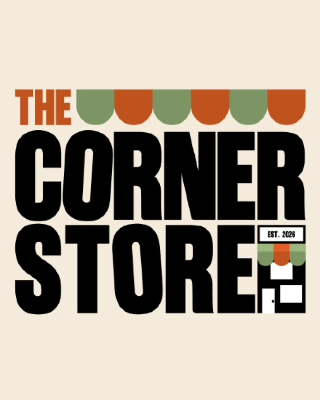
THE CORNER STORE EST. 2026 logo review
4/5
Logo score
Logo review of

The Corner Store Est. 2026

A strong, friendly retail logo with playful details, needing small-size clarity adjustment for best use.

Combination Retro Bold Combination Mark Retail
4/5
Legibility
4/5
Originality
5/5
Misread
4/5
Balance
3/5
Scale
Your next steps

What to fix first

Focus on the changes that matter. Keep what makes the logo work.

1

miniature 'EST. 2026' / storefront block

Test and optimize for small-scale clarity or provide a simplified variant for tiny uses.

Optional refinement High priority Medium effort
Area to inspectApproximate location

The small 'EST. 2026' and storefront icon may become hard to read or recognize at very small sizes.

How to check

Test logo at favicon and social avatar sizes.

See the category review
2

overall wordmark stack

Slightly increase spacing or adjust the mark size to improve balance.

Optional refinement Medium priority Low effort

The lower right detail visually crowds the 'E' in 'STORE', disrupting some optical balance in the lower corner.

How to check

Review the gap between mark and 'E' for improved balance.

See the category review
Detailed review

Logo performance breakdown

4/5

Brief & logo match

Based on an inferred industry
Compared with

Retail/convenience store brand; informal, locally-oriented business likely targeting a broad audience.

The design visually supports a 'corner store' retail identity with strong theme alignment and minor usability risks.

  • Retail/store Theme

    Awning and storefront icon instantly convey a local shop, matching a 'corner store' business.

  • Memorable Identity

    Bold typography and the playful awning treatment create a friendly and recognizable identity.

4/5

Legibility

  • Bold uppercase text is highly readable
  • The small 'EST. 2026' and storefront icon may become hard to read or recognize at very small sizes.

    Optional refinement miniature 'EST. 2026' / storefront block

    Try: Test and optimize for small-scale clarity or provide a simplified variant for tiny uses.

    Check: Test logo at favicon and social avatar sizes.
    Area to inspectApproximate location
4/5

Originality

  • Awning and storefront details add personality
  • Retro type and arrangement have unique character
4/5

Color harmony

  • Earthy orange, green, and black work well together
Orange#C54B1F
Olive#97A575
Black#1A1917
Beige#ECE2D0

Estimated colors. Use the original design file for exact values.

Create a full color palette using these colors

Create new palette
4/5

Balance alignment

  • Awning creates a cohesive header effect
  • The lower right detail visually crowds the 'E' in 'STORE', disrupting some optical balance in the lower corner.

    Optional refinement overall wordmark stack

    Try: Slightly increase spacing or adjust the mark size to improve balance.

    Check: Review the gap between mark and 'E' for improved balance.

Uploaded logoAlignment guide overlay

Inspect spacing with the guide. Optical balance may differ from geometric centering.

3/5

Scalability

  • Strong presence at moderate sizes
  • Awning shapes and the miniature storefront may lose distinctiveness in single-color or low-resolution reproduction.

    Worth testing awning motif and storefront icon

    Try: Test for clarity and visual identity in monotone or pixel-limited settings.

    Check: Render at small size and in black and white for logo legibility.

Uploaded logo at 200 pixels wide
200 × 250 px
Uploaded logo at 100 pixels wide
100 × 125 px
Uploaded logo at 50 pixels wide
50 × 63 px

Compare the detail at different sizes. Labels show the full image dimensions.

5/5

Misinterpretations

  • No plausible unwanted readings in the mark
4/5

Symbol & text fit

  • Storefront icon, awning, and wordmark are conceptually integrated

Black & white

Does the shape still work without color?

These tests are available only for logos uploaded in vector (SVG) format.

Background contrast

Find the surfaces where your logo stays clear.

These tests are available only for logos uploaded in vector (SVG) format.

Blur & silhouette

A 3px blur softens fine details so you can check whether the overall shape stays recognizable. If key gaps close or elements merge, the logo may rely too heavily on detail.

These tests are available only for logos uploaded in vector (SVG) format.

Try your own review

Wondering how your logo performs?

Get a clear logo score, key risks, and priority fix ideas before your client or audience sees it.

Review my logo