Wondering how your logo performs? 🧐
Get professional logo reviews in seconds and catch design issues in time.
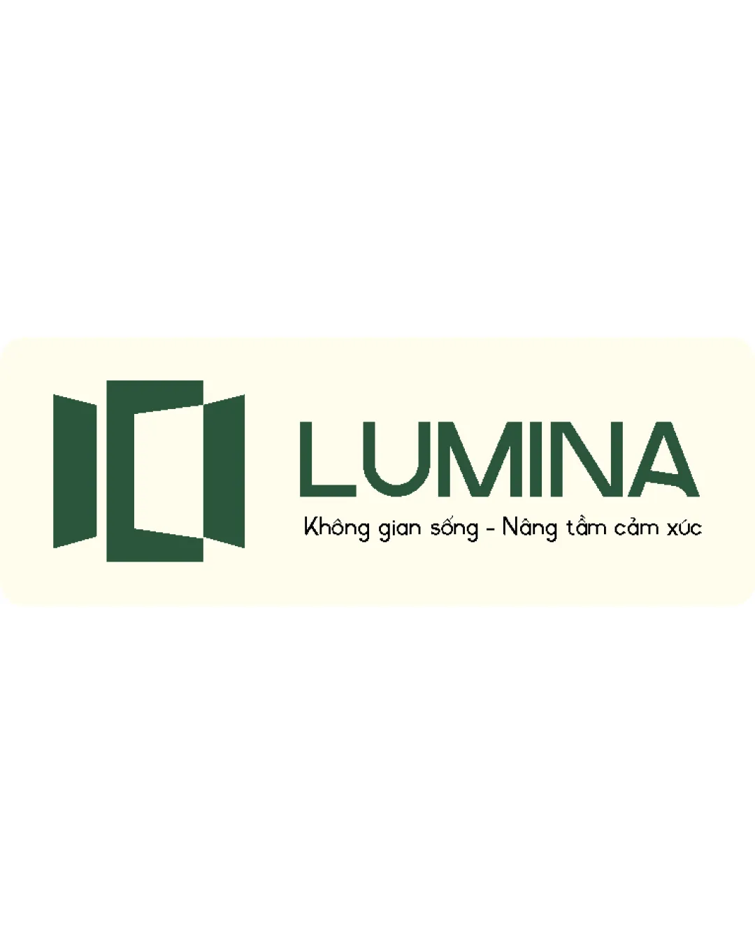
Try it Now!Logo review of LUMINA, Không gian sống - Nâng tầm cảm xú..
 Logo analysis by AI
Logo type:
Style:
Detected symbol:
Negative space:
Detected text:
Business industry:
Review requested by Proqua123
**If AI can recognize or misinterpret it, so can people.
Structured logo review
Legibility
![]() Primary wordmark 'LUMINA' is set in a clean, modern sans-serif, ensuring excellent readability.
Primary wordmark 'LUMINA' is set in a clean, modern sans-serif, ensuring excellent readability.![]() Tagline is legible in a smaller, simple font that maintains clarity.
Tagline is legible in a smaller, simple font that maintains clarity.
Scalability versatility
![]() Geometric logo mark will scale well for signage, business cards, and print collateral.
Geometric logo mark will scale well for signage, business cards, and print collateral.![]() Minimal detailing keeps the form recognizable at small sizes.
Minimal detailing keeps the form recognizable at small sizes.
![]() Thin lines in the tagline may be difficult to read when scaled down for small applications such as favicons or embroidery.
Thin lines in the tagline may be difficult to read when scaled down for small applications such as favicons or embroidery.![]() Complexity of the tagline makes the logo less versatile for applications requiring compact versions.
Complexity of the tagline makes the logo less versatile for applications requiring compact versions.
200x250 px
100×125 px
50×62 px
Balance alignment
![]() Symbol and wordmark are well-aligned on a horizontal axis, achieving visual stability.
Symbol and wordmark are well-aligned on a horizontal axis, achieving visual stability.![]() Proportions between icon and text are carefully set, neither overpowering the other.
Proportions between icon and text are carefully set, neither overpowering the other.

Originality
![]() Geometric door/window mark represents the brand concept without relying on overly generic motifs.
Geometric door/window mark represents the brand concept without relying on overly generic motifs.![]() Negative space usage adds conceptual depth.
Negative space usage adds conceptual depth.
![]() The open door/window form, while executed cleanly, is a somewhat common device in real estate branding.
The open door/window form, while executed cleanly, is a somewhat common device in real estate branding.
Logomark wordmark fit
![]() Visual weight and style of both mark and wordmark feel cohesive.
Visual weight and style of both mark and wordmark feel cohesive.![]() Color and style synchronization create a harmonious unit.
Color and style synchronization create a harmonious unit.
Aesthetic look
![]() Minimalist aesthetic with a fresh, modern vibe.
Minimalist aesthetic with a fresh, modern vibe.![]() Color palette is appealing and professional.
Color palette is appealing and professional.
![]() Symbol is slightly typical for the industry and could be mistaken for competitors without extra brand personality.
Symbol is slightly typical for the industry and could be mistaken for competitors without extra brand personality.
Dual meaning and misinterpretations
![]() No inappropriate or confusing dual meanings identified.
No inappropriate or confusing dual meanings identified.![]() Abstract door/window form is clear and relevant.
Abstract door/window form is clear and relevant.
Color harmony
![]() Only two dominant colors, which harmonize well and provide sufficient contrast.
Only two dominant colors, which harmonize well and provide sufficient contrast.![]() Friendly and elegant color selection suitable for the target industry.
Friendly and elegant color selection suitable for the target industry.
Evergreen
#395D46
Parchment
#FFFBE7