 View review
Logo score
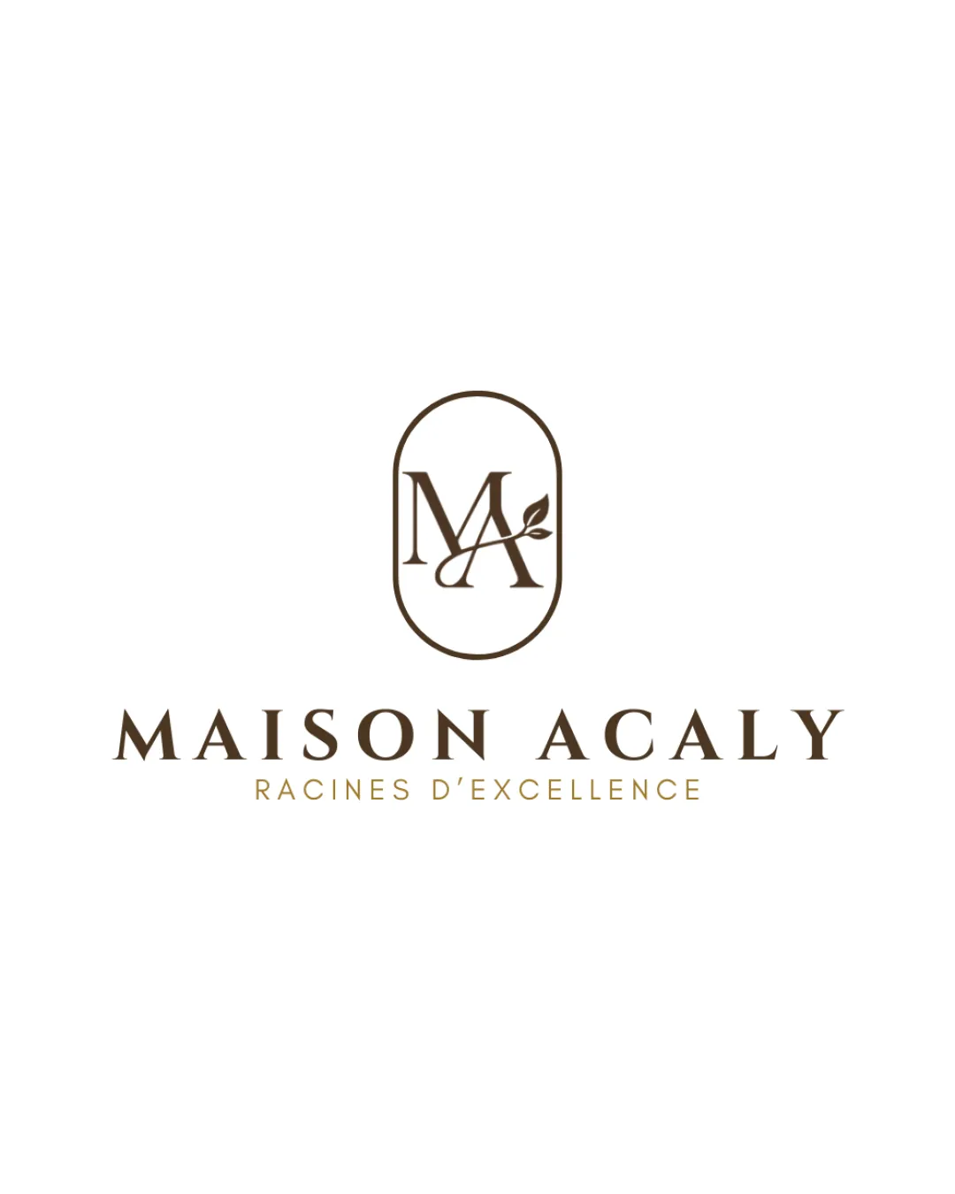
Logo review ofMaison Acaly, Racines D’excellence
Review the detailed scores below to see what is working and what should be refined first.
Legibility
Originality
Misread
Balance
Scale
Detailed review
Logo performance breakdown
Legibility
![]() All text is highly readable and clear
All text is highly readable and clear![]() Elegant serif type supports luxury positioning
Elegant serif type supports luxury positioning
Originality
![]() Custom monogram integration with a leaf gives a unique, elegant touch
Custom monogram integration with a leaf gives a unique, elegant touch![]() Oval encasing adds differentiation
Oval encasing adds differentiation
![]() Serif monogram within an oval is somewhat common among luxury brands; not entirely distinctive
Serif monogram within an oval is somewhat common among luxury brands; not entirely distinctive
Color harmony
![]() Muted brown and white palette is elegant, professional, and harmonious
Muted brown and white palette is elegant, professional, and harmonious![]() Limited color choices maintain brand sophistication
Limited color choices maintain brand sophistication
Deep Brown
#4D3C2B
White
#FFFFFF
Balance alignment
![]() Perfect vertical and horizontal centering between monogram, wordmark, and tagline
Perfect vertical and horizontal centering between monogram, wordmark, and tagline![]() Oval frame and equal spacing provide a stable, balanced feel
Oval frame and equal spacing provide a stable, balanced feel

Scalability
![]() Simple lines and balanced spacing ensure clarity from large to small applications
Simple lines and balanced spacing ensure clarity from large to small applications![]() Monogram can stand alone for small formats or icons
Monogram can stand alone for small formats or icons
![]() Tagline may lose legibility at very small scales, such as on business cards or smaller packaging
Tagline may lose legibility at very small scales, such as on business cards or smaller packaging
200x250 px
100×125 px
50×62 px
Misinterpretations
![]() No apparent negative or inappropriate dual meanings
No apparent negative or inappropriate dual meanings![]() Leaf motif is clear and relevant
Leaf motif is clear and relevant
Symbol & text fit
![]() Monogram style and serif wordmark are highly cohesive
Monogram style and serif wordmark are highly cohesive
![]() Consistent color, weight, and spacing create a unified look
Consistent color, weight, and spacing create a unified look
Try your own review
Review my logo
Wondering how your logo performs?
Get a clear logo score, key risks, and priority fix ideas before your client or audience sees it.
Keep exploring


