Wondering how your logo performs? 🧐
Get professional logo reviews in seconds and catch design issues in time.
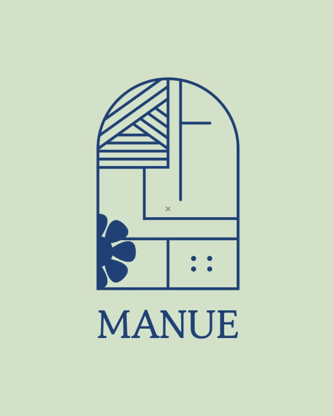
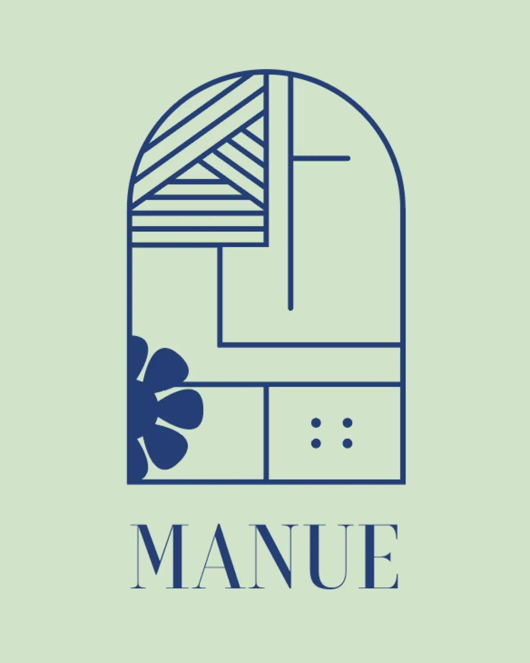
Try it Now!Logo review of MANUE
 Logo analysis by AI
Logo type:
Style:
Detected symbol:
Detected text:
Business industry:
Review requested by Wena
**If AI can recognize or misinterpret it, so can people.
Structured logo review
Legibility
![]() Text is set in a clear, elegant serif typeface.
Text is set in a clear, elegant serif typeface.![]() Letter spacing aids readability and visual balance.
Letter spacing aids readability and visual balance.
![]() The spacing between letterforms could be slightly tightened to further improve coherence.
The spacing between letterforms could be slightly tightened to further improve coherence.![]() Brand name could be overlooked at very small scales.
Brand name could be overlooked at very small scales.
Scalability versatility
![]() Simple lines and limited color palette support various print and digital uses.
Simple lines and limited color palette support various print and digital uses.![]() Icon-centric design could adapt to business cards and social collateral.
Icon-centric design could adapt to business cards and social collateral.
![]() Fine linework and small details (dots, geometric flower) may be lost at favicon size or on embroidery.
Fine linework and small details (dots, geometric flower) may be lost at favicon size or on embroidery.![]() Complex internal geometry may become cluttered when scaled down.
Complex internal geometry may become cluttered when scaled down.
200x250 px
100×125 px
50×62 px
Balance alignment
![]() Geometric layout feels organized and deliberate.
Geometric layout feels organized and deliberate.![]() Upper arch and horizontal baseline offer visual stability.
Upper arch and horizontal baseline offer visual stability.
![]() Lower-left flower motif introduces asymmetry.
Lower-left flower motif introduces asymmetry.![]() Grid lines and shapes disrupt overall central alignment.
Grid lines and shapes disrupt overall central alignment.

Originality
![]() Combination of abstract motifs and arched window concept is distinct.
Combination of abstract motifs and arched window concept is distinct.![]() Creative integration of geometric and organic elements.
Creative integration of geometric and organic elements.
![]() Geometric window/arch motif is somewhat trendy and not entirely unique.
Geometric window/arch motif is somewhat trendy and not entirely unique.![]() No exceptionally inventive use of negative space.
No exceptionally inventive use of negative space.
Logomark wordmark fit
![]() Serif typography harmonizes well with the modern, structured mark.
Serif typography harmonizes well with the modern, structured mark.![]() Both elements share a refined, minimal aesthetic.
Both elements share a refined, minimal aesthetic.
![]() Mark is significantly larger and more visually complex than the wordmark, slightly overshadowing it.
Mark is significantly larger and more visually complex than the wordmark, slightly overshadowing it.
Aesthetic look
![]() Minimal color usage creates a contemporary, elegant aesthetic.
Minimal color usage creates a contemporary, elegant aesthetic.![]() Grid and pattern approach is visually appealing.
Grid and pattern approach is visually appealing.
![]() Slight visual busy-ness due to multiple motifs in one icon.
Slight visual busy-ness due to multiple motifs in one icon.![]() Balance between organic (flower) and geometric shapes can feel slightly forced.
Balance between organic (flower) and geometric shapes can feel slightly forced.
Dual meaning and misinterpretations
![]() No inappropriate or misleading shapes detected.
No inappropriate or misleading shapes detected.
Color harmony
![]() Navy blue on pale mint green is visually harmonious and on-trend.
Navy blue on pale mint green is visually harmonious and on-trend.![]() Limited palette enhances elegance and modernity.
Limited palette enhances elegance and modernity.
Pickled Bluewood
#23304A
Chalk Mint
#E4F6E3