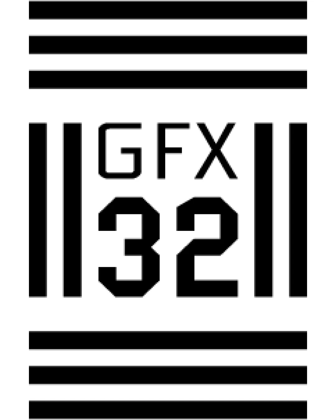
GFX 32 logo review
3.7 / 5
Logo score
Logo review of

Gfx 32

Review the detailed scores below to see what is working and what should be refined first.

Combination Mark Minimal, Geometric, Monospaced, Bold Graphic Design
4/5
Legibility
3/5
Originality
5/5
Misread
3/5
Balance
3/5
Scale
Detailed review

Logo performance breakdown

4/5

Legibility

Checkmark icon Text is readable and clear, especially the numeric portion
Checkmark icon Good contrast between text and background

Warning icon The stylistic integration of lines could slightly disrupt quick readability of 'GFX' for some viewers
3/5

Originality

Checkmark icon Barcode-like motif is a fresh take for a text-and-number logo
Checkmark icon Geometric styling adds a unique edge

Warning icon Barcode/striped motif is somewhat common in apparel and graphic identities
Warning icon Doesn’t offer a distinct symbol or unique twist that would be memorable across industries

5/5

Color harmony

Checkmark icon Strict black-and-white palette is versatile and provides strong, clean contrast
Checkmark icon No excessive or clashing colors used

Black
#000000

White
#FFFFFF

3/5

Balance alignment

Checkmark icon Central alignment is visually present; text and numbers are evenly distributed
Checkmark icon Symmetrical structure

Warning icon Heavy top and bottom bars make the visual weight feel top- and bottom-heavy
Warning icon Middle lines may visually crowd the composition, reducing breathing space

logo 200x250 pixels scalability test alignment grid overlay
3/5

Scalability

Checkmark icon Simple geometric shapes ensure some clarity at reduced sizes
Checkmark icon Effective for digital use, posters, or packaging

Warning icon Thin lines may disappear or blur at very small sizes (like favicons or embroidery)
Warning icon May lose strong visual impact when downsized considerably

logo 200x250 pixels scalability test

200x250 px

logo 100x125 pixels scalability test

100×125 px

logo 50x62 pixels scalability test

50×62 px

5/5

Misinterpretations

Checkmark icon No inappropriate or confusing imagery detected
Checkmark icon Abstract motif stays clear of accidental double meanings

Try your own review

Wondering how your logo performs?

Get a clear logo score, key risks, and priority fix ideas before your client or audience sees it.

Review my logo