Wondering how your logo performs? 🧐
Get professional logo reviews in seconds and catch design issues in time.
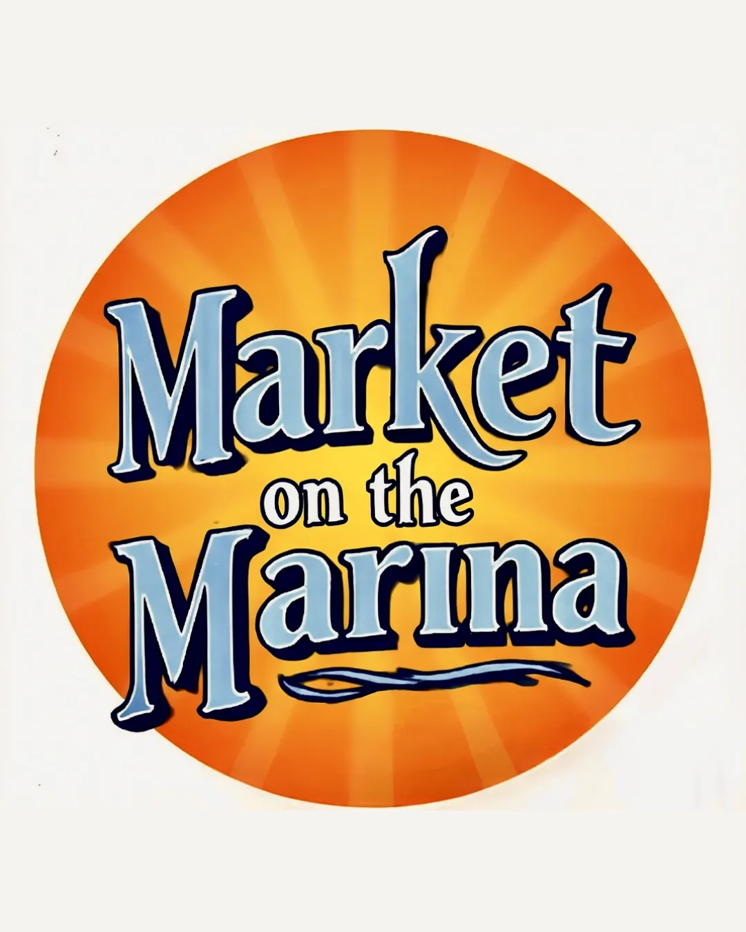
Try it Now!Logo review of Market on the Marina
 Logo analysis by AI
Logo type:
Style:
Detected symbol:
Detected text:
Business industry:
Review requested by Drive2231
**If AI can recognize or misinterpret it, so can people.
Structured logo review
Legibility
![]() Text is bold, readable, and well-contrasted against the orange background.
Text is bold, readable, and well-contrasted against the orange background.![]() Font size and spacing make the main words easy to distinguish.
Font size and spacing make the main words easy to distinguish.
![]() The shadow/outline around the text creates slight visual noise and reduces sharpness.
The shadow/outline around the text creates slight visual noise and reduces sharpness.![]() The playful ligatures and wave underline could distract at small sizes.
The playful ligatures and wave underline could distract at small sizes.
Scalability versatility
![]() Clear and impactful at large sizes such as banners, posters, or signage.
Clear and impactful at large sizes such as banners, posters, or signage.
![]() Excessive detail and text make it hard to scale down to small applications like social media icons, business cards, or embroidery.
Excessive detail and text make it hard to scale down to small applications like social media icons, business cards, or embroidery.![]() Sunburst gradient may not reproduce well in one color or low-res print schemes.
Sunburst gradient may not reproduce well in one color or low-res print schemes.![]() Wavy underline loses purpose at small sizes.
Wavy underline loses purpose at small sizes.
200x250 px
100×125 px
50×62 px
Balance alignment
![]() Typical central alignment creates visual focus.
Typical central alignment creates visual focus.![]() Weight is distributed around the circle motif.
Weight is distributed around the circle motif.
![]() 'Market' and 'Marina' are much larger than 'on the', causing some imbalance.
'Market' and 'Marina' are much larger than 'on the', causing some imbalance.![]() The wavy line at the bottom feels tacked on and doesn't align with the text flow.
The wavy line at the bottom feels tacked on and doesn't align with the text flow.![]() Size hierarchy between 'Market' and 'Marina' feels awkward rather than intentionally structured.
Size hierarchy between 'Market' and 'Marina' feels awkward rather than intentionally structured.

Originality
![]() Combination of a sunburst backdrop and playful typography gives some personality.
Combination of a sunburst backdrop and playful typography gives some personality.![]() Wavy underline nods to the marina/sea theme.
Wavy underline nods to the marina/sea theme.
![]() Sunburst backgrounds and wave elements are commonly used in local retail and farmers' market branding, giving a generic vibe.
Sunburst backgrounds and wave elements are commonly used in local retail and farmers' market branding, giving a generic vibe.![]() Typography lacks a custom or highly distinctive touch; could easily be replicated.
Typography lacks a custom or highly distinctive touch; could easily be replicated.
Aesthetic look
![]() Vivid color palette is bold and inviting.
Vivid color palette is bold and inviting.![]() Circular composition draws focus.
Circular composition draws focus.
![]() Sunburst background and shadowed text create a cluttered look.
Sunburst background and shadowed text create a cluttered look.![]() Many visual tricks (outlines, gradients, waves) feel visually busy and somewhat dated.
Many visual tricks (outlines, gradients, waves) feel visually busy and somewhat dated.![]() Aesthetic lacks modern minimalism or cohesion.
Aesthetic lacks modern minimalism or cohesion.
Dual meaning and misinterpretations
![]() No accidental inappropriate imagery or associations.
No accidental inappropriate imagery or associations.
Color harmony
![]() Color theme suits a friendly, vibrant market environment.
Color theme suits a friendly, vibrant market environment.![]() Contrast between orange and blue adds energy.
Contrast between orange and blue adds energy.
![]() Too many color treatments (gradients, outlines, multiple blues) introduce visual clutter.
Too many color treatments (gradients, outlines, multiple blues) introduce visual clutter.![]() White text on bright orange can cause some legibility issues at a distance or small scale.
White text on bright orange can cause some legibility issues at a distance or small scale.
Orange
#FF931E
White
#FFFFFF
Dark Blue
#1B2B36
Light Blue
#A9D2EA