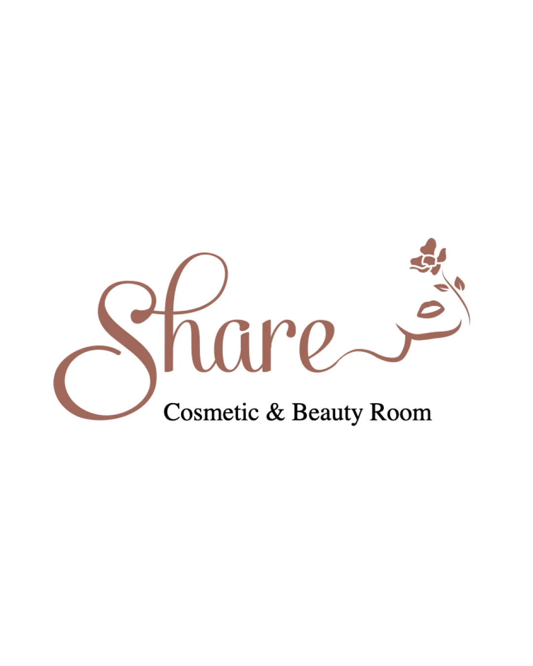
Share Cosmetic & Beauty Room logo review
3.5 / 5
Logo score
Logo review of

Share Cosmetic & Beauty Room

Solid industry fit with elegant tone, but refinement needed to ensure readability and usage versatility, especially at small sizes.

Combination Mark Elegant Script With Floral Accent Beauty
3.5/5
Legibility
3/5
Originality
5/5
Misread
3.5/5
Balance
3/5
Scale
Action plan

What to fix first

The most important fixes to handle before polishing the full presentation.

1

Reduce complexity of the script flourish and floral detail to improve scalability and legibility at smaller sizes.

High priority

The current intricate flourish and thin lines risk loss of detail and legibility at small scales.

Impact: Improves Visibility, Flexibility, And Usability Across Applications. · Effort: Medium

2

Slightly adjust spatial balance by either shortening the horizontal flourish or enhancing the left-to-right weight balance.

Medium priority

Balance feels slightly stretched due to the wide script and distant flower.

Impact: Enhances Visual Harmony And Professional Polish. · Effort: Low

Detailed review

Logo performance breakdown

3.5/5

Legibility

Checkmark icon Main brand name 'Share' is readable after close inspection.
Checkmark icon Descriptor text is clear due to simpler typeface.

Warning icon Large script 'S' and flourish may cause initial legibility issue, especially at small sizes.
Warning icon Flourish integrating with rose may distract from reading flow.

3/5

Originality

Checkmark icon Script with integrated floral accent provides some personality.

Warning icon Floral integration with script is a common trope in beauty logos.

4/5

Color harmony

Checkmark icon Single, elegant copper rose color is fitting for beauty industry.
Checkmark icon Contrast with black descriptor maintains clarity.

Warning icon Limited palette limits adaptation for different themes, but not a major issue.

Copper Rose
#9D6B5F

Black
#000000

Your palette is close. Refine the color roles and combinations before updating the logo.

Build brand colors
3.5/5

Balance alignment

Checkmark icon Vertical spacing between name and descriptor is consistent.
Checkmark icon Floral symbol is aligned to right, balancing wide script.

Warning icon Long horizontal flourish causes right-heavy visual weight.
Warning icon Visual balance slightly skewed by dense left (S) and right (flower) areas.

logo 200x250 pixels scalability test alignment grid overlay
3/5

Scalability

Checkmark icon Floral mark is visually distinctive.
Checkmark icon Wordmark uses color with sufficient contrast.

Warning icon Thin script lines and floral detail risk loss at small sizes.
Warning icon Elaborate flourish does not translate well to monochrome usages.

logo 200x250 pixels scalability test

200x250 px

logo 100x125 pixels scalability test

100×125 px

logo 50x62 pixels scalability test

50×62 px

5/5

Misinterpretations

Checkmark icon No apparent inappropriate or confusing secondary readings.

4 / 5

Logo structure & brief match

Checkmark icon Floral mark grows directly from signature flourish, showing conceptual connection.

Warning icon Slight risk the flourish is seen more as a line than a unique symbol.

Checkmark icon Industry: Elegant script lettering with floral accent is well-suited to a cosmetic & beauty brand.

Try your own review

Wondering how your logo performs?

Get a clear logo score, key risks, and priority fix ideas before your client or audience sees it.

Review my logo