MAVÉ RITUALS logo review
4/5
Logo score
Logo review of

Mavé Rituals

Well-crafted, especially with legibility, but further differentiation is recommended before final rollout.

Combination Mark Modern Botanical, Elegant Serif Wellness
5/5
Legibility
3.5/5
Originality
5/5
Misread
4/5
Balance
4/5
Scale
Your next steps

What to fix first

Focus on the changes that matter. Keep what makes the logo work.

1

Refine the top-heavy logomark balance for better proportional fit with the wordmark

High priority Medium effort

Top-weighted mark can distract from wordmark and reduce polish.

Improves visual cohesion and professional finish
2

Prepare logo variants for dark and colored backgrounds

Medium priority Low effort

Green on white is strong, but inverse may be needed for packaging, web and social uses.

Ensures consistency and visibility across all brand applications

3

Add a more distinctive twist to the 'M' symbol

Medium priority Medium effort

Botanical overlays on letters are widespread; a unique element or composition could better stand out.

Improves memorability and reduces template risk for the category

Detailed review

Logo performance breakdown

Not scored

Brief & logo match

From the original review
  • Botanical/natural Theme

    Effective use of green, leaves, and clean serif evokes botanical and wellness cues

  • Luxury Or Premium Positioning

    Serif font and clean composition contribute to premium appearance

5/5

Legibility

  • All text is sharp and highly legible, even at small sizes
  • Good typeface selection
3.5/5

Originality

  • Leaf integration with letterform adds some distinction to the 'M'
  • Botanical lettermarks are common in wellness; nothing groundbreaking in core concept
4.5/5

Color harmony

  • Monochrome green palette evokes nature and wellness
  • White background ensures strong contrast
  • Palette lacks versatility for dark backgrounds unless inverted
Green#226B2B
White#FFFFFF

Estimated colors. Use the original design file for exact values.

Create a full color palette using these colors

Create new palette

4/5

Balance alignment

  • Good vertical and horizontal centering between logomark and wordmark
  • Text weights and mark weight are harmonious
  • Logomark feels heavier at top compared to wordmark; could use subtle reduction or spacing refinement
Uploaded logoAlignment guide overlay

Inspect spacing with the guide. Optical balance may differ from geometric centering.

4/5

Scalability

  • Main forms and leaf details maintain integrity at small sizes
  • Very fine details on starbursts and leaf points might slightly blur when extremely scaled down
Uploaded logo at 200 pixels wide
200 × 250 px
Uploaded logo at 100 pixels wide
100 × 125 px
Uploaded logo at 50 pixels wide
50 × 63 px

Compare the detail at different sizes. Labels show the full image dimensions.

5/5

Misinterpretations

  • No negative or confusing hidden shapes
4/5

Symbol & text fit

  • Consistent stroke weights and color unify mark and wordmark
  • Slight disconnect in style between highly decorative logomark and understated wordmark

Black & white

Does the shape still work without color?

These tests are available only for logos uploaded in vector (SVG) format.

Background contrast

Find the surfaces where your logo stays clear.

These tests are available only for logos uploaded in vector (SVG) format.

Blur & silhouette

A 3px blur softens fine details so you can check whether the overall shape stays recognizable. If key gaps close or elements merge, the logo may rely too heavily on detail.

These tests are available only for logos uploaded in vector (SVG) format.

3/5
Market fit

Category positioning

Functional but not highly differentiated.

The logo aligns well with category conventions but resembles many existing wellness/rituals brands with serif and botanical motifs.

1
Category Fit
Good fit

Uses familiar botanical cues and serif type tied to wellness and natural goods.

Audience will immediately recognize sector.

2
Differentiation Risk
Some overlap

Leafy monogram is attractive but common; could blend with competitors.

Limited memorability if not paired with other distinct branding elements.

3
Market Signal
Mixed signal

Premium and trustworthy, but does not surprise or innovate for the space.

Missed opportunity for stand-out brand recall.

How to stand out more
  • Explore a signature detail in the monogram or stars for stronger recall.
  • Test color tweaks to help separate from saturated green palettes.
From design file to real use

Use-case readiness

How the logo may work in practice, and what to check before production.

Web and digital platforms

Looks suitable

Good legibility and contrast for screens.

Packaging (labels, boxes)

Looks suitable

Logo and wordmark are crisp for print.

Embroidery or small merchandise

Adjust first

Fine details in the leaf/star areas may fill in when stitched small.

Social media avatar

Looks suitable

The 'M' monogram works well as a square icon.

Signage or storefronts

Adjust first

Might need thicker lines for high visibility at a distance.

Delivery checklist

Logo suite verification

A practical checklist of the logo versions to prepare before sending the final files to a client or team.

Detected in this upload

Already included

Visible

Primary lockup (mark and wordmark stacked)

Core version is present and well-composed.

Before delivery

Versions to remember

1

Monogram/logo mark only (for icons, favicons)

High priority Recommended

Monogram is distinct and useful for small spaces.

2

Horizontal lockup (mark and wordmark in a row)

Medium priority Recommended

More flexible for website headers and invoices.

3

Single-color/inverse version

High priority Recommended

Ensures seamless application on dark backgrounds.

4

Clear space and sizing guide

Medium priority Optional

Provides usage clarity for third-party vendors.

Presentation kit

Finalize and present this logo

Primary lockup

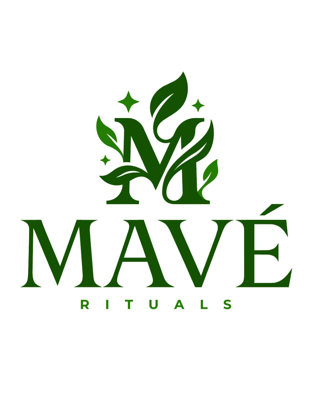
A leafy monogram 'M' featuring decorative leaves and sparkles sits above the elegant serif wordmark 'MAVÉ RITUALS', delivering a balanced, premium identity.

Wordmark

'MAVÉ RITUALS' in a stately serif font, lending credibility and sophistication.

Monogram/Logomark

A stylized 'M' entwined with green leaves and subtle star accents, symbolizing natural origins and wellness rituals.

Color palette

Monochrome deep green for a fresh, nature-inspired feel on a crisp white background.

Positioning statement

This logo blends botanical symbolism with an elegant serif wordmark, expressing both natural wellness and premium quality.

Design rationale

Leafy embellishments on the 'M' emphasize natural ingredients and rituals.

Classic serif typography elevates the brand to a premium, trustworthy space.

Tips for the logo presentation

Mockup ideas
  • Cosmetic jar and dropper bottle packaging with the green logo on white and tan backgrounds.
  • Instagram profile avatar using the leafy 'M'.
  • Retail box sleeve with logo in reversed white-on-green.
Possible objections
  • The logo might resemble other wellness or botanical brands.
  • Will it be distinct enough on crowded shelves?
Presentation tips
  • Present side-by-side comparisons with leading competitors.
  • Show in-use with packaging and social icon mockups to demonstrate visual impact.
Try your own review

Wondering how your logo performs?

Get a clear logo score, key risks, and priority fix ideas before your client or audience sees it.

Review my logo