MEATBALL JOY logo review
4/5
Logo score
Logo review of

Meatball Joy

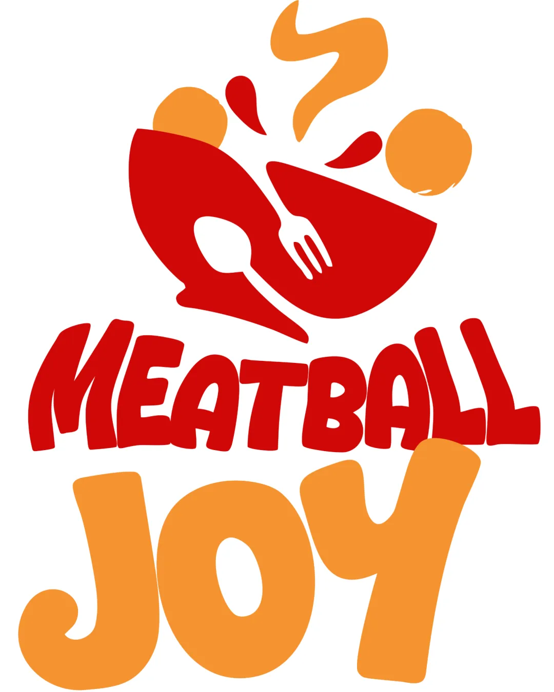
A strong, playful logo with clear food cues; minor refinement will further improve impact and everyday legibility.

Combination Mark Playful, Bold, Illustrative Food & Beverage
3/5
Legibility
4/5
Originality
5/5
Misread
3/5
Balance
4/5
Scale
Your next steps

What to fix first

Focus on the changes that matter. Keep what makes the logo work.

1

wordmark 'JOY'

Slightly refine 'J' and 'Y' shapes to preserve playfulness while boosting immediate recognition, especially in small reproductions.

Visible issue High priority Low effort
Area to inspectApproximate location

The exaggerated 'J' and 'Y' serifs in 'JOY' could cause mild hesitation in quick reading, especially at small sizes.

How to check

Test legibility at reduced logo sizes and with users unfamiliar with the brand.

See the category review
2

entire logo composition

Increase vertical spacing between the graphic and the wordmark for improved separation and impact.

Optional refinement Medium priority Low effort

The logomark and wordmarks are visually balanced but sit quite close together; added margin could improve clarity and hierarchy.

How to check

Compare with and without added spacing to assess improvement in visual hierarchy.

See the category review
Detailed review

Logo performance breakdown

4/5

Brief & logo match

Based on an inferred industry
Compared with

food & beverage brand aiming for a playful, joyful impression

Fun, food-centric concept matches a joyful eatery or product, with minor tweaks recommended for scalability and clarity.

  • Playful Personality

    Energetic colors and bouncing shapes express joy and fun, matching an upbeat tone.

  • Food Theme

    Bowl, utensils and splash clearly signal a culinary focus, aiding instant category recognition.

3/5

Legibility

  • Bold, readable lettering for main wordmark
  • Distinct separation of word parts
  • The exaggerated 'J' and 'Y' serifs in 'JOY' could cause mild hesitation in quick reading, especially at small sizes.

    Visible issue wordmark 'JOY'

    Try: Slightly refine 'J' and 'Y' shapes to preserve playfulness while boosting immediate recognition, especially in small reproductions.

    Check: Test legibility at reduced logo sizes and with users unfamiliar with the brand.
    Area to inspectApproximate location
4/5

Originality

  • Clever graphic integration of utensils into bowl
  • Playful, memorable typography and graphic
4/5

Color harmony

  • Red and orange palette feels appetizing and energetic
Red#E22A2D
Orange#F9A83E

Estimated colors. Use the original design file for exact values.

Create a full color palette using these colors

Create new palette
3/5

Balance alignment

  • Fun, energetic layout
  • The logomark and wordmarks are visually balanced but sit quite close together; added margin could improve clarity and hierarchy.

    Optional refinement entire logo composition

    Try: Increase vertical spacing between the graphic and the wordmark for improved separation and impact.

    Check: Compare with and without added spacing to assess improvement in visual hierarchy.

Uploaded logoAlignment guide overlay

Inspect spacing with the guide. Optical balance may differ from geometric centering.

4/5

Scalability

  • Simple shapes likely maintain clarity at small sizes
  • Limited color palette assists reproduction
Uploaded logo at 200 pixels wide
200 × 250 px
Uploaded logo at 100 pixels wide
100 × 125 px
Uploaded logo at 50 pixels wide
50 × 63 px

Compare the detail at different sizes. Labels show the full image dimensions.

5/5

Misinterpretations

  • No unintended readings or inappropriate elements detected
4/5

Symbol & text fit

  • Illustrative mark matches wordmark tone

Black & white

Does the shape still work without color?

These tests are available only for logos uploaded in vector (SVG) format.

Background contrast

Find the surfaces where your logo stays clear.

These tests are available only for logos uploaded in vector (SVG) format.

Blur & silhouette

A 3px blur softens fine details so you can check whether the overall shape stays recognizable. If key gaps close or elements merge, the logo may rely too heavily on detail.

These tests are available only for logos uploaded in vector (SVG) format.

Try your own review

Wondering how your logo performs?

Get a clear logo score, key risks, and priority fix ideas before your client or audience sees it.

Review my logo