Slightly simplify the octopus illustration to improve clarity at small sizes.
Fine lines and detail might blur or close up at small scale.
Enhances versatility for icons and digital use.
Distinct, memorable, and well-composed. Very minor adjustments recommended for small-scale use.
Focus on the changes that matter. Keep what makes the logo work.
Fine lines and detail might blur or close up at small scale.
Enhances versatility for icons and digital use.
Mark feels slightly denser than the open, airy type.
Improves brand presence hierarchy, especially in stacked lockup.
Current mark has some complexity that might not scale to very small icons.
Ensures strongest brand recognition at all sizes.
Symbol communicates region and culinary context (octopus, olive branches). Font choice and color feel Mediterranean.
Estimated colors. Use the original design file for exact values.
Create a full color palette using these colors
Create new palette
Inspect spacing with the guide. Optical balance may differ from geometric centering.
Compare the detail at different sizes. Labels show the full image dimensions.
Does the shape still work without color?
Find the surfaces where your logo stays clear.
A 3px blur softens fine details so you can check whether the overall shape stays recognizable. If key gaps close or elements merge, the logo may rely too heavily on detail.
Strong, with minor differentiation risk.
Fits Mediterranean/seafood dining with a playful twist; just unique enough to stand out, but not highly disruptive.
Clearly communicates Mediterranean/restaurant feel, fitting customer expectation.
Essential Mediterranean signals are present.
Mild—octopus motif is not rare, but chef spin adds some distinction.
May resemble other seafood/Mediterranean brands if not paired with consistent brand assets.
Signals casual, approachable, quality Mediterranean dining.
Style fits and elevates the sector's visual norms.
How the logo may work in practice, and what to check before production.
Clear at standard web sizes.
Distinct visual element—minor clarity risk at smallest avatar sizes.
Detail reduction recommended for small icon.
Bold color and simple silhouette suitable for signage and print.
Very fine details may need thickening for stitching.
A practical checklist of the logo versions to prepare before sending the final files to a client or team.
Main brand presentation is shown.
For maximum print and production flexibility.
To ensure recognizability at very small sizes.
Useful for menus, windows, or dark UI themes.
Wider applications (website banners, signage) may benefit from a horizontal layout.
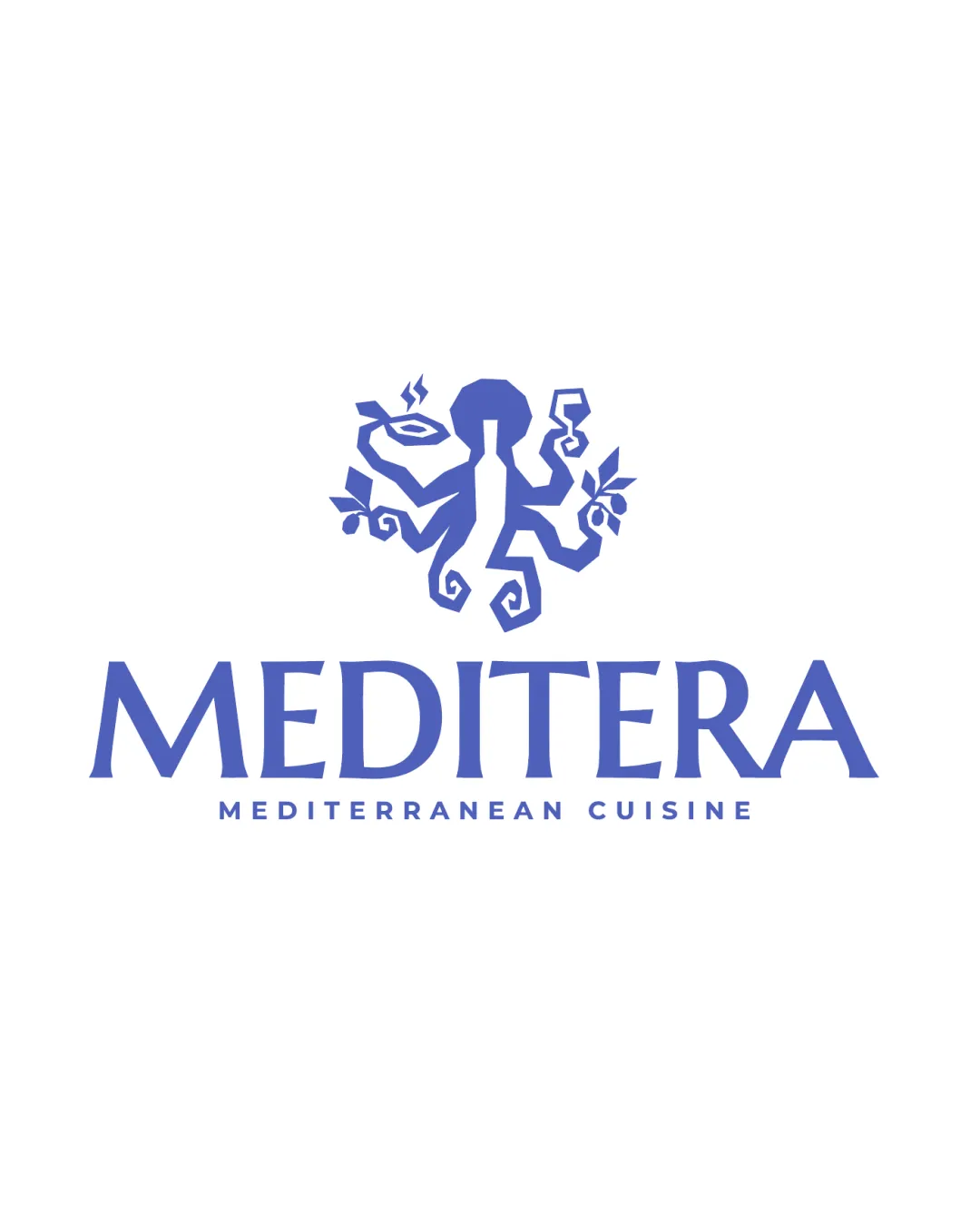
The logo features a playful, illustrated octopus chef holding a plate, utensils, and olive branches, positioned above a bold, custom wordmark. The composition is vibrant and balanced, evoking a sense of Mediterranean hospitality.
The wordmark uses an elegant, all-caps serif typeface with a handcrafted feel, expressing tradition and approachability.
The logomark is a stylized indigo octopus with characteristic spiraling limbs, holding both food and Mediterranean flora—communicating cuisine, freshness, and regional heritage.
Single-color indigo blue provides a sophisticated, Mediterranean-inspired visual identity that is easy to reproduce across materials.
A vibrant, playful logo that fuses Mediterranean culinary tradition with creative flair for a memorable restaurant experience.
Octopus chef icon merges Mediterranean seafood and hospitality traditions.
Flowing custom typography matches the mark's handcrafted energy.
Get a clear logo score, key risks, and priority fix ideas before your client or audience sees it.
More credits needed
Add credits to continue without losing your work.
Then $7/month. Cancel anytime.