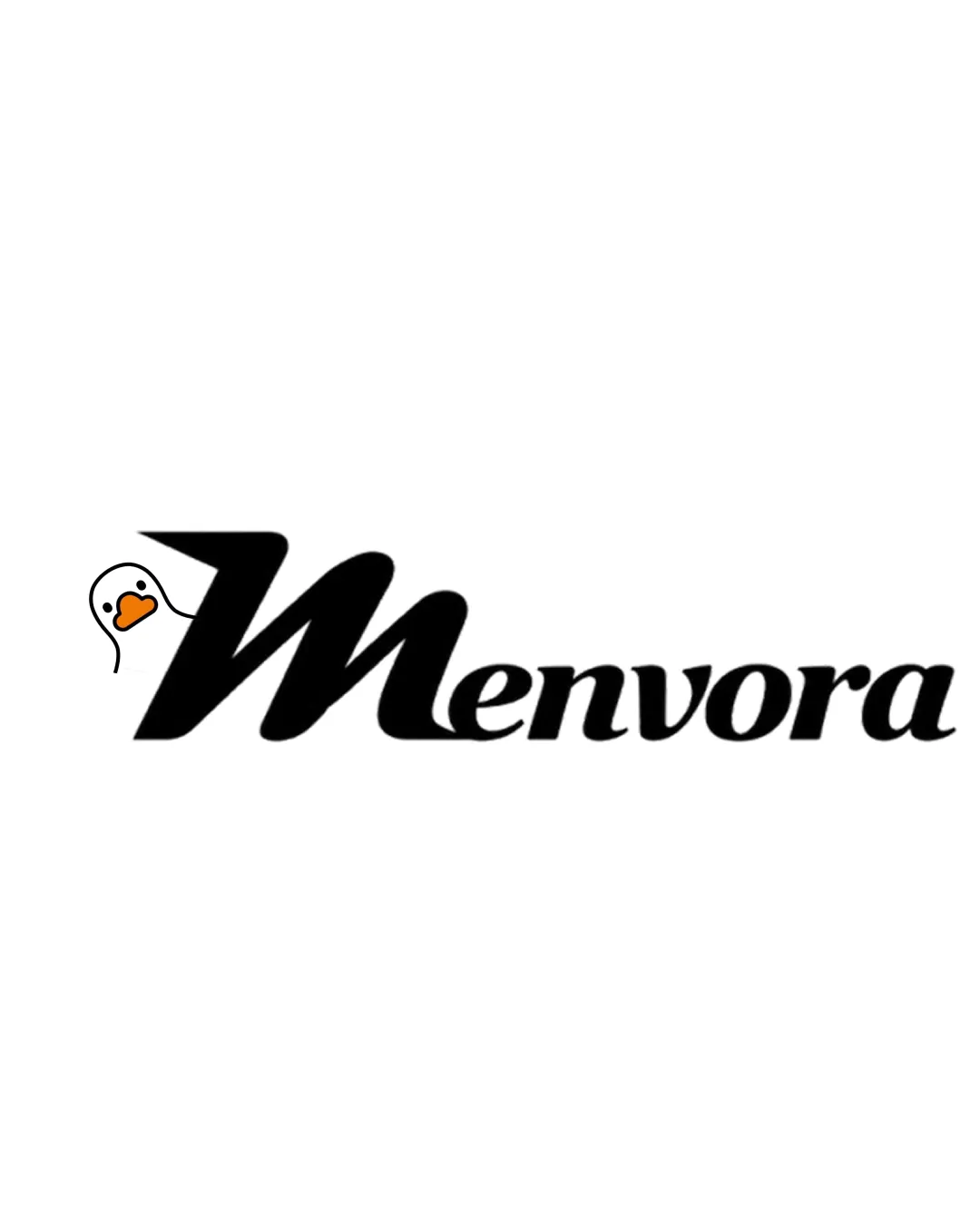
Menvora logo review
3.7 / 5
Logo score
Logo review of

Menvora

A distinct and memorable logo with a strong foundation; refinement of the illustrative detail will raise it to a top-tier fashion identity.

Objective AI feedback. Your creative decision.

Combination Mark Modern Wordmark With Whimsical Illustrative Accent Fashion
4.5/5
Legibility
4/5
Originality
4/5
Misread
3.5/5
Balance
3.5/5
Scale
Action plan

What to fix first

The most important fixes to handle before polishing the full presentation.

1

Refine the duck illustration for greater visual cohesion, sophistication, and scalable clarity

High priority

Current illustration feels slightly cartoonish and can undermine the upscale impression

Impact: A More Stylized Or Minimal Duck Detail Will Better Align With Premium Fashion And Stay Readable At Small Sizes · Effort: Medium

2

Fine-tune balance between the mark and wordmark, possibly reducing the duck's size and aligning for more even visual weight

Medium priority

Balances playful identity with premium aesthetics

Impact: Strengthens Overall Balance And Harmony, Making The Logo More Polished For High-end Apparel · Effort: Low

Detailed review

Logo performance breakdown

4.5/5

Legibility

Checkmark icon Wordmark is highly readable and well-crafted
Checkmark icon Distinct capital 'M' anchors the logo

4/5

Originality

Checkmark icon Playful animal illustration adds uniqueness
Checkmark icon Custom 'M' shape feels distinctive

Warning icon Duck head could risk feeling unrelated to premium fashion

3/5

Color harmony

Checkmark icon Splash of orange adds playful visual interest

Warning icon Color palette feels playful but not clearly premium or fashion-forward

Black
#000000

Orange
#FFA500

White
#FFFFFF

Color may be holding this logo back. Build a stronger strategic palette before updating the logo.

Build brand colors
3.5/5

Balance alignment

Checkmark icon Wordmark is balanced and visually coherent

Warning icon Duck head makes left side heavier; creates slight imbalance

logo 200x250 pixels scalability test alignment grid overlay
3.5/5

Scalability

Checkmark icon Simple forms allow for versatile use

Warning icon Small illustrated duck detail may lose clarity at small sizes

logo 200x250 pixels scalability test

200x250 px

logo 100x125 pixels scalability test

100×125 px

logo 50x62 pixels scalability test

50×62 px

4/5

Misinterpretations

Checkmark icon No confusing or inappropriate forms detected

3 / 5

Logo structure & brief match

Checkmark icon Both elements are playful and youthful

Warning icon Duck illustration feels partially disconnected from upscale fashion positioning

Checkmark icon Modern, Stylish, Distinctive: Distinctive 'M' and clean wordmark provide a modern, recognizable impression
Checkmark icon Youthful, Playful: Duck illustration delivers clear youthful and playful cues
Checkmark icon Premium, Fashion: Wordmark is close to premium, but animal illustration lightly undermines luxury perception

Try your own review

Wondering how your logo performs?

Get a clear logo score, key risks, and priority fix ideas before your client or audience sees it.

Review my logo