Concept & direction
A paired curved symbol gives the lowercase name a simple, recognizable companion.
Spelling & grammar
No obvious issue foundThe name reads as “skynet”; its spelling has not been verified.
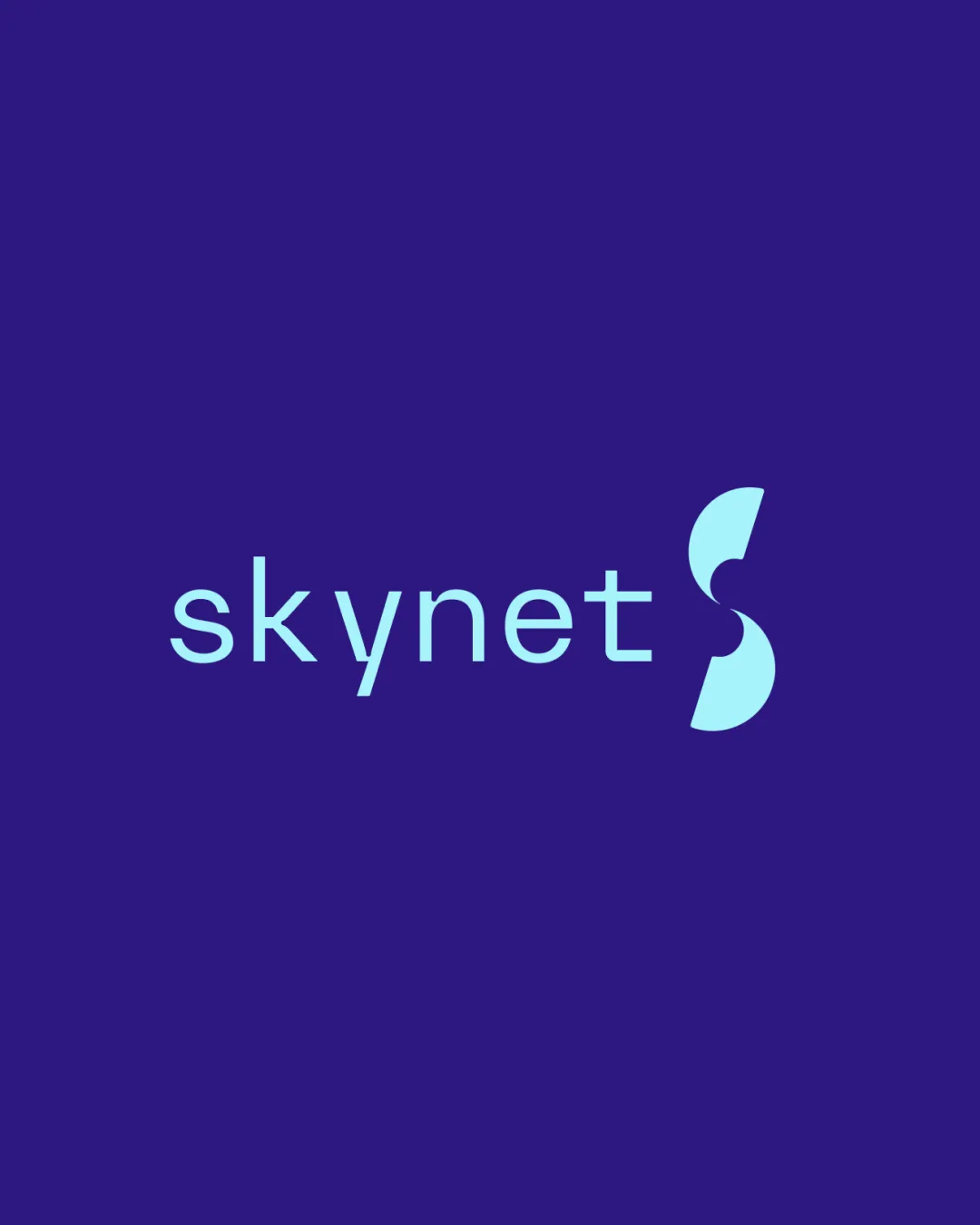
A clear, cohesive lockup with a relatively familiar visual construction.
This logo lockup shows solid execution, supported by visual balance and text readability; improving distinctiveness is the clearest next step.
Focus on the changes that matter. Keep what makes the logo work.
A paired curved symbol gives the lowercase name a simple, recognizable companion.
The name reads as “skynet”; its spelling has not been verified.
Wordmark
The wordmark’s relatively thin strokes may lose definition sooner than the solid symbol when the lockup is reduced.
See the category reviewThere isn't enough brand context to assess the match.
Symbol 3/5 · Wordmark 3/5
The paired curved shapes and familiar sans-serif lettering make a clean but relatively conventional combination.
Try: Explore a more distinctive relationship between the curved symbol and the lettering.
Check: Compare alternatives for distinctiveness while keeping the name easy to read.
Wordmark 4/5 · Layout 4/5
Symbol 4/5 · Wordmark 4/5 · Layout 4/5
The tall, solid symbol carries more visual weight than the thin-stroked name and draws the eye to the right.

Inspect spacing with the guide. Optical balance may differ from geometric centering.
Symbol 4/5 · Wordmark 4/5 · Layout 4/5
The wordmark’s relatively thin strokes may lose definition sooner than the solid symbol when the lockup is reduced.
Try: Test the complete lockup at the smallest expected display and print sizes.
Get a clear logo score, key risks, and priority fix ideas before your client or audience sees it.
More credits needed
Add credits to continue without losing your work.
Then $7/month. Cancel anytime.
Essential logo review
Usually takes under a minute