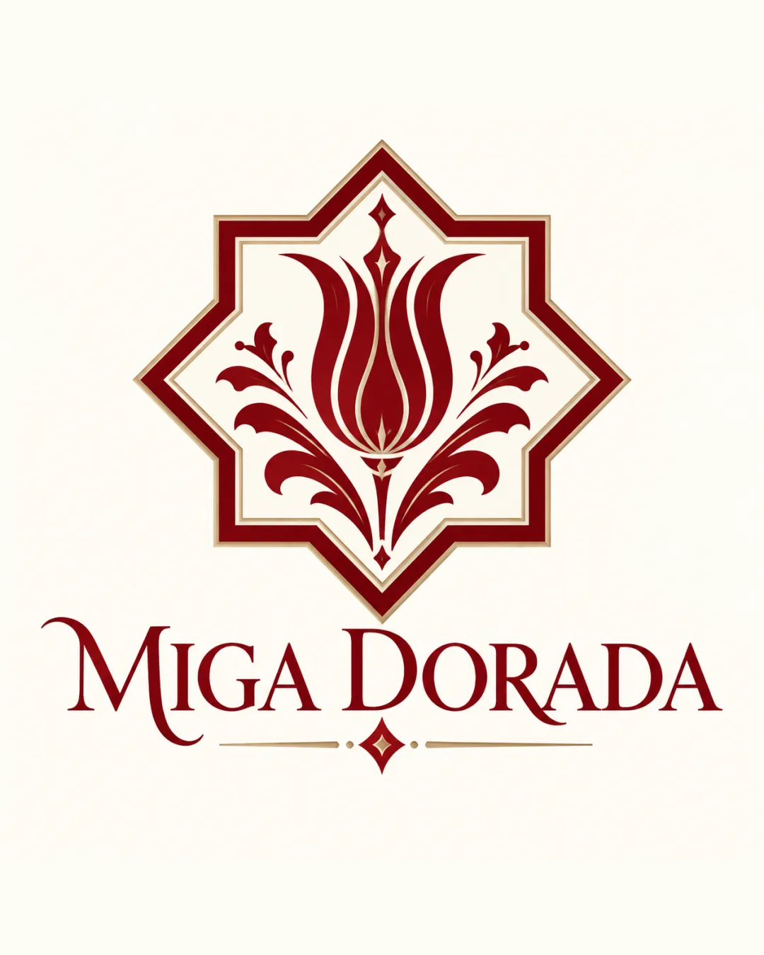
MIGA DORADA logo review
4/5
Logo score
Logo review of

Miga Dorada

Elegant, distinctive logo for an artisan bakery; minor spacing and scaling refinements will optimize usage.

Combination Elegant, Vintage, Ornamental Bakery, Patisserie, Traditional Foods
4.5/5
Legibility
4/5
Originality
5/5
Misread
3.5/5
Balance
3/5
Scale
Your next steps

What to fix first

Focus on the changes that matter. Keep what makes the logo work.

1

Standalone mark

Test simplified or alternate mark for small-scale applications.

Worth testing High priority Medium effort
Area to inspectApproximate location

Floral emblem contains fine ornamental details that may lose clarity at small sizes.

How to check

Verify legibility and emblem recognition on packaging and small digital uses.

See the category review
2

wordmark

Adjust inter-word and internal letterspacing for more even visual flow.

Visible issue Medium priority Low effort
Area to inspectApproximate location

Wordmark tracking is uneven, with large gap between 'MIGA' and 'DORADA' and very tight internal spacing.

How to check

Review typographic spacing with grid and optical adjustment.

See the category review
Detailed review

Logo performance breakdown

4.5/5

Brief & logo match

Based on your brief
Compared with

Pastelería artesanal

The logo convincingly expresses a sense of artisanal craftsmanship and premium bakery tradition.

  • Artisan Bakery Craft

    Ornate mark and elegant serif wordmark evoke traditional European patisserie aesthetics, supporting a handmade and premium impression.

  • Luxury/Quality Signals

    Rich color palette and intricate emblem convey quality, but fine detail may distract in informal or small-scale bakery settings.

4.5/5

Legibility

  • Wordmark is highly readable with elegant serif styling.
4/5

Originality

  • Unique integration of an ornate mark and refined type conveys heritage.
4.5/5

Color harmony

  • Rich red-gold palette harmonizes with bakery and artisanal values.
Dark Red#7D2525
Off White#F5EADF
Gold Brown#B19674

Estimated colors. Use the original design file for exact values.

Create a full color palette using these colors

Create new palette
3.5/5

Balance alignment

  • Overall elements are well-centered and styled.
  • Wordmark tracking is uneven, with large gap between 'MIGA' and 'DORADA' and very tight internal spacing.

    Visible issue wordmark

    Try: Adjust inter-word and internal letterspacing for more even visual flow.

    Check: Review typographic spacing with grid and optical adjustment.

    Area to inspectApproximate location
Uploaded logoAlignment guide overlay

Inspect spacing with the guide. Optical balance may differ from geometric centering.

3/5

Scalability

  • Ornate emblem is visually distinctive.
  • Floral emblem contains fine ornamental details that may lose clarity at small sizes.

    Worth testing Standalone mark

    Try: Test simplified or alternate mark for small-scale applications.

    Check: Verify legibility and emblem recognition on packaging and small digital uses.
    Area to inspectApproximate location
Uploaded logo at 200 pixels wide
200 × 250 px
Uploaded logo at 100 pixels wide
100 × 125 px
Uploaded logo at 50 pixels wide
50 × 63 px

Compare the detail at different sizes. Labels show the full image dimensions.

5/5

Misinterpretations

  • No unintended visual readings or dual meanings detected.
4.5/5

Symbol & text fit

  • Mark and wordmark share stylistic coherence and vintage tone.

Black & white

Does the shape still work without color?

These tests are available only for logos uploaded in vector (SVG) format.

Background contrast

Find the surfaces where your logo stays clear.

These tests are available only for logos uploaded in vector (SVG) format.

Blur & silhouette

A 3px blur softens fine details so you can check whether the overall shape stays recognizable. If key gaps close or elements merge, the logo may rely too heavily on detail.

These tests are available only for logos uploaded in vector (SVG) format.

Try your own review

Wondering how your logo performs?

Get a clear logo score, key risks, and priority fix ideas before your client or audience sees it.

Review my logo