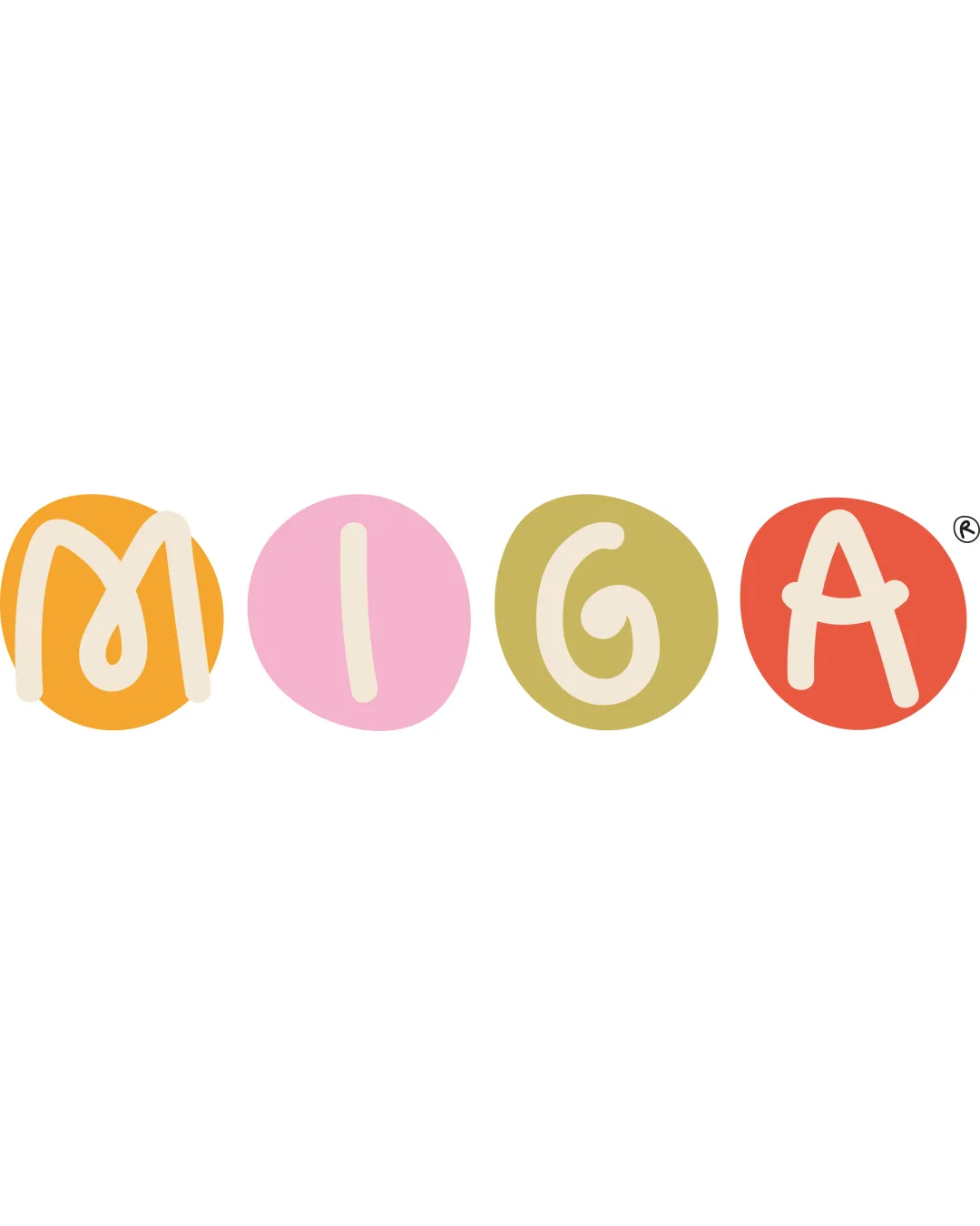
MIGA logo review
3.5 / 5
Logo score
Logo review of

Miga

Memorable and suitable for a café with kid-friendly or artisanal positioning, but needs polish for professional-grade deployment.

Wordmark Playful Hand-drawn Food / Café
4/5
Legibility
4/5
Originality
5/5
Misread
3/5
Balance
3/5
Scale
Action plan

What to fix first

The most important fixes to handle before polishing the full presentation.

1

Strengthen visual consistency between each letter and circle, particularly the 'M' and 'G', for improved balance and clarity.

High priority

Uneven letter and circle proportions affect polish and professionalism.

Impact: Moderate · Effort: Medium

2

Test at smaller sizes and adjust stroke weights for better scalability and legibility on packaging or signage.

Medium priority

Thin or irregular outlines may not hold up in all use cases.

Impact: Moderate · Effort: Low

Detailed review

Logo performance breakdown

4/5

Legibility

Checkmark icon Letters are individually clear and readable
Checkmark icon High contrast between text and background

Warning icon 'M' shape is slightly irregular and could be misread at a glance

4/5

Originality

Checkmark icon Playful, lively style not generic
Checkmark icon Distinct use of colored circles per letter

Warning icon Hand-drawn circle-letter motifs are common in playful branding

4/5

Color harmony

Checkmark icon Friendly, inviting pastel palette with good contrast

Warning icon Color choices might not achieve maximum sophistication

Orange
#F6A623

Pink
#EBAACD

Olive
#BDBA74

Red
#E06443

Your palette is close. Refine the color roles and combinations before updating the logo.

Build brand colors
3/5

Balance alignment

Checkmark icon Even spacing and visually balanced area for each letter-circle pair

Warning icon Letter sizes and circle shapes are not perfectly consistent, creating slight imbalance

logo 200x250 pixels scalability test alignment grid overlay
3/5

Scalability

Checkmark icon Simple hand-drawn style keeps detail minimal

Warning icon Thin, uneven strokes and colored circles lose definition at small sizes

logo 200x250 pixels scalability test

200x250 px

logo 100x125 pixels scalability test

100×125 px

logo 50x62 pixels scalability test

50×62 px

5/5

Misinterpretations

Checkmark icon No unintended or inappropriate visual readings detected

Beta

No AI design signals found

Likely designed by a human

No clear AI artifacts; details, forms, and joins appear intentionally hand-drawn.

  • Consistent hand-drawn quality
  • No malformed letterforms

Visual assessment; not definitive proof of authorship.

Brief match

Checkmark icon Industry: Playful, food-friendly colors and style are well suited for a pastry and café brand.

Try your own review

Wondering how your logo performs?

Get a clear logo score, key risks, and priority fix ideas before your client or audience sees it.

Review my logo