View review
Logo score
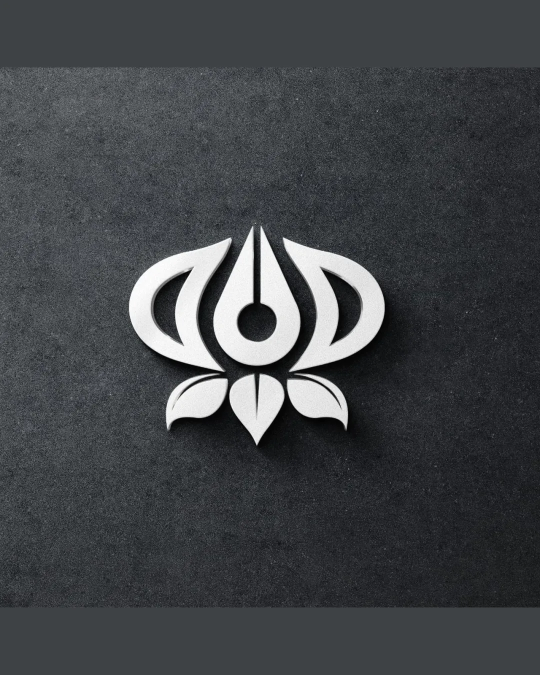
Logo review ofStylized Lotus Flower With Geometric Symmetry
Visually striking and conceptually solid; ready for presentation with a minor tweak.
Originality
Misread
Balance
Scale
Action plan
What to fix first
The most important fixes to handle before polishing the full presentation.
1
Refine line thickness and clear spacing slightly to ensure all gaps and internal shapes remain distinct at small sizes.
Medium priorityFine lines between petals may close up and obscure the logo’s form in small applications.
Impact: Improves Scalability And Detail Retention · Effort: Low
Detailed review
Logo performance breakdown
Originality
![]() Creative abstraction of a lotus with unique geometric approach
Creative abstraction of a lotus with unique geometric approach
![]() Shares basic structure seen in various symmetrical flower/lotus icons
Shares basic structure seen in various symmetrical flower/lotus icons
Color harmony
![]() Monochrome palette is elegant and modern
Monochrome palette is elegant and modern
![]() Logo may blend into light backgrounds without sufficient contrast
Logo may blend into light backgrounds without sufficient contrast
White
#FFFFFF
Gunmetal
#363636
Your palette is close. Explore sharper color combinations with Colorfly.design before updating the logo.
Explore palettesBalance alignment
![]() Excellent symmetry and well-distributed visual weight
Excellent symmetry and well-distributed visual weight

Scalability
![]() Bold, clean lines hold up at various sizes
Bold, clean lines hold up at various sizes![]() Minimal detail aids reproduction
Minimal detail aids reproduction
![]() Small gaps between elements may merge at tiny scales
Small gaps between elements may merge at tiny scales
200x250 px
100×125 px
50×62 px
Misinterpretations
![]() No unintended or inappropriate visual interpretations detected
No unintended or inappropriate visual interpretations detected
Brief match
![]() Lotus Inspiration, Simplicity, Clarity: Lotus motif is clear; minimalist execution reinforces the intended values of clarity and simplicity
Lotus Inspiration, Simplicity, Clarity: Lotus motif is clear; minimalist execution reinforces the intended values of clarity and simplicity
Try your own review
Review my logo
Wondering how your logo performs?
Get a clear logo score, key risks, and priority fix ideas before your client or audience sees it.
Keep exploring