Refine negative space within '29' numerals to ensure clarity at micro sizes.
Ensures clarity and avoids visual blockage in mark.
Enhances small-scale reproducibility and digital display.
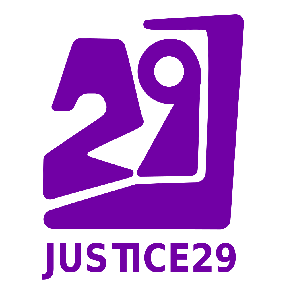
A distinctive, well-resolved logo that effectively communicates energy and modernity while fitting the brief for a youth-oriented justice initiative.
Focus on the changes that matter. Keep what makes the logo work.
Ensures clarity and avoids visual blockage in mark.
Enhances small-scale reproducibility and digital display.
Reduces perceived tension between angled mark and wordmark baseline.
Slightly increases visual harmony for horizontal compositions.
Logo achieves youthful energy through bold color and angular forms.
Modern, assertive character implies activist intent and contemporary relevance.
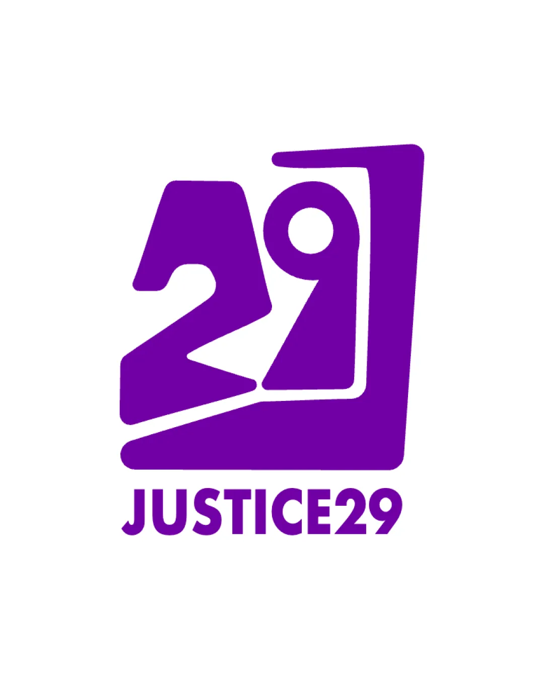

Inspect spacing with the guide. Optical balance may differ from geometric centering.
Compare the detail at different sizes. Labels show the full image dimensions.
Does the shape still work without color?
Find the surfaces where your logo stays clear.
Compare the mark and lettering on each surface.
Shows the lower-contrast areas of the logo (5th percentile). Tiny details may have lower contrast. Good ≥ 4.5:1 · Medium ≥ 3:1 · Bad < 3:1. A visual guide, not an accessibility rating.
A 3px blur softens fine details so you can check whether the overall shape stays recognizable. If key gaps close or elements merge, the logo may rely too heavily on detail.
Look for clear separation between shapes and a distinctive outline.
Get a clear logo score, key risks, and priority fix ideas before your client or audience sees it.
More credits needed
Add credits to continue without losing your work.
Then $7/month. Cancel anytime.