 View review
Logo score
Logo review ofMk, Logic
Review the detailed scores below to see what is working and what should be refined first.
Legibility
Originality
Misread
Balance
Scale
Detailed review
Logo performance breakdown
Legibility
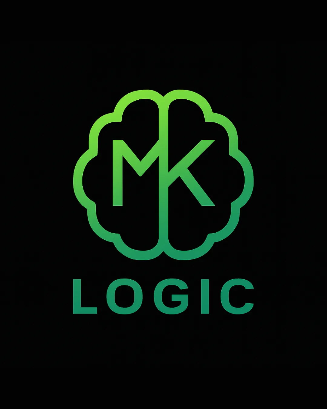
![]() The word 'LOGIC' is set in a clean, modern, sans-serif font, making it easy to read.
The word 'LOGIC' is set in a clean, modern, sans-serif font, making it easy to read.![]() The MK monogram inside the brain outline is distinguishable.
The MK monogram inside the brain outline is distinguishable.
![]() MK monogram could present minor legibility issues if scaled down very small, as lines may merge or become unclear.
MK monogram could present minor legibility issues if scaled down very small, as lines may merge or become unclear.
Originality
![]() Use of a brain outline to convey 'logic' is relevant, and containing the MK monogram shows some creativity.
Use of a brain outline to convey 'logic' is relevant, and containing the MK monogram shows some creativity.![]() Gradient green hue adds a fresh, modern touch.
Gradient green hue adds a fresh, modern touch.
![]() A brain outline is somewhat common in tech and logical/AI branding. The monogram integration, while good, doesn't push the boundaries of originality.
A brain outline is somewhat common in tech and logical/AI branding. The monogram integration, while good, doesn't push the boundaries of originality.
Color harmony
![]() Green gradient is well executed, rich in tone, and consistent throughout elements.
Green gradient is well executed, rich in tone, and consistent throughout elements.![]() Limited color palette ensures logo remains visually unified.
Limited color palette ensures logo remains visually unified.
Emerald
#37C46A
Ebony
#212121
Balance alignment
![]() Monogram is symmetrically centered within the brain outline, giving a balanced feel.
Monogram is symmetrically centered within the brain outline, giving a balanced feel.![]() Typography beneath the symbol aligns visually with the width of the brain illustration.
Typography beneath the symbol aligns visually with the width of the brain illustration.

Scalability
![]() Logo works well on digital media, banners, and signage due to bold lines.
Logo works well on digital media, banners, and signage due to bold lines.![]() Brain outline and central letters are clear in moderate sizes.
Brain outline and central letters are clear in moderate sizes.
![]() Thin line weights and gradient may become hard to distinguish at small sizes or on embroidery/product labels.
Thin line weights and gradient may become hard to distinguish at small sizes or on embroidery/product labels.![]() Complexity of the brain outline can result in detail loss on business cards or favicons.
Complexity of the brain outline can result in detail loss on business cards or favicons.
200x250 px
100×125 px
50×62 px
Misinterpretations
![]() Logo communicates clear intended meanings with no unintended or inappropriate associations.
Logo communicates clear intended meanings with no unintended or inappropriate associations.
Symbol & text fit
![]() The wordmark 'LOGIC' and logomark (brain with MK) use similar weights and geometric styles, achieving harmony together.
The wordmark 'LOGIC' and logomark (brain with MK) use similar weights and geometric styles, achieving harmony together.
![]() Gradient color palette ties both elements together visually.
Gradient color palette ties both elements together visually.
Try your own review
Review my logo
Wondering how your logo performs?
Get a clear logo score, key risks, and priority fix ideas before your client or audience sees it.
Keep exploring


