Concept & direction
An abstract monogram using sharp, angular lines combining light gray and yellow to create a striking, modern form that hints at the initials E and RM or ER.
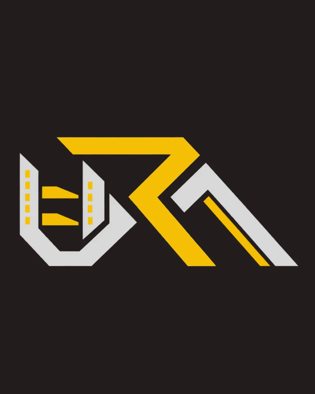
Dynamic and modern monogram with distinctive style, but requires clearer letter definition to achieve lasting impact.
Focus on the changes that matter. Keep what makes the logo work.
An abstract monogram using sharp, angular lines combining light gray and yellow to create a striking, modern form that hints at the initials E and RM or ER.
Current abstraction reduces letter clarity and could hinder recognition.
Greater legibility and brand recall.
Estimated colors. Use the original design file for exact values.
Create a full color palette using these colors
Create new palette
Inspect spacing with the guide. Optical balance may differ from geometric centering.
Get a clear logo score, key risks, and priority fix ideas before your client or audience sees it.
More credits needed
Add credits to continue without losing your work.
Then $7/month. Cancel anytime.
Essential logo review with AI
Estimated progress