modernichalupy.cz
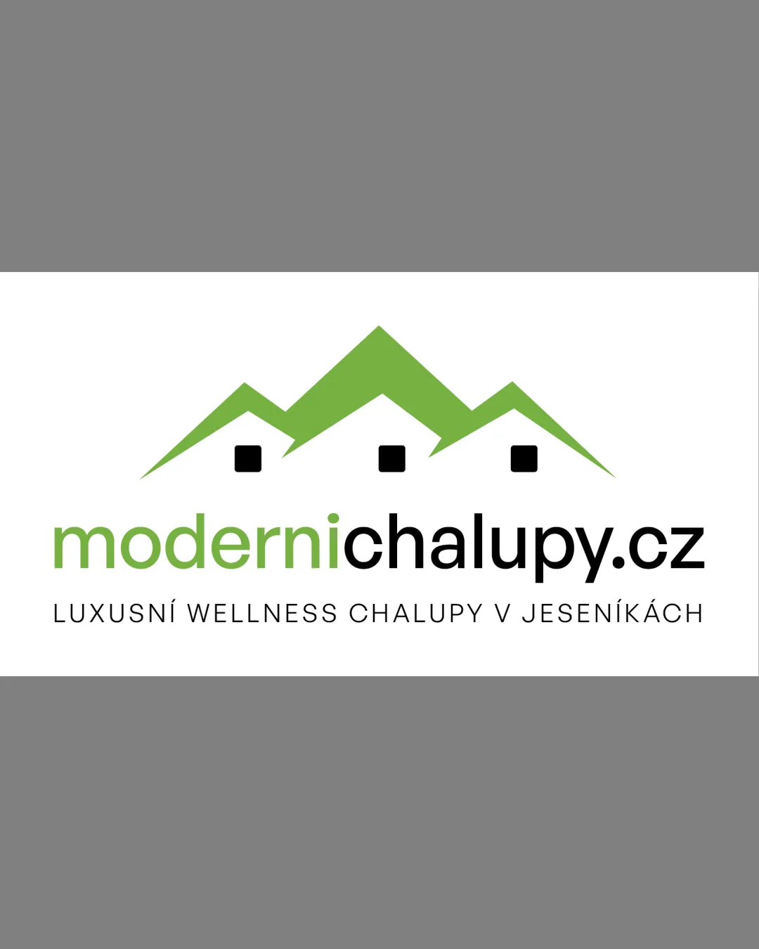
LUXUSNÍ WELLNESS CHALUPY V JESE.. logo review
3/5
Logo score
Logo review of

Modernichalupy.cz Luxusní Wellness Chalupy V Jese..

A clear and functional logo but conceptually generic and visually separate; could benefit from signature details or tighter integration.

Combination Clean Geometric Real Estate / Hospitality
5/5
Legibility
2/5
Originality
5/5
Misread
3/5
Balance
4/5
Scale
Your next steps

What to fix first

Focus on the changes that matter. Keep what makes the logo work.

1

Standalone mark

Explore a more distinctive arrangement or graphic detail to create a unique signature.

Visible issue High priority Medium effort
Area to inspectApproximate location

The three-peak roof/mountain motif is a common real estate and hospitality trope and lacks a unique twist.

How to check

Confirm the symbol feels memorable and differentiated from common real estate logos.

See the category review
2

Standalone mark and wordmark

Integrate the roof symbol more tightly with the wordmark, possibly reducing the vertical gap or adjusting mark size.

Optional refinement Medium priority Low effort
Area to inspectApproximate location

The green roofs/symbol feel visually separate from the wordmark due to differing weights and some vertical disconnect.

How to check

Verify that the elements read as one cohesive logo, not separate pieces.

See the category review
Detailed review

Logo performance breakdown

3/5

Brief & logo match

Based on an inferred industry
Compared with

Logo for a modern luxury chalet or wellness lodging provider, with a visual connection to mountain/cabin scenery.

The logo matches the general market signals of a modern chalet destination but uses standard symbols and needs a more distinctive or localized approach.

  • Theme: Modern Chalets And Wellness

    Roof/mountain shapes and 'modern' in the text support the context of upscale wellness chalets.

  • Destination: Jeseník Region

    Evocation of mountain/cabin scenery is geographically relevant but generic to many regions.

5/5

Legibility

  • Highly readable text in both the name and tagline.
2/5

Originality

  • The three-peak roof/mountain motif is a common real estate and hospitality trope and lacks a unique twist.

    Visible issue Standalone mark

    Try: Explore a more distinctive arrangement or graphic detail to create a unique signature.

    Check: Confirm the symbol feels memorable and differentiated from common real estate logos.

    Area to inspectApproximate location
4/5

Color harmony

  • Fresh green contrasts well with black and white for a modern, clean look.
Green#74B53E
Black#000000
White#FFFFFF

Estimated colors. Use the original design file for exact values.

Create a full color palette using these colors

Create new palette
3/5

Balance alignment

  • Elements are centered and visually ordered.
  • The green roofs/symbol feel visually separate from the wordmark due to differing weights and some vertical disconnect.

    Optional refinement Standalone mark and wordmark

    Try: Integrate the roof symbol more tightly with the wordmark, possibly reducing the vertical gap or adjusting mark size.

    Check: Verify that the elements read as one cohesive logo, not separate pieces.

    Area to inspectApproximate location
Uploaded logoAlignment guide overlay

Inspect spacing with the guide. Optical balance may differ from geometric centering.

4/5

Scalability

  • Simple icon and clear typography will reproduce well at small sizes.
Uploaded logo at 200 pixels wide
200 × 250 px
Uploaded logo at 100 pixels wide
100 × 125 px
Uploaded logo at 50 pixels wide
50 × 63 px

Compare the detail at different sizes. Labels show the full image dimensions.

5/5

Misinterpretations

  • No unintended meanings or negative space issues.
3/5

Symbol & text fit

  • Clear separation between symbol and text.

Black & white

Does the shape still work without color?

These tests are available only for logos uploaded in vector (SVG) format.

Background contrast

Find the surfaces where your logo stays clear.

These tests are available only for logos uploaded in vector (SVG) format.

Blur & silhouette

A 3px blur softens fine details so you can check whether the overall shape stays recognizable. If key gaps close or elements merge, the logo may rely too heavily on detail.

These tests are available only for logos uploaded in vector (SVG) format.

Try your own review

Wondering how your logo performs?

Get a clear logo score, key risks, and priority fix ideas before your client or audience sees it.

Review my logo