Montenegro.com logo review
4.3/5
Logo score
Logo review of

Montenegro.com

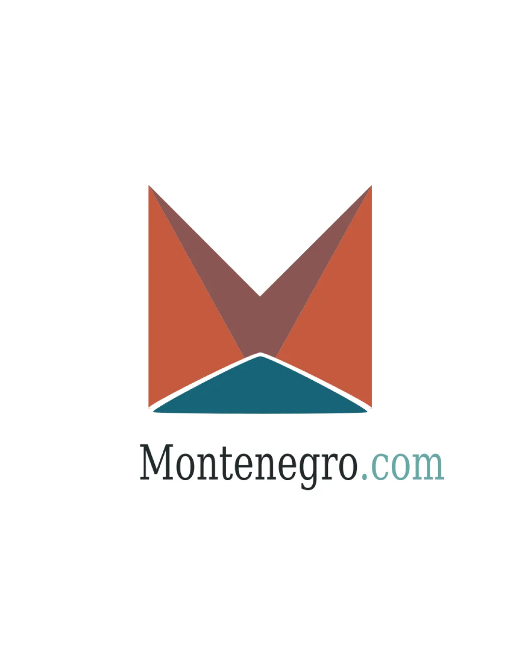
Distinctive, on-brief logo that strongly positions Montenegro.com as a memorable, locally-focused travel platform while maintaining professional appeal.

Combination Mark Modern Geometric Minimalism Travel
4.5/5
Legibility
4/5
Originality
5/5
Misread
4.5/5
Balance
4/5
Scale
Action plan

What to fix first

The most important fixes to handle before polishing the full presentation.

1

Slightly increase the color contrast in '.com' or ensure thickness in fine lines for optimally small sizes.

Medium priority

Ensures the logo retains clarity and inclusivity at all practical sizes.

Impact: Improves Accessibility And Reproduction Quality In Digital And Print Uses. · Effort: Low

Detailed review

Logo performance breakdown

4.5/5

Legibility

Checkmark icon 'Montenegro.com' wordmark is highly readable
Checkmark icon Clear and balanced typeface choice

Warning icon Slight contrast drop in '.com' may hinder low-vision visibility

4/5

Originality

Checkmark icon Abstract 'M' with landscape symbolism feels fitting and unique to Montenegro's identity

Warning icon Geometric 'M' marks are a reasonably common device

4/5

Color harmony

Checkmark icon Earthy orange-brown and teal evoke Montenegro's terrain and coast
Checkmark icon Distinctive palette stands out from standard blue/green travel schemes

Warning icon Palette is unique but not highly vibrant or energetic

Orange
#C56341

Teal
#324F56

Brown
#83706B

Muted Teal
#6CA09A

Your palette is close. Refine the color roles and combinations before updating the logo.

Build brand colors
4.5/5

Balance alignment

Checkmark icon Excellent centering and proportionality between mark and text
Checkmark icon Visually cohesive relationship between all elements

logo 200x250 pixels scalability test alignment grid overlay
4/5

Scalability

Checkmark icon Minimalist mark scales well
Checkmark icon Wordmark and mark are clear at smaller sizes

Warning icon Thin white divider in mark may lose separation detail at tiny sizes

logo 200x250 pixels scalability test

200x250 px

logo 100x125 pixels scalability test

100×125 px

logo 50x62 pixels scalability test

50×62 px

5/5

Misinterpretations

Checkmark icon No unintended negative or confusing secondary readings

4.5/5

Logo structure & brief match

Checkmark icon Mark sits harmoniously above wordmark with relevant visual ties

Checkmark icon Industry Relevance: Strong use of abstract mountains/landscape and a clear 'M' directly ties to travel and the Montenegro focus.
Checkmark icon Memorability: Distinct geometric logo with appropriate local cues increases brand recall vs generic travel marks.

Try your own review

Wondering how your logo performs?

Get a clear logo score, key risks, and priority fix ideas before your client or audience sees it.

Review my logo