Increase clarity and simplicity of illustrative mark for small-size usage.
Fine details may blur or become unclear at small scale, especially on merch and icons.
Mark will remain recognizable in all applications.
Distinctive, warm, and professional with strong visual storytelling; suitable for coffee shop use with only modest technical refinements required.
Focus on the changes that matter. Keep what makes the logo work.
Fine details may blur or become unclear at small scale, especially on merch and icons.
Mark will remain recognizable in all applications.
Unusual 'O' forms could delay instant recognition, especially for signage.
Improves functional ease for new customers.
Visual weight can be further tuned for perfect lockup aesthetics.
Visually tighter presentation across all media.
Uplifting illustration and soft brown create an inviting mood.
Curvy lines, characterized woman, and sun motif communicate gentle femininity.
Coffee drinking, nature, and warm color directly reference the café experience.
Estimated colors. Use the original design file for exact values.
Create a full color palette using these colors
Create new palette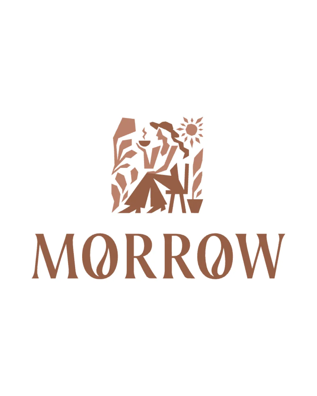

Inspect spacing with the guide. Optical balance may differ from geometric centering.
Compare the detail at different sizes. Labels show the full image dimensions.
Does the shape still work without color?
Find the surfaces where your logo stays clear.
Compare the mark and lettering on each surface.
Shows the lower-contrast areas of the logo (5th percentile). Tiny details may have lower contrast. Good ≥ 4.5:1 · Medium ≥ 3:1 · Bad < 3:1. A visual guide, not an accessibility rating.
A 3px blur softens fine details so you can check whether the overall shape stays recognizable. If key gaps close or elements merge, the logo may rely too heavily on detail.
Look for clear separation between shapes and a distinctive outline.
Well-placed and differentiated for boutique coffee shop sector.
Original illustration and brown palette suggest warmth and comfort, while maintaining distinctiveness among competitive café brands.
Fits well with current specialty café design trends without feeling generic.
Visual storytelling and inviting palette strengthen its sector appeal.
Low likelihood of confusion with standard coffee icons or generic scripts.
The illustrated scene and custom type reinforce ownable uniqueness.
Signals warmth, sophistication, and a feminine-leaning cafe experience.
Serif and illustration choices directly cue quality, positivity, and comfort.
How the logo may work in practice, and what to check before production.
Clear and visually appealing at standard web sizes.
Mark may need simplification to remain recognizable at tiny scale.
Overly detailed mark; requires a simplified variant.
Wordmark is strong for signage, mark is effective at moderate sizes.
Simplification required for clarity on small goods or stitched surfaces.
A practical checklist of the logo versions to prepare before sending the final files to a client or team.
Main showcase logo for web, print, and menus.
Required for print, stamps, or simple applications.
Mark must stand alone for icons and merchandise.
Provides flexible branding for minimalist use.
Helpful for social avatars or favicons where details can be lost.
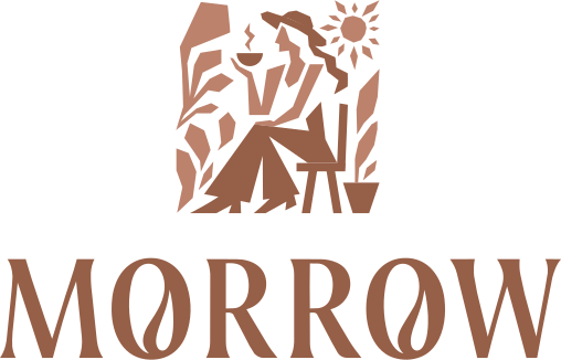
A warm, inviting combination mark with an illustrated vignette of a woman enjoying coffee in nature, stacked above a custom serif wordmark.
The name 'MORROW' in a classic serif font, with leaf motifs replacing the counters in both 'O's for a distinctive botanical feel.
An illustrative graphic of a woman in a hat sipping coffee amid plants and sunshine, evoking relaxation, warmth, and daily ritual.
A distinctive and inviting logo celebrating positive coffee moments in a feminine, nature-inspired style.
Illustrative mark highlights morning ritual, comfort, and connection to nature.
Monochrome brown tone strengthens the café identity and aids recognition.
Get a clear logo score, key risks, and priority fix ideas before your client or audience sees it.
More credits needed
Add credits to continue without losing your work.
Then $7/month. Cancel anytime.