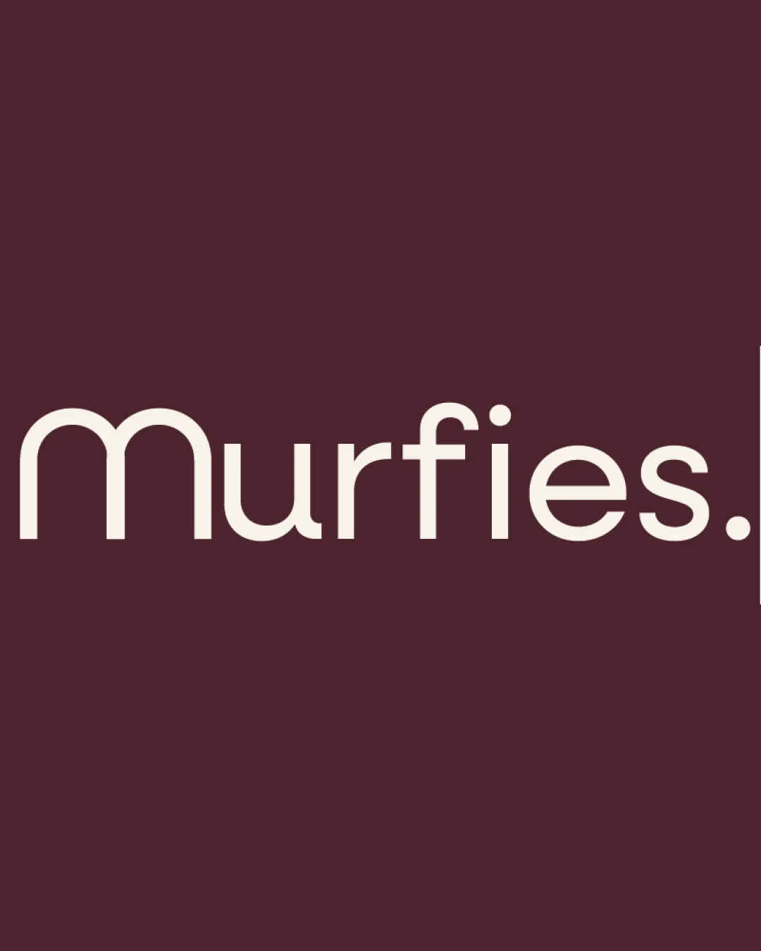
Murfies. logo review
3.3/5
Logo score
Logo review of

Murfies.

A functional, attractive wordmark, but too generic and lacking crafted or distinctive cues for an artisanal dessert brand.

Wordmark Contemporary Geometric Wordmark Food And Beverage
5/5
Legibility
2.5/5
Originality
5/5
Misread
4/5
Balance
3.5/5
Scale
Your next steps

What to fix first

Focus on the changes that matter. Keep what makes the logo work.

1

wordmark

Introduce a unique typographic twist or subtle craft-inspired accent to enhance memorability and align with the artisanal theme.

Visible issue High priority Medium effort

The wordmark relies on a standard geometric sans-serif style, which feels generic and lacks distinctive artisanal elements for a patisserie.

How to check

Test recognition and recall with and without additional creative flourishes.

See the category review
2

wordmark

Check application at small scale and on complex or printed backgrounds.

Worth testing Medium priority Low effort

Fine/gentle stroke weight may lose clarity or appear faint at very small sizes or on textured backgrounds.

How to check

Print and test at intended smallest use-case and on patterned substrates.

See the category review
Detailed review

Logo performance breakdown

3/5

Brief & logo match

Based on your brief
Compared with

Murfies: cloud kitchen and artisanal patisserie with global and craft emphasis, for premium desserts.

It covers the premium and indulgent vibe through color and clarity, but lacks crafted or global character needed for the brief.

  • Artisanal, Crafted Identity

    The clean, minimal style feels premium but lacks an overt handmade element or nod to diverse global influences.

  • Food/dessert Focus

    Color choices (chocolate tones) support a dessert-oriented brand and indulgence.

5/5

Legibility

  • Very clear, highly readable text even at a glance.
2.5/5

Originality

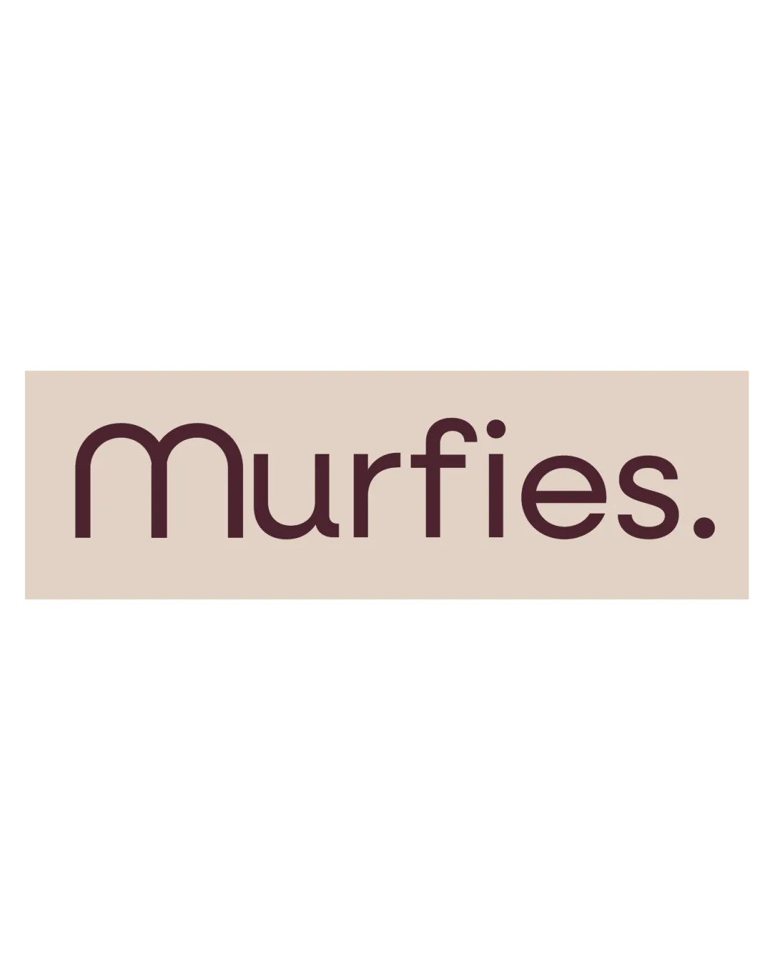
  • The wordmark relies on a standard geometric sans-serif style, which feels generic and lacks distinctive artisanal elements for a patisserie.

    Visible issue wordmark

    Try: Introduce a unique typographic twist or subtle craft-inspired accent to enhance memorability and align with the artisanal theme.

    Check: Test recognition and recall with and without additional creative flourishes.
4/5

Color harmony

  • Deep brown and cream suggest chocolate, indulgence and warmth.
Dark Brown#57303A
Light Cream#F6ECE4

Estimated colors. Use the original design file for exact values.

Create a full color palette using these colors

Create new palette
4/5

Balance alignment

  • Consistent stroke widths and balanced spacing.
Uploaded logoAlignment guide overlay

Inspect spacing with the guide. Optical balance may differ from geometric centering.

3.5/5

Scalability

  • Simple geometric forms generally scale well.
  • Fine/gentle stroke weight may lose clarity or appear faint at very small sizes or on textured backgrounds.

    Worth testing wordmark

    Try: Check application at small scale and on complex or printed backgrounds.

    Check: Print and test at intended smallest use-case and on patterned substrates.

Uploaded logo at 200 pixels wide
200 × 250 px
Uploaded logo at 100 pixels wide
100 × 125 px
Uploaded logo at 50 pixels wide
50 × 63 px

Compare the detail at different sizes. Labels show the full image dimensions.

5/5

Misinterpretations

  • No unintended readings or ambiguity.

Black & white

Does the shape still work without color?

These tests are available only for logos uploaded in vector (SVG) format.

Background contrast

Find the surfaces where your logo stays clear.

These tests are available only for logos uploaded in vector (SVG) format.

Blur & silhouette

A 3px blur softens fine details so you can check whether the overall shape stays recognizable. If key gaps close or elements merge, the logo may rely too heavily on detail.

These tests are available only for logos uploaded in vector (SVG) format.

Try your own review

Wondering how your logo performs?

Get a clear logo score, key risks, and priority fix ideas before your client or audience sees it.

Review my logo