 View review
Logo score
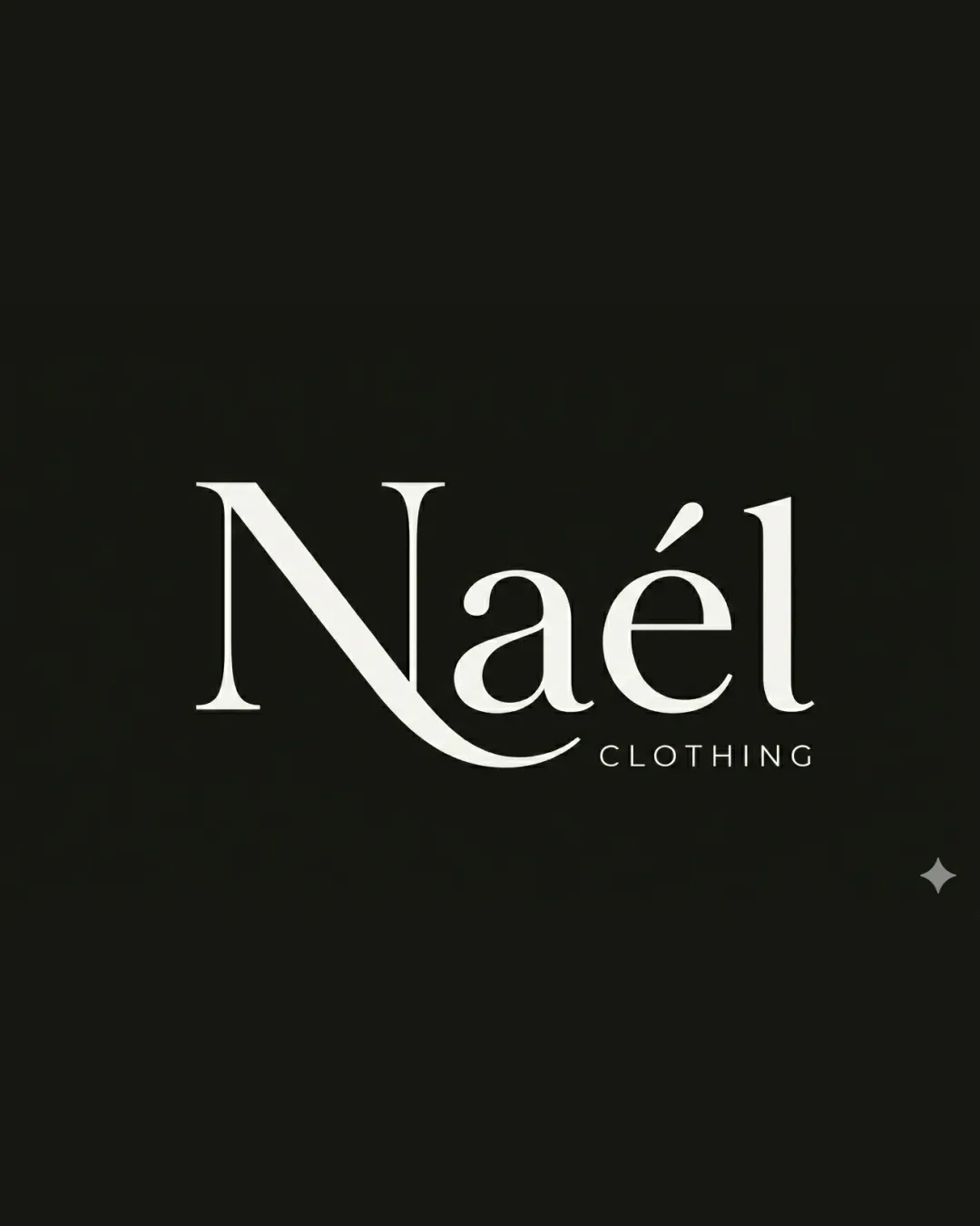
Logo review ofNaél Clothing
Review the detailed scores below to see what is working and what should be refined first.
Legibility
Originality
Misread
Balance
Scale
Detailed review
Logo performance breakdown
Legibility
![]() Primary brand name 'Naél' is clear and stands out
Primary brand name 'Naél' is clear and stands out![]() Contrasting color scheme enhances readability
Contrasting color scheme enhances readability
![]() Extended swash on the letter 'N' might affect quick recognition, especially at smaller sizes
Extended swash on the letter 'N' might affect quick recognition, especially at smaller sizes![]() 'CLOTHING' in all caps and smaller size can be harder to read at a distance or in small-scale applications
'CLOTHING' in all caps and smaller size can be harder to read at a distance or in small-scale applications
Originality
![]() Custom swash on 'N' adds a distinctive, memorable touch
Custom swash on 'N' adds a distinctive, memorable touch
![]() Overall serif wordmark remains within common fashion branding conventions, not highly unique
Overall serif wordmark remains within common fashion branding conventions, not highly unique
Color harmony
![]() Excellent use of monochrome palette, projecting sophistication and timelessness
Excellent use of monochrome palette, projecting sophistication and timelessness![]() No clashing hues or distracting color transitions
No clashing hues or distracting color transitions
White
#FFFFFF
Nero
#10100B
Balance alignment
![]() Letterforms are well aligned and create a sophisticated layout
Letterforms are well aligned and create a sophisticated layout![]() The accent on the 'é' is visually balanced with the rest of the word
The accent on the 'é' is visually balanced with the rest of the word
![]() Long swash under 'N' somewhat disrupts horizontal balance, introducing slight heaviness to the left side
Long swash under 'N' somewhat disrupts horizontal balance, introducing slight heaviness to the left side

Scalability
![]() Simple color palette supports straightforward reproduction on multiple mediums
Simple color palette supports straightforward reproduction on multiple mediums![]() Wordmark style generally adapts well across various formats
Wordmark style generally adapts well across various formats
![]() Delicate lines and thin serifs may get lost on embroidery or very small print items (such as labels or tags)
Delicate lines and thin serifs may get lost on embroidery or very small print items (such as labels or tags)![]() Thin text for 'CLOTHING' is especially vulnerable to illegibility at small scales or low resolutions
Thin text for 'CLOTHING' is especially vulnerable to illegibility at small scales or low resolutions
200x250 px
100×125 px
50×62 px
Misinterpretations
![]() No inappropriate or ambiguous shapes detected in letterforms
No inappropriate or ambiguous shapes detected in letterforms
Try your own review
Review my logo
Wondering how your logo performs?
Get a clear logo score, key risks, and priority fix ideas before your client or audience sees it.
Keep exploring


