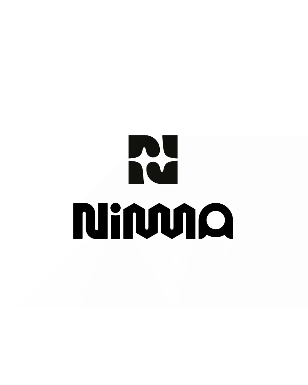
Nimma logo review
4/5
Logo score
Logo review of

Nimma

A strong, stylish visual identity with minor legibility and balance refinements to resolve before professional rollout.

Combination Modern Geometric, Bold Sans-serif Design/creative Services
3/5
Legibility
4/5
Originality
5/5
Misread
3.5/5
Balance
4/5
Scale
Your next steps

What to fix first

Focus on the changes that matter. Keep what makes the logo work.

1

wordmark

Clarify the joint 'mm' letterforms for improved readability.

Visible issue High priority Medium effort
Area to inspectApproximate location

The custom double-M ligature, while stylish, creates ambiguity that could be misread as 'Niwa' or 'Niwaa' at a glance.

How to check

Reassess wordmark shapes for instant recognition, especially at small sizes.

See the category review
2

Standalone mark

Refine the spacing within the mark for more optical balance.

Optional refinement Medium priority Low effort
Area to inspectApproximate location

The geometric standalone mark has slightly uneven optical spacing between the internal shapes, making the negative space less harmonious.

How to check

Visually inspect for evenness in negative and positive spaces.

See the category review
Detailed review

Logo performance breakdown

4/5

Brief & logo match

Based on your brief
Compared with

graphic design studio specialize in brand and logo design for mainly the hospitalty and event industry

The logo's bold, modern aesthetic aligns well with creative, hospitality, and event-focused identity needs.

  • Target Industry (hospitality, Events, Creative)

    Modern, bold forms give a creative and professional impression relevant to design, hospitality, and event industries.

  • Logo/wordmark Integration

    Integrated geometric theme across symbol and type suggests expertise in branding; provides a unified visual language.

3/5

Legibility

  • Distinctive letterforms.
  • Bold presence.
  • The custom double-M ligature, while stylish, creates ambiguity that could be misread as 'Niwa' or 'Niwaa' at a glance.

    Visible issue wordmark

    Try: Clarify the joint 'mm' letterforms for improved readability.

    Check: Reassess wordmark shapes for instant recognition, especially at small sizes.
    Area to inspectApproximate location
4/5

Originality

  • Unified geometric style in mark and wordmark.
  • Distinct double-M ligature.
3.5/5

Balance alignment

  • Good symmetry overall; room for mark refinement.
  • The geometric standalone mark has slightly uneven optical spacing between the internal shapes, making the negative space less harmonious.

    Optional refinement Standalone mark

    Try: Refine the spacing within the mark for more optical balance.

    Check: Visually inspect for evenness in negative and positive spaces.

    Area to inspectApproximate location
Uploaded logoAlignment guide overlay

Inspect spacing with the guide. Optical balance may differ from geometric centering.

4/5

Scalability

  • Simple, reproducible forms.
  • Works at a range of sizes.
Uploaded logo at 200 pixels wide
200 × 250 px
Uploaded logo at 100 pixels wide
100 × 125 px
Uploaded logo at 50 pixels wide
50 × 63 px

Compare the detail at different sizes. Labels show the full image dimensions.

5/5

Misinterpretations

  • No unintended readings.
4/5

Symbol & text fit

  • Geometric mark and wordmark feel visually connected.

Black & white

Does the shape still work without color?

These tests are available only for logos uploaded in vector (SVG) format.

Background contrast

Find the surfaces where your logo stays clear.

These tests are available only for logos uploaded in vector (SVG) format.

Blur & silhouette

A 3px blur softens fine details so you can check whether the overall shape stays recognizable. If key gaps close or elements merge, the logo may rely too heavily on detail.

These tests are available only for logos uploaded in vector (SVG) format.

Try your own review

Wondering how your logo performs?

Get a clear logo score, key risks, and priority fix ideas before your client or audience sees it.

Review my logo