Wondering how your logo performs? 🧐
Get professional logo reviews in seconds and catch design issues in time.
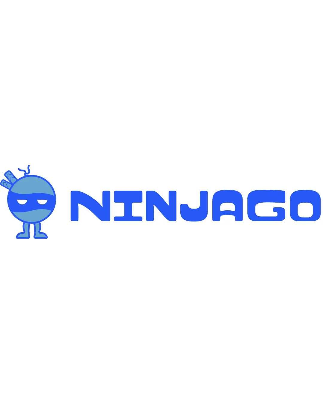
Try it Now!Logo review of NINJAGO
 Logo analysis by AI
Logo type:
Style:
Detected symbol:
Detected text:
Business industry:
Review requested by Koya122024
**If AI can recognize or misinterpret it, so can people.
Structured logo review
Legibility
![]() Text is bold and high contrast against background.
Text is bold and high contrast against background.![]() All letters are easy to distinguish.
All letters are easy to distinguish.
![]() Some rounded forms, particularly in the 'G' and 'O,' reduce clarity at a smaller scale.
Some rounded forms, particularly in the 'G' and 'O,' reduce clarity at a smaller scale.![]() Spacing between letters could be slightly more open for instant recognition.
Spacing between letters could be slightly more open for instant recognition.
Scalability versatility
![]() Simple character design aids scalability.
Simple character design aids scalability.![]() Logo would perform well for merchandise, event posters, or social media.
Logo would perform well for merchandise, event posters, or social media.
![]() Detailed features of the ninja character, like the swords and facial expression, may be lost at small sizes.
Detailed features of the ninja character, like the swords and facial expression, may be lost at small sizes.![]() May lack clarity when shrunk for app icons or embroidery.
May lack clarity when shrunk for app icons or embroidery.
200x250 px
100×125 px
50×62 px
Balance alignment
![]() Consistent baseline alignment between wordmark and character.
Consistent baseline alignment between wordmark and character.
![]() The character is visually heavier compared to the text, making the left side feel weighted.
The character is visually heavier compared to the text, making the left side feel weighted.![]() More negative space on the right side of the logo causes mild imbalance.
More negative space on the right side of the logo causes mild imbalance.

Originality
![]() Playful and unique ninja character illustrates the brand well.
Playful and unique ninja character illustrates the brand well.![]() Distinctive approach compared to typical ninja logos.
Distinctive approach compared to typical ninja logos.
![]() Ninja character trope is not 100% original within entertainment/gaming sectors.
Ninja character trope is not 100% original within entertainment/gaming sectors.
Logomark wordmark fit
![]() Both elements share a cohesive cartoonish style.
Both elements share a cohesive cartoonish style.![]() Color scheme and line weight are consistent.
Color scheme and line weight are consistent.
![]() Ninja character is stylistically just a bit more detailed than the geometric text, introducing a slight mismatch.
Ninja character is stylistically just a bit more detailed than the geometric text, introducing a slight mismatch.
Aesthetic look
![]() Fun and friendly appearance is visually engaging.
Fun and friendly appearance is visually engaging.![]() Color palette is youthful and appropriate for entertainment.
Color palette is youthful and appropriate for entertainment.
![]() Logo could feel too childish for broader audiences or older demographics.
Logo could feel too childish for broader audiences or older demographics.
Dual meaning and misinterpretations
![]() No inappropriate or ambiguous forms detected.
No inappropriate or ambiguous forms detected.![]() Clear ninja representation avoids misinterpretation.
Clear ninja representation avoids misinterpretation.
Color harmony
![]() Color palette is cohesive and visually harmonious.
Color palette is cohesive and visually harmonious.![]() Consistent use of blue reinforces brand tone.
Consistent use of blue reinforces brand tone.
Cornflower Blue
#3781FF
Carolina Blue
#60AFFF
White
#FFFFFF