View review
Logo review ofNiwtx Smart City
Review the detailed scores below to see what is working and what should be refined first.
Logo performance breakdown
Legibility
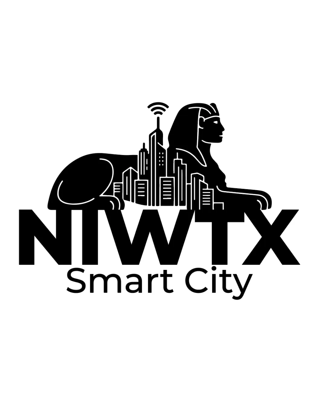
The main wordmark 'NIWTX' is bold, uppercase, and highly readable.
'Smart City' subtitle uses a simple sans-serif font, ensuring easy legibility.
Sphinx tail and skyscraper details slightly overlap with the 'N', which could cause minor readability issues at small sizes.

Originality
Unique combination of ancient Egyptian Sphinx and modern smart city imagery.
Wireless signal adds a fresh conceptual twist relevant to the tech industry.
Idea of merging city skylines with cultural icons is not entirely new, though the Sphinx use is less common.
Color harmony
Single-color design maximizes contrast and versatility.
High contrast ensures visibility on most backgrounds.
Black
#000000
White
#FFFFFF
Balance alignment
Vertical centering of elements provides some structural stability.
Logo mark feels top-heavy with the Sphinx and dense skyscrapers stacked above 'NIWTX'.
The horizontal spread of the Sphinx disproportionately outweighs the text base, making the logo feel visually imbalanced.
'Smart City' is loosely anchored; it does not sufficiently balance or tie the strong mark above.
Scalability
Strong silhouette works well in black and white, good for basic reproduction.
Clear on white backgrounds and suitable for digital presentation materials.
Complexity of the cityscape, Sphinx, and wireless icon may not scale down well for small applications like favicons, small merchandise, or embroidery.
Details may be lost when used at sizes below 2cm or on textured backgrounds.
200x250 px
100×125 px
50×62 px
Misinterpretations
No inappropriate or misleading shapes detected.
Symbolism is clear and on-message for the intended concept.
Symbol & text fit
Logomark and wordmark use similar black fill, giving visual cohesion.
Placement integrates the wordmark into the base of the overall logo, connecting the elements.
Disparity in visual density: the logomark is highly detailed compared to the simple, heavy wordmark.
Stylistic clash: intricate cityscape/Sphinx vs. ultra-bold, blunt type.
Wondering how your logo performs?
Get a clear logo score, key risks, and priority fix ideas before your client or audience sees it.