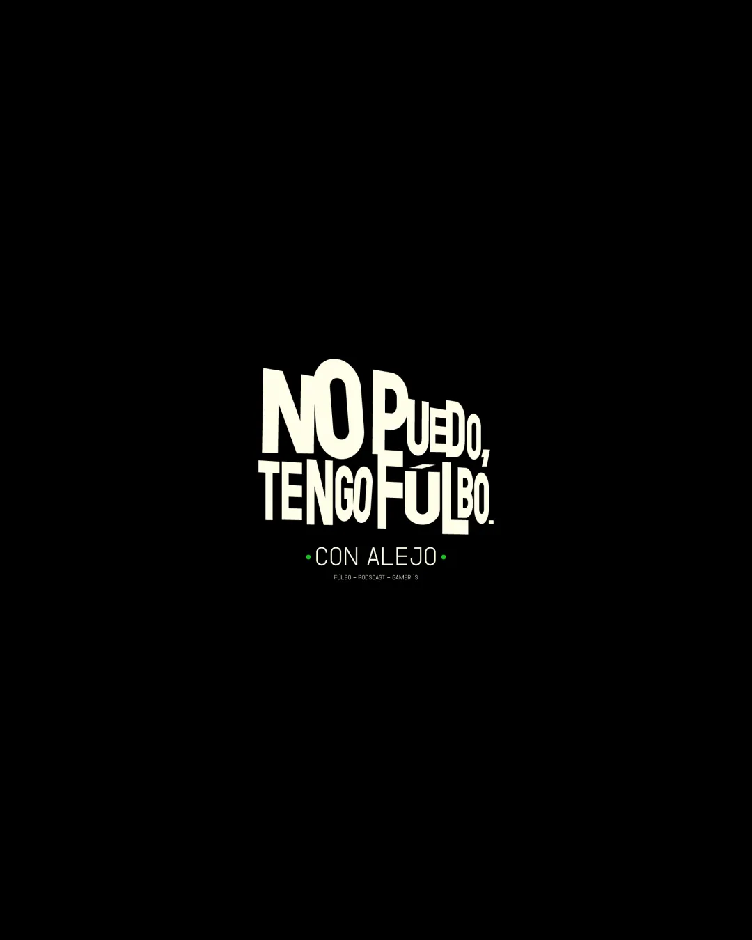
NO PUEDO, TENGO FULBO. • CON ALEJO • FULBO •.. logo review
3.5/5
Logo score
Logo review of

No Puedo, Tengo Fulbo. • Con Alejo • Fulbo •..

Strong core idea for a streaming brand, but requires tagline readability and slight balance improvements for reliable application.

Wordmark Bold Playful Typography Streaming
3.5/5
Legibility
4/5
Originality
5/5
Misread
3/5
Balance
2.5/5
Scale
Your next steps

What to fix first

Focus on the changes that matter. Keep what makes the logo work.

1

wordmark/tagline

Increase tagline thickness or use simpler tagline for small formats.

Visible issue High priority Low effort
Area to inspectApproximate location

The tagline and fine print 'CON ALEJO' and 'FULBO • PODCAST • GAMER’S' are thin and much less readable at smaller sizes.

How to check

Test smallest intended display size for clarity.

See the category review
2

wordmark

Slightly refine letter size variation and baseline for a cleaner structure.

Optional refinement Medium priority Medium effort
Area to inspectApproximate location

The exaggerated differences in letter size and the shifting baseline create a lively feel, but may disrupt balance and make alignment appear irregular.

How to check

Check overall shape cohesion while maintaining playful character.

See the category review
Detailed review

Logo performance breakdown

4/5

Brief & logo match

Based on your brief
Compared with

streaming

Dynamic typography and focus on streaming/podcast topics match the brief, though readability could improve at small sizes.

  • Streaming Focus

    Logo uses bold, dynamic text fitting for attention-grabbing streaming branding.

  • Podcast/gamer Context

    Tagline notes podcast and gaming, aligning well with the content direction; The playful style supports engagement for live and online viewers.

3.5/5

Legibility

  • Main headline is bold and highly readable.
4/5

Originality

  • Distinctive playful text layout.
3/5

Balance alignment

  • Energetic arrangement with casual alignment.
  • The exaggerated differences in letter size and the shifting baseline create a lively feel, but may disrupt balance and make alignment appear irregular.

    Optional refinement wordmark

    Try: Slightly refine letter size variation and baseline for a cleaner structure.

    Check: Check overall shape cohesion while maintaining playful character.

    Area to inspectApproximate location
Uploaded logoAlignment guide overlay

Inspect spacing with the guide. Optical balance may differ from geometric centering.

2.5/5

Scalability

  • Large text scales well.
  • The tagline and fine print 'CON ALEJO' and 'FULBO • PODCAST • GAMER’S' are thin and much less readable at smaller sizes.

    Visible issue wordmark/tagline

    Try: Increase tagline thickness or use simpler tagline for small formats.

    Check: Test smallest intended display size for clarity.

    Area to inspectApproximate location
Uploaded logo at 200 pixels wide
200 × 250 px
Uploaded logo at 100 pixels wide
100 × 125 px
Uploaded logo at 50 pixels wide
50 × 63 px

Compare the detail at different sizes. Labels show the full image dimensions.

5/5

Misinterpretations

  • No confusion with negative space or letterforms.

Black & white

Does the shape still work without color?

These tests are available only for logos uploaded in vector (SVG) format.

Background contrast

Find the surfaces where your logo stays clear.

These tests are available only for logos uploaded in vector (SVG) format.

Blur & silhouette

A 3px blur softens fine details so you can check whether the overall shape stays recognizable. If key gaps close or elements merge, the logo may rely too heavily on detail.

These tests are available only for logos uploaded in vector (SVG) format.

Try your own review

Wondering how your logo performs?

Get a clear logo score, key risks, and priority fix ideas before your client or audience sees it.

Review my logo