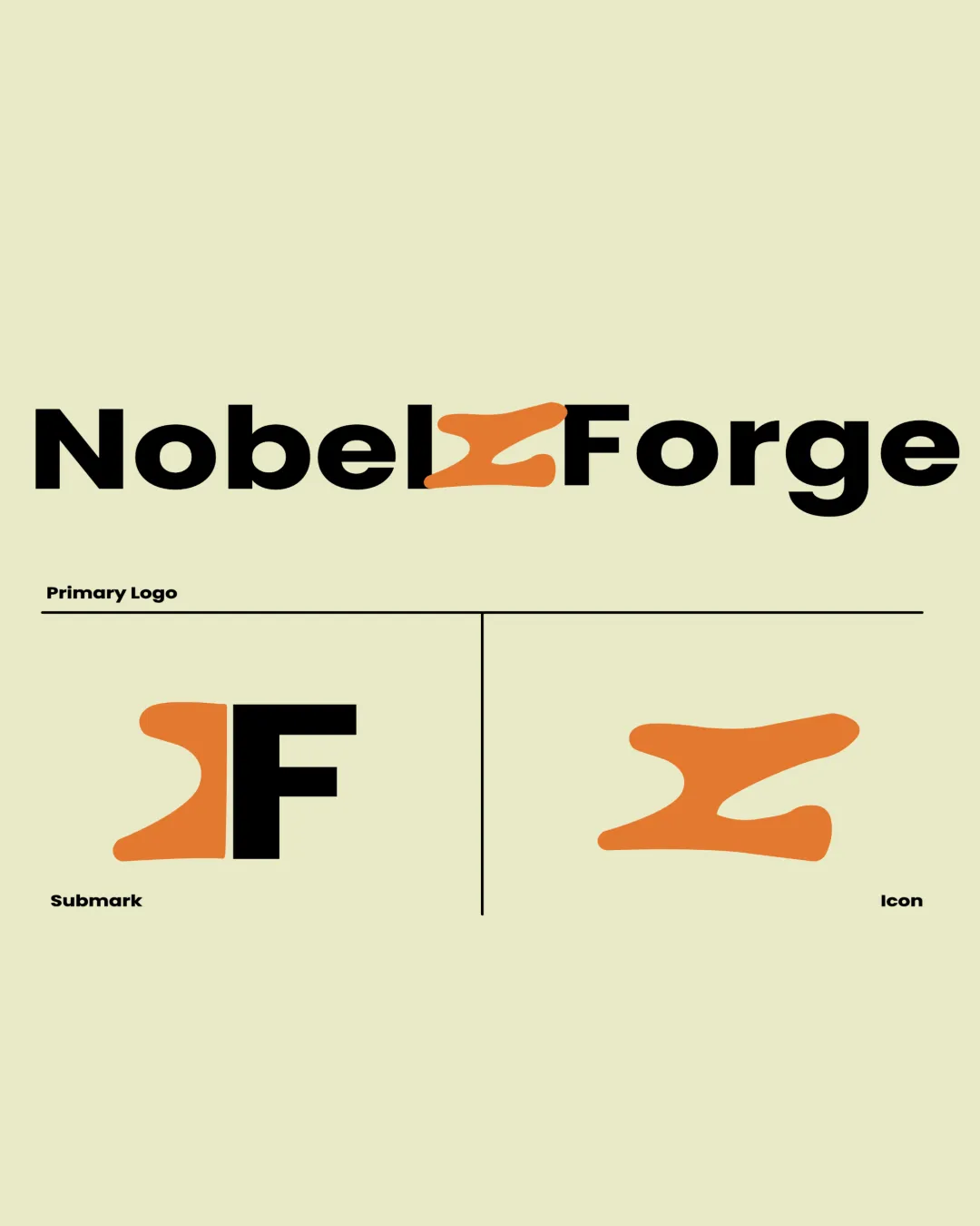
NobelForge Primary Logo Submark Icon logo review
4/5
Logo score
Logo review of

Nobelforge Primary Logo Submark Icon

A distinctive and versatile identity with minor refinements needed for mark clarity and balance.

Combination Modern Geometric Sans-serif With An Abstract Symbol Tech/career/education
5/5
Legibility
4/5
Originality
5/5
Misread
4/5
Balance
4/5
Scale
Your next steps

What to fix first

Focus on the changes that matter. Keep what makes the logo work.

1

Standalone mark (all versions)

Consider subtle refinements to strengthen intended letterform without losing abstraction.

Optional refinement Medium priority Medium effort
Area to inspectApproximate location

The abstract orange symbol is distinctive but could be seen as ambiguous, neither an explicit 'N' nor 'SF'; this could slightly reduce memorability for new audiences.

How to check

User-testing for recognition and recall.

See the category review
2

Primary Logo (horizontal band 1; central mark area)

Fine-tune mark alignment and weight for optical balance within the wordmark.

Optional refinement Medium priority Low effort
Area to inspectApproximate location

The bold sans-serif type contrasts sharply with the organic mark; the integration is visually strong but could benefit from finer alignment or tweaking mark weight, especially adjacent to the 'l' and 'F'.

How to check

Check for better visual rhythm, particularly at small sizes.

See the category review
Detailed review

Logo performance breakdown

4/5

Brief & logo match

Based on your brief
Compared with

Simulated software development workplace, conveying creation, teamwork, and real-world learning.

Logo visually supports a hands-on, transformative workplace concept with a standout abstract mark.

  • Simulated Workplace Concept

    The molten, dynamic form alludes to forging or creating talent, fitting the brand story of hands-on work experience.

  • Modern Tech/career Focus

    Bold sans-serif wordmark and abstract mark convey modernity and seriousness, suited to a tech/career platform.

5/5

Legibility

  • Wordmark is bold and highly legible.
4/5

Originality

  • Unique, distinctive abstract mark integrated with type.
  • The abstract orange symbol is distinctive but could be seen as ambiguous, neither an explicit 'N' nor 'SF'; this could slightly reduce memorability for new audiences.

    Optional refinement Standalone mark (all versions)

    Try: Consider subtle refinements to strengthen intended letterform without losing abstraction.

    Check: User-testing for recognition and recall.
    Area to inspectApproximate location
4/5

Color harmony

  • Vivid orange contrasts well with black and light background.
Very Light Yellow#E1DEB0
Orange#FF9030
Black#000000

Estimated colors. Use the original design file for exact values.

Create a full color palette using these colors

Create new palette
4/5

Balance alignment

  • Strong integration of symbol with type.
  • The bold sans-serif type contrasts sharply with the organic mark; the integration is visually strong but could benefit from finer alignment or tweaking mark weight, especially adjacent to the 'l' and 'F'.

    Optional refinement Primary Logo (horizontal band 1; central mark area)

    Try: Fine-tune mark alignment and weight for optical balance within the wordmark.

    Check: Check for better visual rhythm, particularly at small sizes.

    Area to inspectApproximate location
Uploaded logoAlignment guide overlay

Inspect spacing with the guide. Optical balance may differ from geometric centering.

4/5

Scalability

  • Submark and icon versions supplied.
  • Main mark is simple but may risk detail loss at tiny sizes.
  • The organic shape may lose clarity at very small sizes, especially as a favicon or app icon.

    Worth testing Standalone mark/submark

    Try: Test mark legibility at reduced sizes and in single-color use.

    Check: Review favicon/small icon rendering for clarity.

Uploaded logo at 200 pixels wide
200 × 250 px
Uploaded logo at 100 pixels wide
100 × 125 px
Uploaded logo at 50 pixels wide
50 × 63 px

Compare the detail at different sizes. Labels show the full image dimensions.

5/5

Misinterpretations

  • No plausible negative readings detected.
4/5

Symbol & text fit

  • Mark and wordmark integration is thoughtful and relevant.

Black & white

Does the shape still work without color?

These tests are available only for logos uploaded in vector (SVG) format.

Background contrast

Find the surfaces where your logo stays clear.

These tests are available only for logos uploaded in vector (SVG) format.

Blur & silhouette

A 3px blur softens fine details so you can check whether the overall shape stays recognizable. If key gaps close or elements merge, the logo may rely too heavily on detail.

These tests are available only for logos uploaded in vector (SVG) format.

Try your own review

Wondering how your logo performs?

Get a clear logo score, key risks, and priority fix ideas before your client or audience sees it.

Review my logo