What to preserve
The wordmark integrates a face profile into 'S' and a damru (drum) as the 'i' dot, connecting to Hindu spiritual themes.
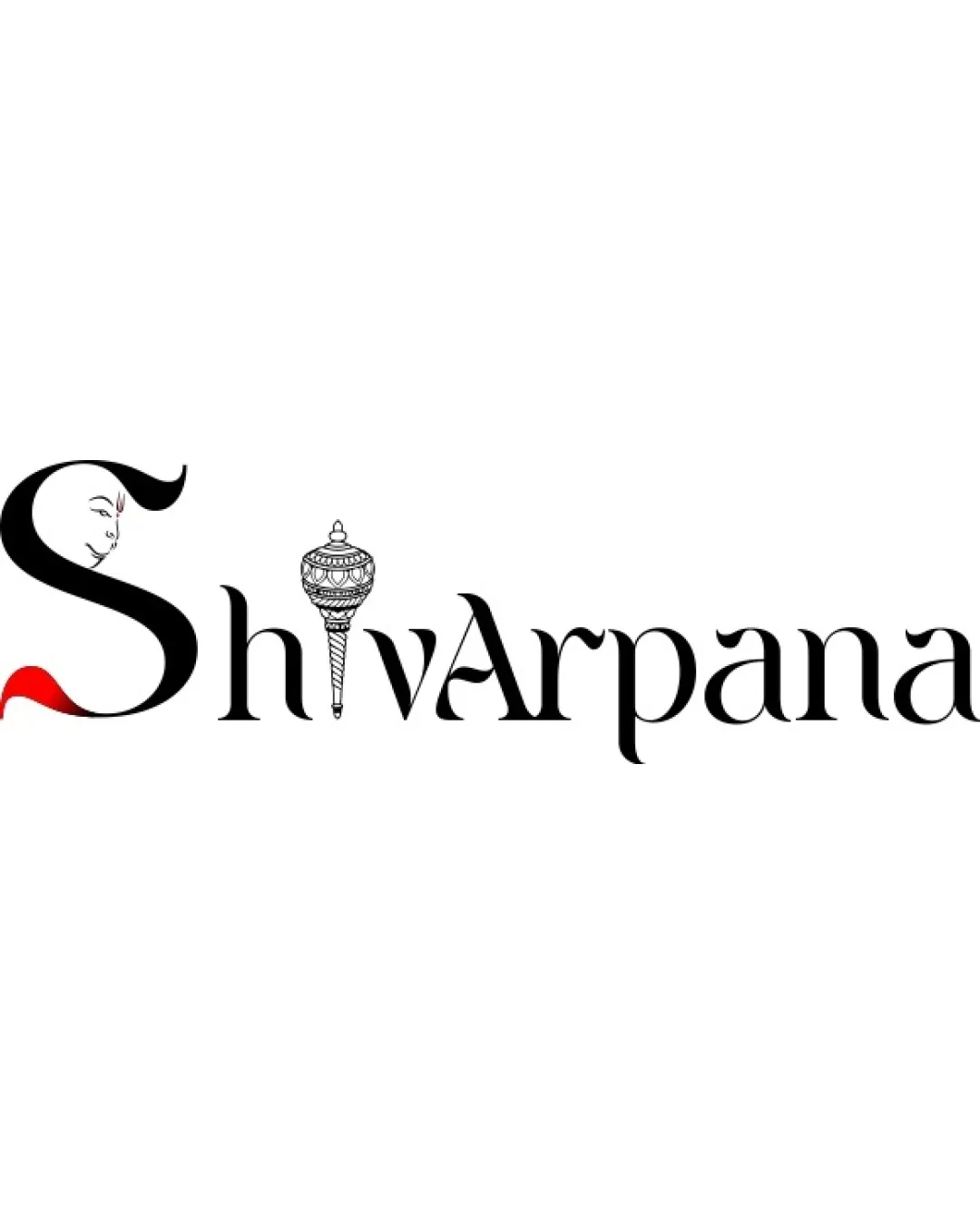
A distinctive and culturally-rooted wordmark needing minor simplification for better versatility.
Focus on the changes that matter. Keep what makes the logo work.
The wordmark integrates a face profile into 'S' and a damru (drum) as the 'i' dot, connecting to Hindu spiritual themes.
Logo preview unavailable. The written feedback is still available on this card.
face in 'S' and damru as 'i' dot
Spiritual motifs are cleverly integrated into the letterforms, but the face in 'S' and detailed damru are somewhat intricate at small scale.
Test miniaturized versions for symbol recognizability.
Logo preview unavailable. The written feedback is still available on this card.
'S' and damru in 'i'
The large 'S' and detailed damru create slight visual imbalance compared to the rest of the letters.
See the category reviewVisually anchors spiritual intent and brand name with relevant motifs, though fine detail may limit scale versatility.
Spiritual motifs are cleverly integrated into the letterforms, but the face in 'S' and detailed damru are somewhat intricate at small scale.
Try: Simplify details in face and damru for clarity at smaller sizes.
Check: Test miniaturized versions for symbol recognizability.
Logo preview unavailable. The written feedback is still available on this card.
Estimated colors. Use the original design file for exact values.
Create a full color palette using these colors
Create new paletteThe large 'S' and detailed damru create slight visual imbalance compared to the rest of the letters.
Try: Refine scaling and alignment of 'S' and damru to achieve better harmony with the rest of the wordmark.
Logo preview unavailable. The written feedback is still available on this card.

Inspect spacing with the guide. Optical balance may differ from geometric centering.
Get a clear logo score, key risks, and priority fix ideas before your client or audience sees it.
More credits needed
Add credits to continue without losing your work.
Then $7/month. Cancel anytime.
Essential logo review with AI
Estimated progress