 View review
Logo score
Logo review of
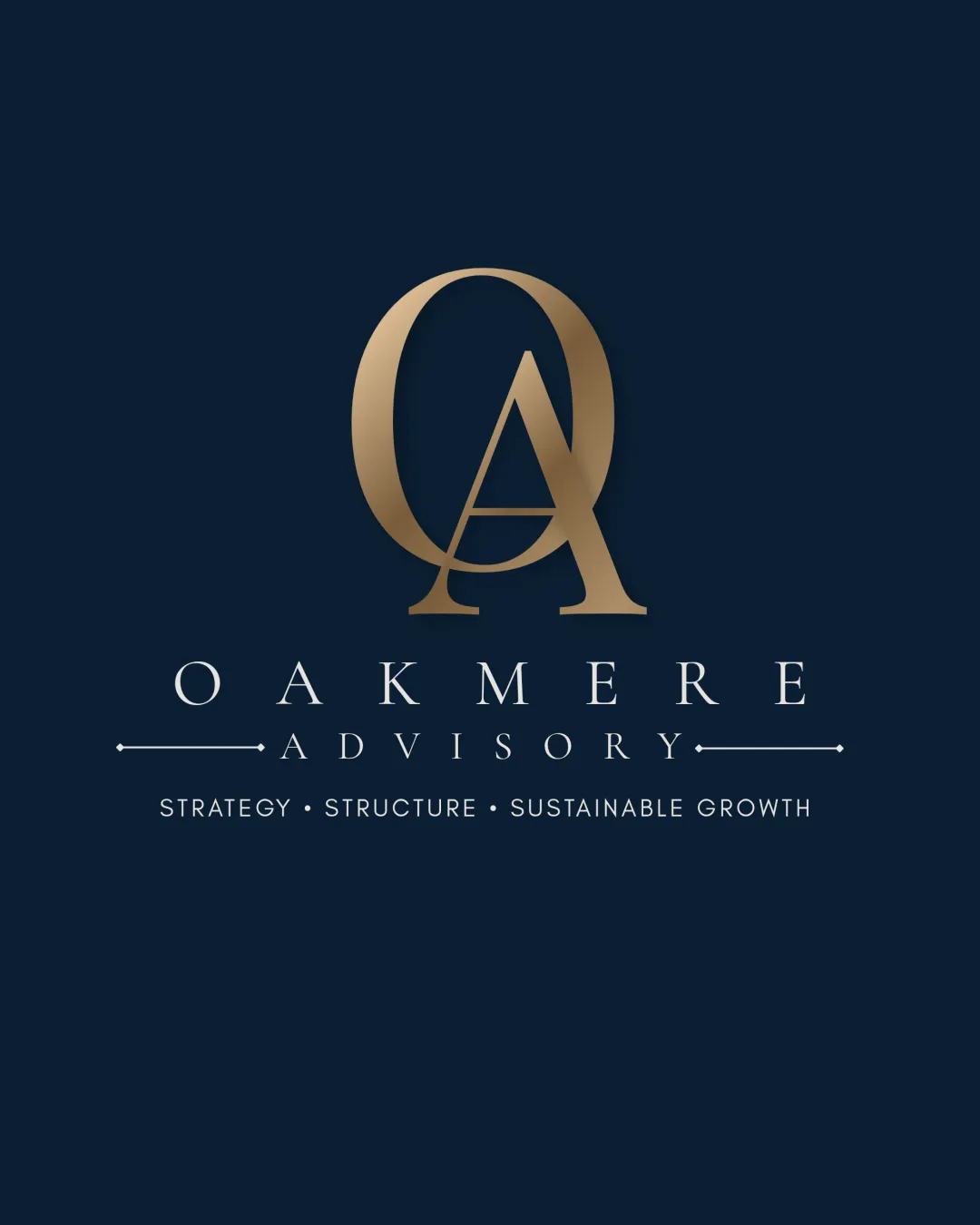
Oakmere Advisory Strategy • Structure • Sustai..
An elegant, client-ready identity with strong fit for business consulting. Consider a flat variation for maximum versatility.
Objective AI feedback. Your creative decision.
Legibility
Originality
Misread
Balance
Scale
Action plan
What to fix first
The most important fixes to handle before polishing the full presentation.
1
Simplify or offer a flat version for small-size usage.
High priorityGold gradient and tagline detail may lose legibility at reduced sizes.
Impact: Improves Versatility In Digital And Print Applications · Effort: Low
Detailed review
Logo performance breakdown
Legibility
 Clear, well-spaced typography. Hierarchy of name, descriptor, and tagline is effective.
 Gold gradient may slightly affect legibility at small sizes.
Originality
The OA monogram is tastefully constructed and elevated by execution.
Basic monogram approach is conventional for this sector.
Color harmony
Gold on navy is classic and communicates sophistication.
Gold
#B69E73
Navy
#182238
Balance alignment
Excellent centering and proportional distribution. Visually stable monogram atop balanced wordmark and tagline.

Scalability
Simple forms, strong contrast on dark background.
Gold gradient and fine text in tagline may lose clarity at very small sizes.
200x250 px
100×125 px
50×62 px
Misinterpretations
No negative or confusing alternate readings.
Logo structure & brief match
Monogram and wordmark are highly compatible in tone and style.
Industry: The design aligns well with business consulting, conveying credibility and sophistication.
Tone: Premium and trustworthy, matching expectations for a consultancy.
Try your own review
Review my logo
Wondering how your logo performs?
Get a clear logo score, key risks, and priority fix ideas before your client or audience sees it.
Keep exploring