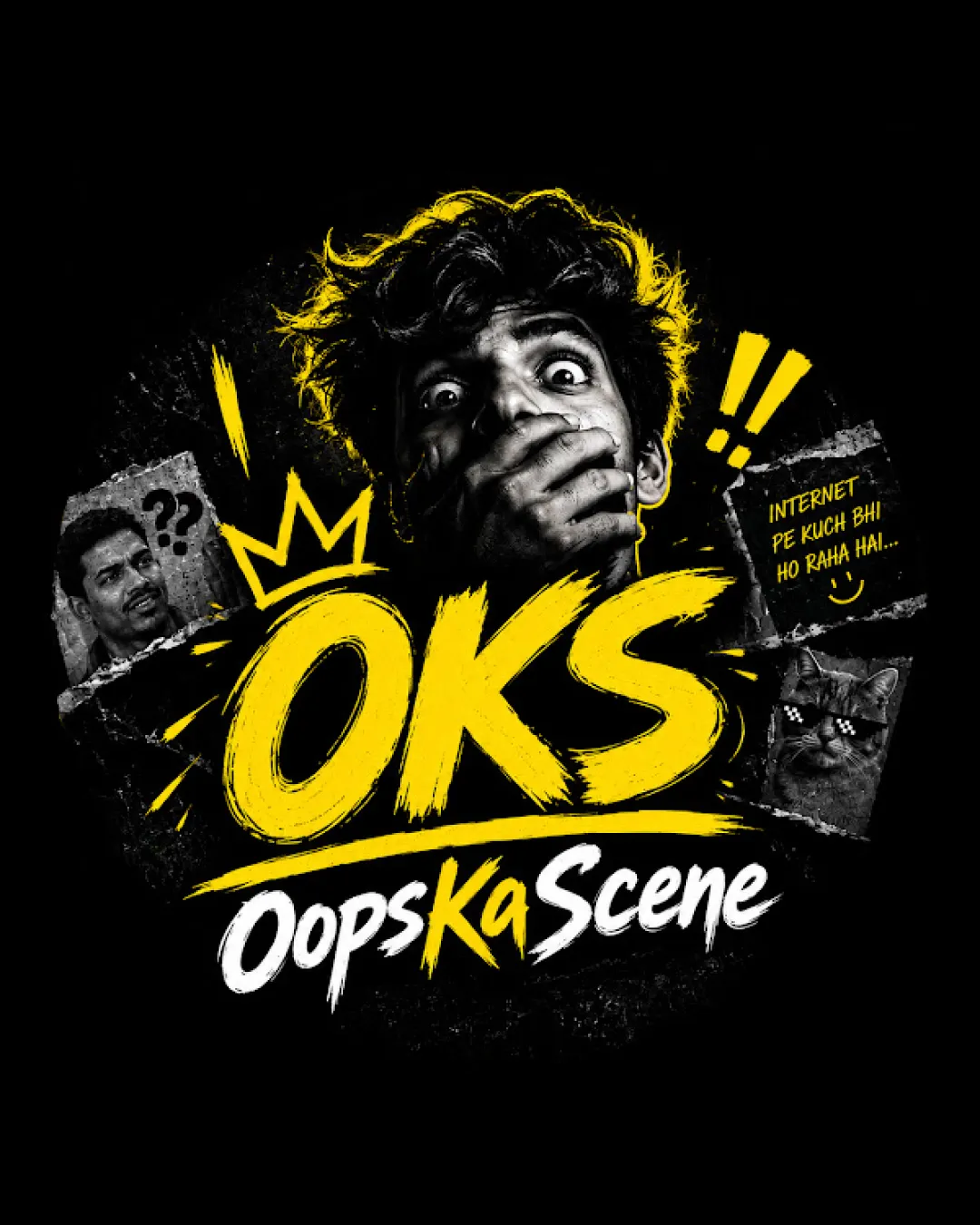
OKS Oops Ka Scene INTERNET PE KUCH BHI HO RAHA HAI.. logo review
3/5
Logo score
Logo review of

Oks Oops Ka Scene Internet Pe Kuch Bhi Ho Raha Hai..

Fun, memorable, and genre-relevant design for meme/OTT entertainment, but too busy and detailed for robust, professional logo deployment.

Combination Mark Edgy, Hand-drawn, Meme-inspired Street Style Entertainment
3.5/5
Legibility
4/5
Originality
4/5
Misread
3/5
Balance
2/5
Scale
Action plan

What to fix first

The most important fixes to handle before polishing the full presentation.

1

Simplify or modularize logo for small-scale digital use; create an icon or alternate lockup that preserves identity without photos or collage.

High priority

Current design is engaging but loses integrity and detail at small scale.

Impact: Improves Brand Visibility, Legibility, And Usability As Social Avatar Or Watermark. · Effort: Medium

2

Reduce visual clutter by prioritizing graphic/wordmark integration and downplaying or stylizing meme photos.

Medium priority

Reduces competition between elements while keeping humor and energy.

Impact: Improves Readability And Overall Brand Impact. · Effort: Medium

Detailed review

Logo performance breakdown

3.5/5

Legibility

Checkmark icon 'OKS' and 'Oops Ka Scene' are readable at larger sizes

Warning icon Busy collage and overlaid graphics begin to reduce legibility, especially for 'Oops Ka Scene' at small sizes

4/5

Originality

Checkmark icon Fresh mix of urban art, meme, and OTT digital humor; instantly recognizable genre style

Warning icon Some elements (like meme collage and handwritten treatment) are trending; less likely to age well

4/5

Color harmony

Checkmark icon Yellow/white/black palette is high contrast and eye-catching

Warning icon May feel visually overwhelming due to intense contrasts and busy layout

Yellow
#FFFF00

White
#FFFFFF

Black
#000000

Your palette is close. Refine the color roles and combinations before updating the logo.

Build brand colors
3/5

Balance alignment

Checkmark icon Bold center focus on 'OKS' with supporting surrounding elements

Warning icon Crowded side images/effects create visual noise and disrupt balance

logo 200x250 pixels scalability test alignment grid overlay
2/5

Scalability

Checkmark icon Main title and impact image are clear in larger displays

Warning icon Complex composition, photographic elements, and small memes are likely to be lost or turn muddy at smaller logo sizes

logo 200x250 pixels scalability test

200x250 px

logo 100x125 pixels scalability test

100×125 px

logo 50x62 pixels scalability test

50×62 px

4/5

Misinterpretations

Checkmark icon No obvious inappropriate or confused readings; overall mood is playful

3.5/5

Logo structure & brief match

Checkmark icon Surprised photo and graffiti style fits wordmark energy

Warning icon Photo-realistic element clashes with comic-style wordmark in some contexts

Checkmark icon Entertainment/meme Brand: Strong thematic fit with current meme/OTT digital culture.
Checkmark icon Flexibility For Social Profiles: Heavy detail and photo will not scale well to social icons or small badges.

Try your own review

Wondering how your logo performs?

Get a clear logo score, key risks, and priority fix ideas before your client or audience sees it.

Review my logo