 View review
Logo score
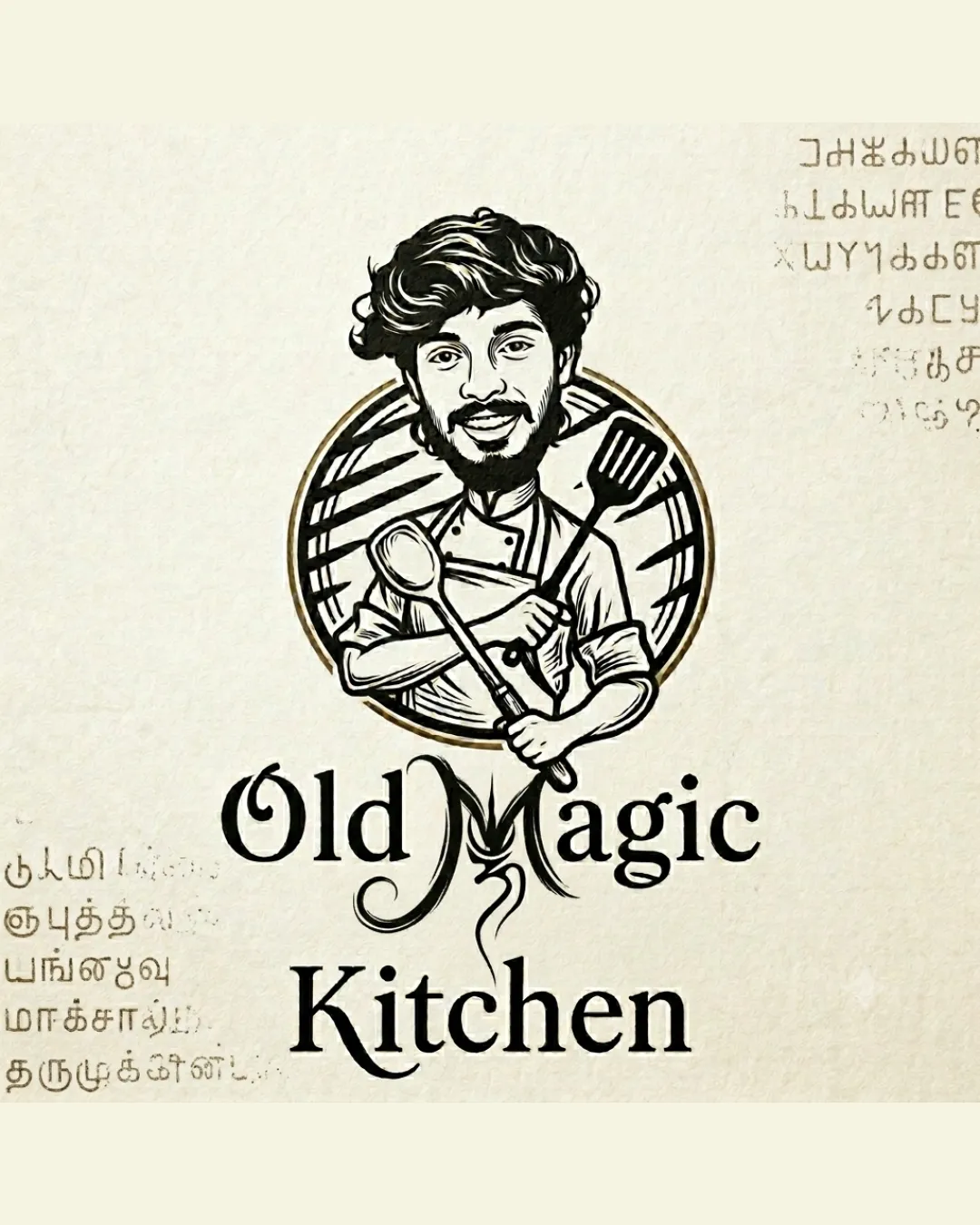
Logo review ofOld Magic Kitchen
Review the detailed scores below to see what is working and what should be refined first.
Legibility
Originality
Misread
Balance
Scale
Detailed review
Logo performance breakdown
Legibility
![]() The main name 'Old Magic Kitchen' is clear and readable.
The main name 'Old Magic Kitchen' is clear and readable.![]() Font choice has character and matches the vintage theme.
Font choice has character and matches the vintage theme.
![]() The flourish in the 'M' adds visual interest but slightly disrupts the flow of reading.
The flourish in the 'M' adds visual interest but slightly disrupts the flow of reading.
Originality
![]() Hand-drawn chef caricature is highly personal and distinguishes the brand.
Hand-drawn chef caricature is highly personal and distinguishes the brand.![]() Custom illustrated mark instead of generic icons.
Custom illustrated mark instead of generic icons.
![]() Chef-with-utensils is a common restaurant motif and doesn't push originality further.
Chef-with-utensils is a common restaurant motif and doesn't push originality further.
Color harmony
![]() Limited and harmonious palette with classic black and gold tones.
Limited and harmonious palette with classic black and gold tones.![]() Color use enhances vintage and high-quality perception.
Color use enhances vintage and high-quality perception.
Ebony
#222222
Chalk
#E7DEC6
Metallic Gold
#A88443
Balance alignment
![]() Centralized arrangement with circle background anchors the composition.
Centralized arrangement with circle background anchors the composition.![]() Wordmark is well centered under the illustration.
Wordmark is well centered under the illustration.
![]() Caricature head is significantly larger than the wordmark, creating top-heavy visual weight.
Caricature head is significantly larger than the wordmark, creating top-heavy visual weight.![]() The overly decorative 'M' interrupts the balance between the top and bottom text.
The overly decorative 'M' interrupts the balance between the top and bottom text.

Scalability
![]() Logo works well on menus or signage where large display is possible.
Logo works well on menus or signage where large display is possible.![]() Hand-drawn style gives strong personality for marketing materials, posters.
Hand-drawn style gives strong personality for marketing materials, posters.
![]() The detailed caricature will lose clarity when scaled down (e.g., business cards or social media icons).
The detailed caricature will lose clarity when scaled down (e.g., business cards or social media icons).![]() Thin lines and complex elements do not translate for embroidery, favicon, or small package labels.
Thin lines and complex elements do not translate for embroidery, favicon, or small package labels.
200x250 px
100×125 px
50×62 px
Misinterpretations
![]() No inappropriate or unintended visual connotations are present.
No inappropriate or unintended visual connotations are present.
Symbol & text fit
![]() Both the illustration and wordmark share a hand-crafted feel.
Both the illustration and wordmark share a hand-crafted feel.
![]() The illustrative mark is visually dominant while the wordmark feels secondary.
The illustrative mark is visually dominant while the wordmark feels secondary.
![]() Decorative 'M' introduces a slightly discordant style not reflected in other letters or the illustration.
Decorative 'M' introduces a slightly discordant style not reflected in other letters or the illustration.
Try your own review
Review my logo
Wondering how your logo performs?
Get a clear logo score, key risks, and priority fix ideas before your client or audience sees it.
Keep exploring