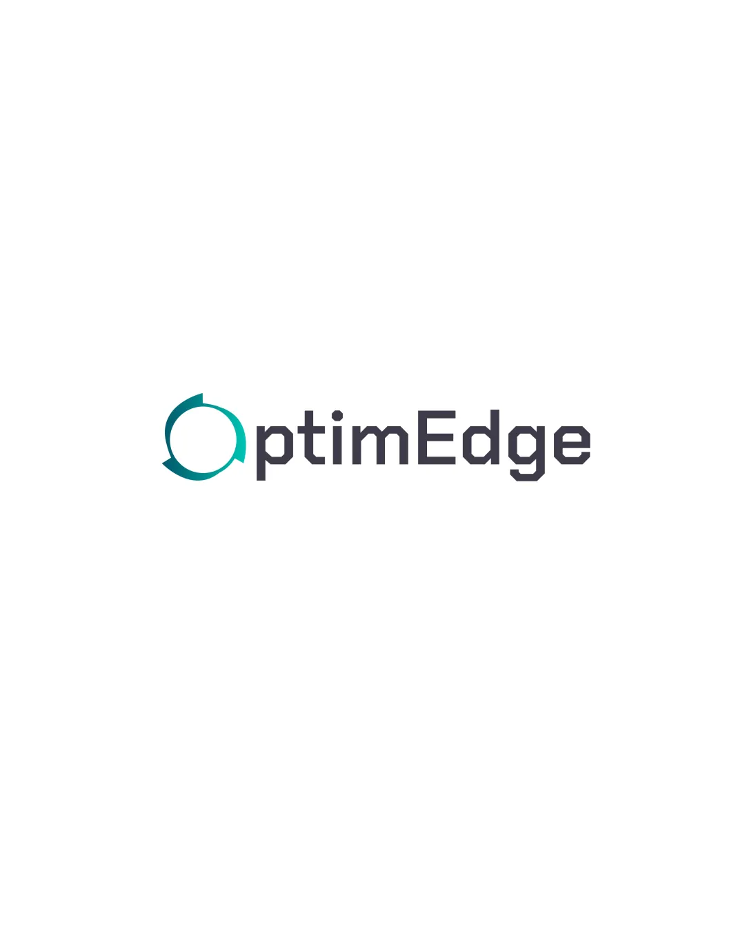
optimEdge logo review
4.4 / 5
Logo score
Logo review of

Optimedge

Review the detailed scores below to see what is working and what should be refined first.

Objective AI feedback. Your creative decision.

Combination Mark Modern, Geometric, Sans-serif Technology
5/5
Legibility
4/5
Originality
5/5
Misread
4/5
Balance
4/5
Scale
Detailed review

Logo performance breakdown

5/5

Legibility

Checkmark icon All characters are clean and readable.
Checkmark icon Font size and spacing are optimal for clarity.
4/5

Originality

Checkmark icon Integration of the circular arrow within the 'O' gives a unique twist.
Checkmark icon Font choice and implementation help distinguish the mark.

Warning icon Circular arrows are commonly used in technology/logistics logos, so the concept leans a bit generic without further differentiation.

5/5

Color harmony

Checkmark icon Color usage is limited and harmonious.
Checkmark icon Contrast between teal and dark gray is effective.

Teal
#11B4B5

Gunmetal
#373640

White
#FFFFFF

4/5

Balance alignment

Checkmark icon Overall composition is well balanced between symbol and wordmark.
Checkmark icon Symbol aligns well with the baseline of the text.

Warning icon Slight heaviness toward the left due to the size and color contrast of the symbol compared to the wordmark, which could be reduced.

logo 200x250 pixels scalability test alignment grid overlay
4/5

Scalability

Checkmark icon Logo is simple and will scale well for most sizes including digital applications, business cards, and letterheads.
Checkmark icon Wordmark and symbol retain clarity at small and large sizes.

Warning icon Thin negative spaces in the circular arrow may become less distinct at very small sizes such as favicons or embroidery.

logo 200x250 pixels scalability test

200x250 px

logo 100x125 pixels scalability test

100×125 px

logo 50x62 pixels scalability test

50×62 px

5/5

Misinterpretations

Checkmark icon No inappropriate dual meanings or visual misinterpretations detected.

4 / 5

Symbol & text fit

Checkmark icon Geometric curves and thickness of the mark complement the angular wordmark.
Checkmark icon Colors in the symbol and wordmark are cohesive.

Warning icon Symbol's visual weight slightly overpowers the wordmark, needing finer proportional tuning.

Try your own review

Wondering how your logo performs?

Get a clear logo score, key risks, and priority fix ideas before your client or audience sees it.

Review my logo




