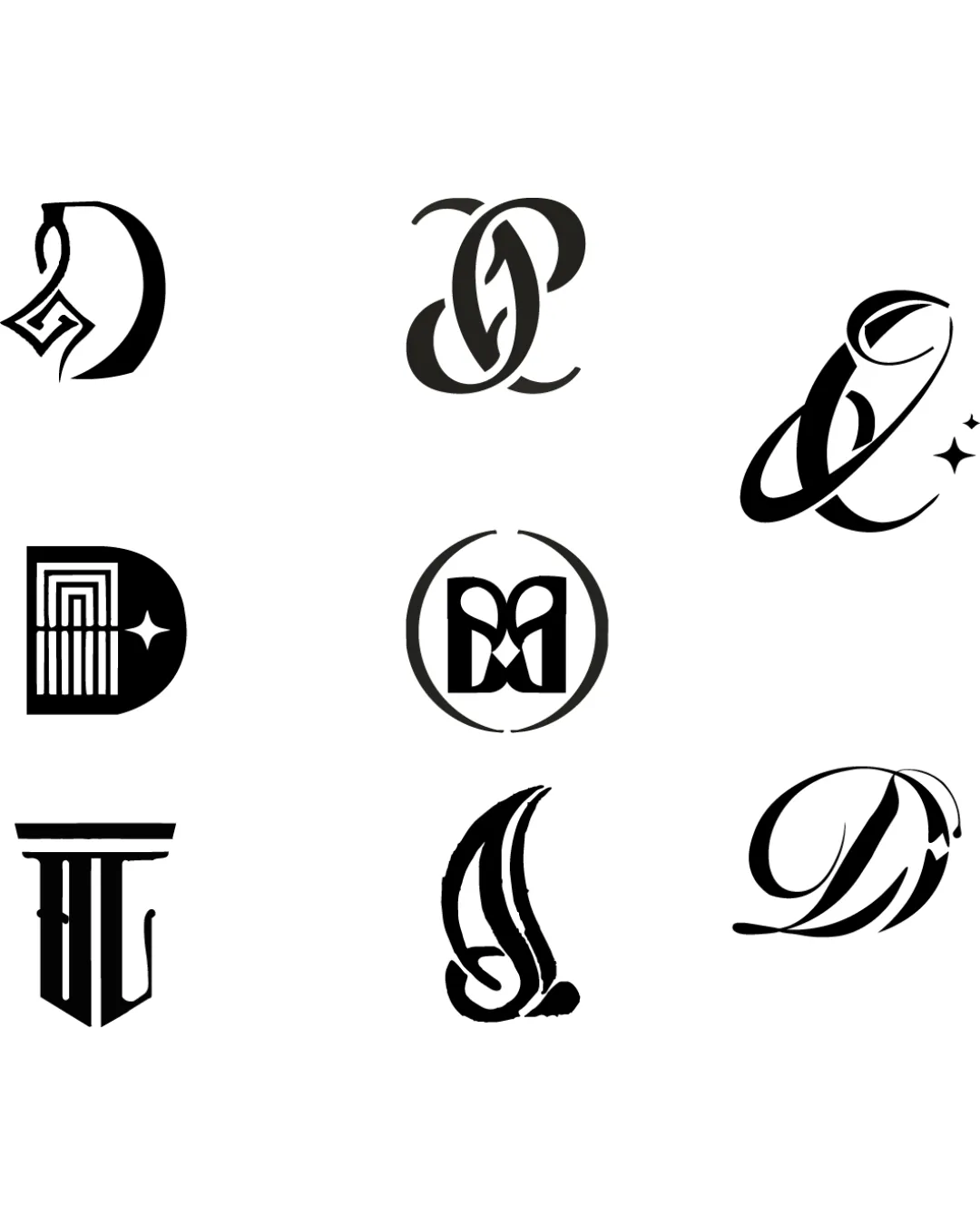
Multiple monograms and ornamental letterforms logo review
3.0 / 5
Logo score
Logo review of

Multiple Monograms And Ornamental Letterforms

An eye-catching set of ornamental monograms with individual style, but most marks require refinement to boost clarity, recognition, and scalability for professional use.

Objective AI feedback. Your creative decision.

Multiple Versions Ornamental And Monogram
2.5/5
Legibility
3.5/5
Originality
3.5/5
Misread
3/5
Balance
3/5
Scale
Action plan

What to fix first

The most important fixes to handle before polishing the full presentation.

1

Refine monogram legibility while preserving ornamentation.

High priority

Some monograms are hard to identify and may confuse viewers.

Impact: Greater User Recognition And Usability. · Effort: Medium

2

Optimize stroke contrast and simplify overly intricate sections for small-scale use.

Medium priority

Fine details and tight curves risk filling in when scaled down.

Impact: Improved Versatility And Reproduction Fidelity. · Effort: Medium

Detailed review

Logo performance breakdown

2.5/5

Legibility

Checkmark icon Some monograms have distinguishable letterforms.

Warning icon Several letters are difficult to confidently identify due to ornamental abstraction.
Warning icon Uniform stroke weights reduce clarity in some cases.

3.5/5

Originality

Checkmark icon Most marks display unique decorative stylization.

Warning icon Ornamental monogram style is familiar and somewhat traditional.

3/5

Balance alignment

Checkmark icon Each monogram shows deliberate internal symmetry and balance.

Warning icon Spacing and stroke flow are inconsistent across the suite.

logo 200x250 pixels scalability test alignment grid overlay
3/5

Scalability

Checkmark icon Strong, simple contrast supports scaling up to medium sizes.

Warning icon Fine details and tight curves may fill in at small sizes.
Warning icon Some designs lack a clear silhouette.

logo 200x250 pixels scalability test

200x250 px

logo 100x125 pixels scalability test

100×125 px

logo 50x62 pixels scalability test

50×62 px

3.5/5

Misinterpretations

Checkmark icon No obvious negative space misreadings.

Try your own review

Wondering how your logo performs?

Get a clear logo score, key risks, and priority fix ideas before your client or audience sees it.

Review my logo